After writing this piece on Magento stores, a number of people asked me to create an equivalent piece for Salesforce Commerce Cloud (formerly Demandware) websites / implementations. The choices of the Salesforce Commerce Cloud implementations used in this article are mainly based on the design and the overall user experience of the website, as well as the adoption of other innovative eCommerce technologies to aid the customer experience.
Following the acquisition of the Demandware platform by Salesforce back in 2016, Demandware now operates as Salesforce Commerce Cloud filling the eCommerce gap in the Salesforce product portfolio and extending the platform’s capabilities for existing and new clients into the world of CRM, marketing and customer service at the same time.
Salesforce Commerce Cloud is generally only used by enterprise-level merchants, so most of the stores featured in this artible are household names / big brands. If there are any Salesforce Commerce Cloud websites you think I’ve missed, feel free to suggest them below and I’ll add them in. You can also read my Magento Enterprise vs Demandware piece or my ecommerce platform selection guide.
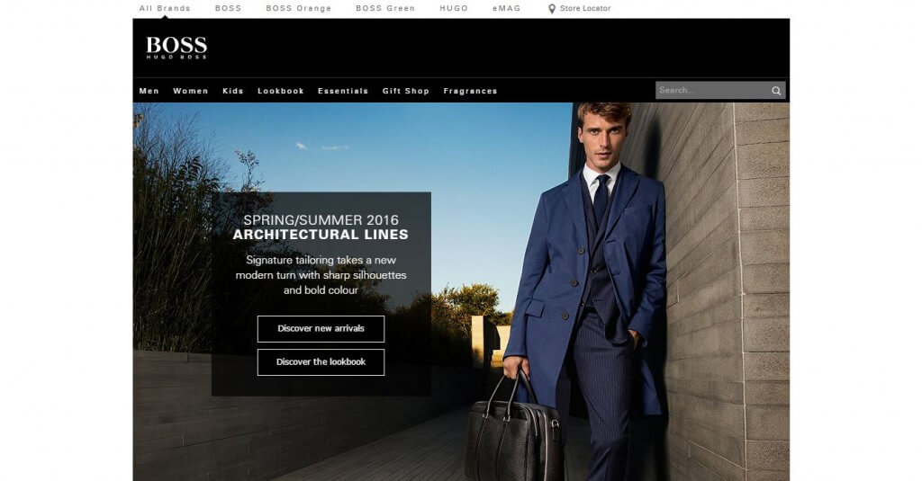
Hugo Boss
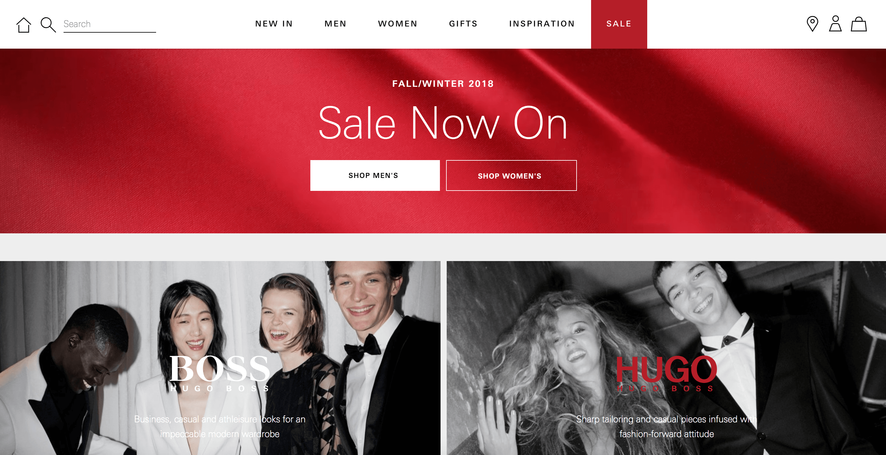
Very clean, modern DTC eCommerce store, powered by Salesforce Commerce Cloud. Great mobile experience and considered product detail pages.
—
Ralph Lauren

Simplistic international eCommerce store with a lot of local storefronts. Very strong and modern product detail pages and good use of product recommendations for up-sells and cross-sells.
—
Sweaty Betty

Very clean, UX-focused eCommerce store that is a huge improvement on their previous version. Features some excellent product video, very clean and well-thought-out navigation and good use of up-sells.
—
Adidas
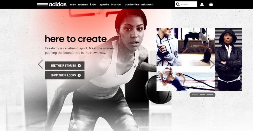
The main Adidas direct to consumer website – nice use of imagery, very simple and clean UX and very strong product pages.
—
Tate Modern
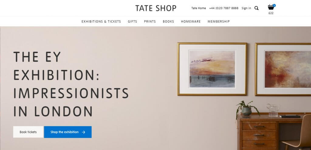
A really clean website with plenty of strong templates offering a seamless experience. One of the highlights is the ticket booking functionality sitting along the more usual eCommerce products offered within the store. The home visualisation tool for the prints and posters category is super useful and well presented too.
—
Beats By Dre
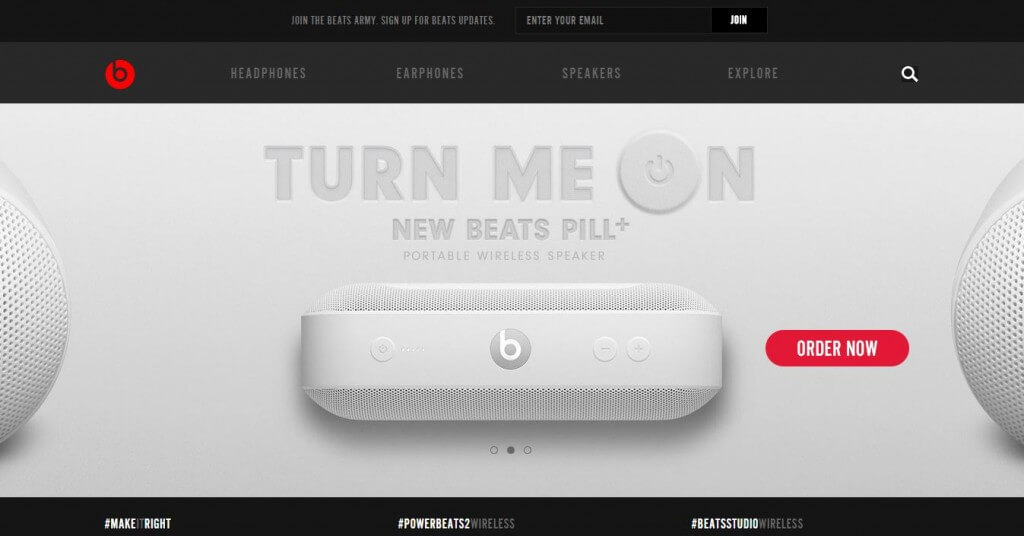
The Beats by Dre site is very good at showcasing the quality and key features of the products and I also really like how simple the navigation is. The product pages are pretty good as well, although the buy button now goes to the product on the Apple site since the acquisition.
—
L’Oreal USA
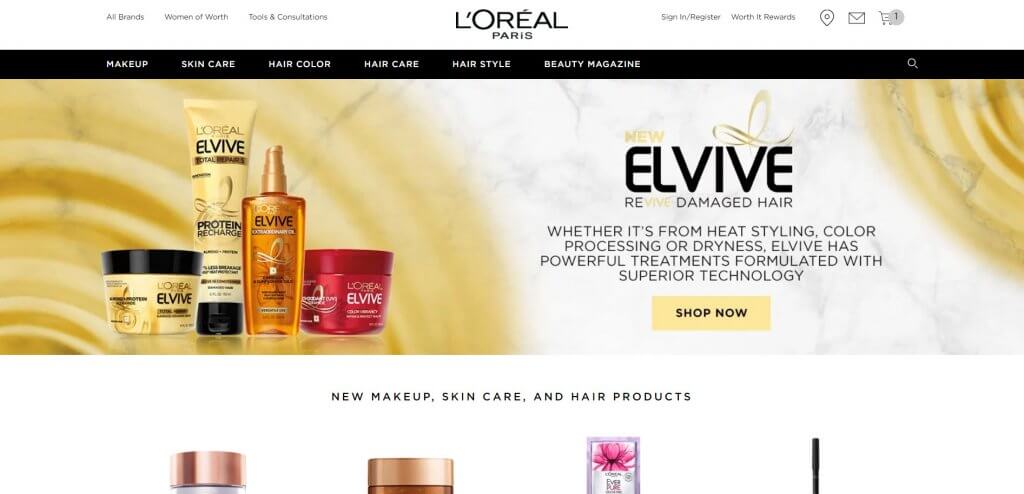
The world’s largest beauty and cosmetics brand operates various localised sites offering different customer journeys. The USA store sits on Demandware / Salesforce Ecommerce Cloud and lets customers shop all products directly form the site as opposed to the UK version which currently pushes users to shop from partner sites (eg Amazon). I particularly loved how rapid this store is. Product detail pages also tick many boxes for me, including content (beauty guides and how-tos) related to the product and a wealth of product reviews and customer Q&As.
—
Joseph
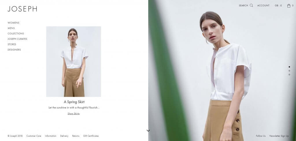
A minimalist, clean design, the site delivers on product photography and navigation features. A nice detail is the size availability displayed on product listing level.
—
Boohoo
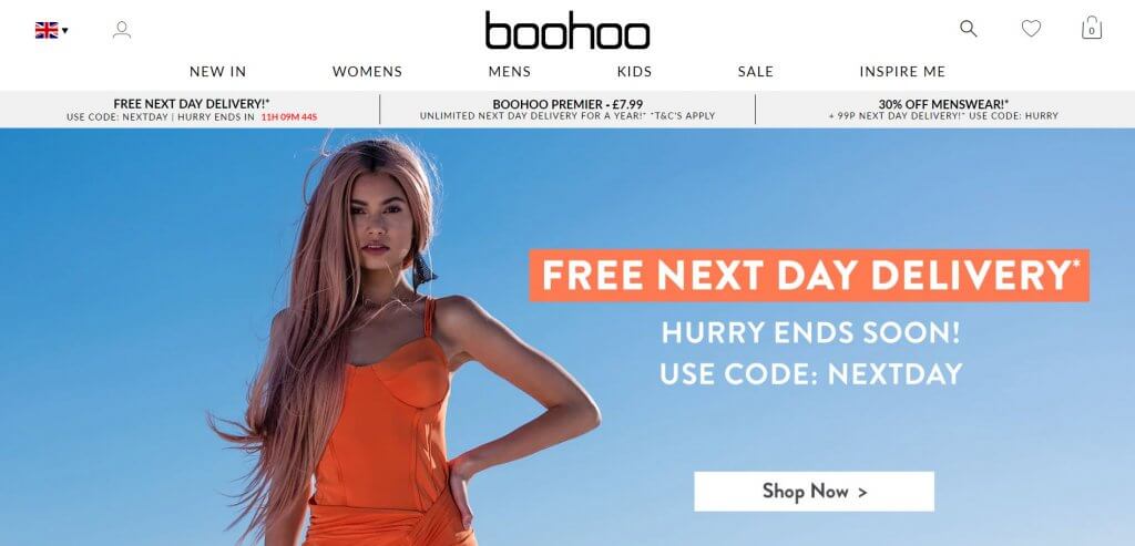
A perfect mix of high impact visuals, rapid site speed and smooth checkout functionality – which includes several shipping options from locker collection to choosing your preferred courier.
—
Brooks Brothers
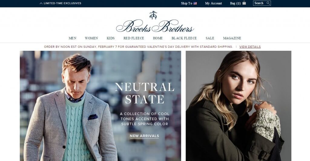
Very nice, clean design with lots of lifestyle images. I think the product pages could arguably be better and their BazaarVoice reviews implementation is a bit cluttered. Nice design overall though.
—
Orlebar Brown
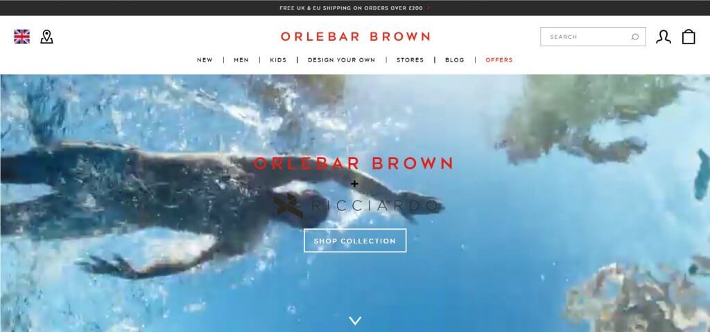
A beautifully put together store, the Orlebar Brown site offers an exceptional brand experience with stunning image and video content. A feature that stands out is the ‘Design Your Own’ tool.
—
Burton
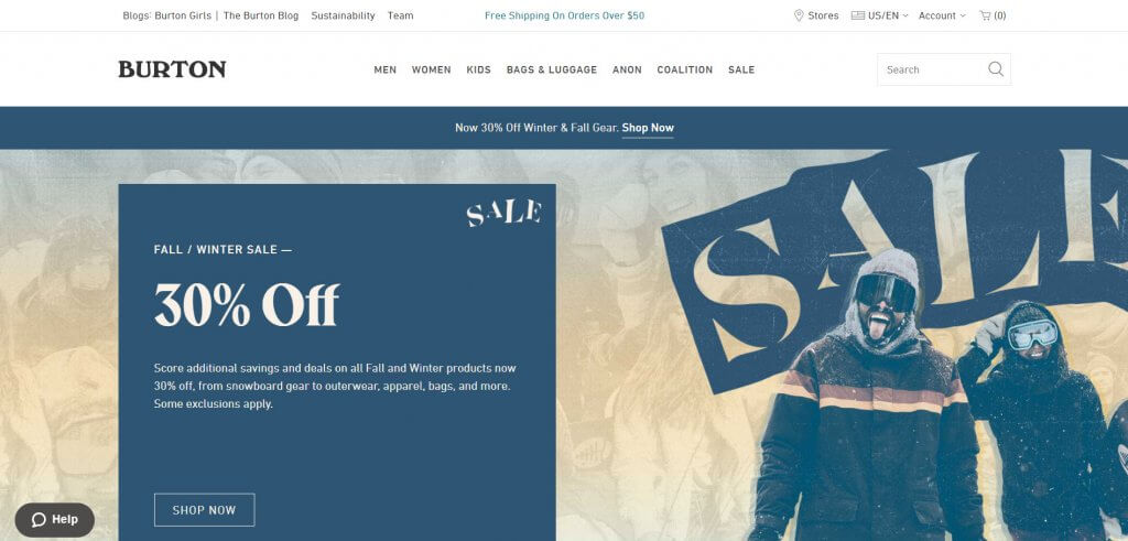
A super-functional site with a great search function and well laid-out product details pages. The site could do with injecting some of its blog content into the eCommerce side but overall a very smooth experience.
—
Space NK
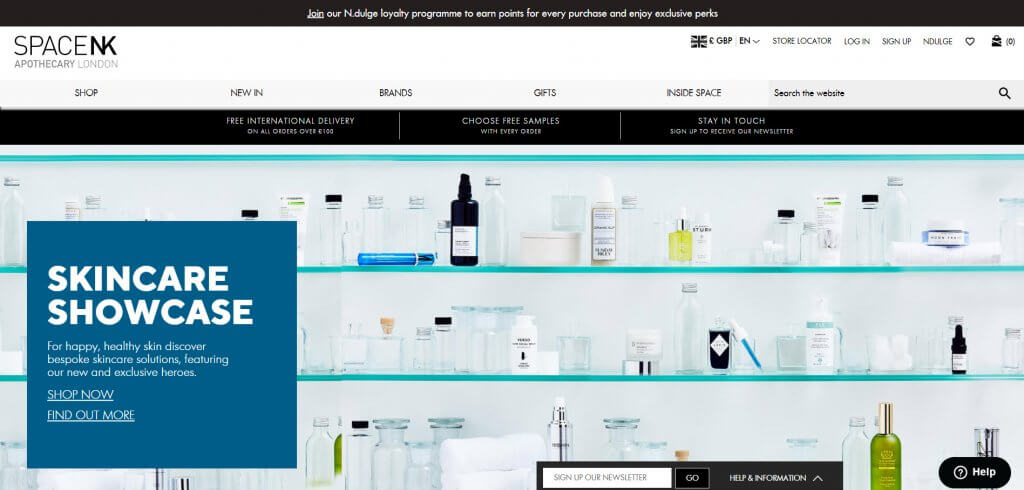
A multi-brand retailer specialising in beauty, the site holds hundreds of different products which means the search tool and customer feedback are key features in the shopping journey.
—
Charles Tyrwhitt
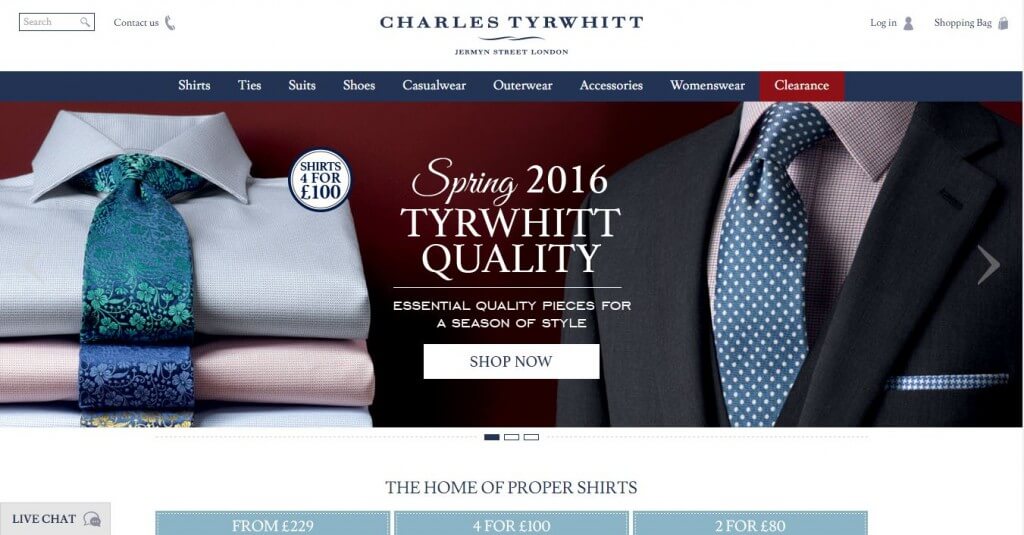
Nice clean design, very strong product pages with lots of detail around sizing etc.
—
Clarins
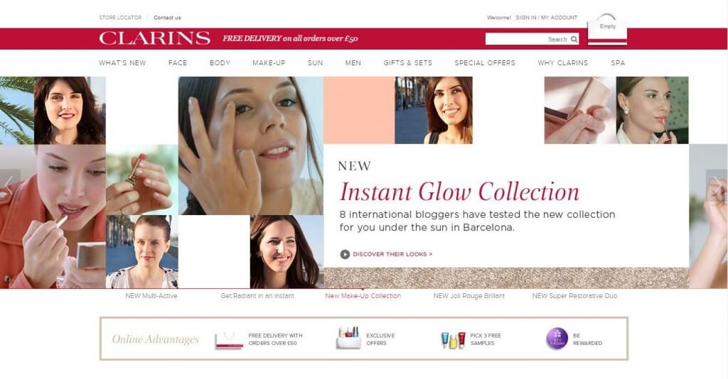
Nicely designed overall and good use of different types of content across the site. Again I think they could improved the layout of their reviews (also using BazaarVoice) on product pages.
—
Columbia
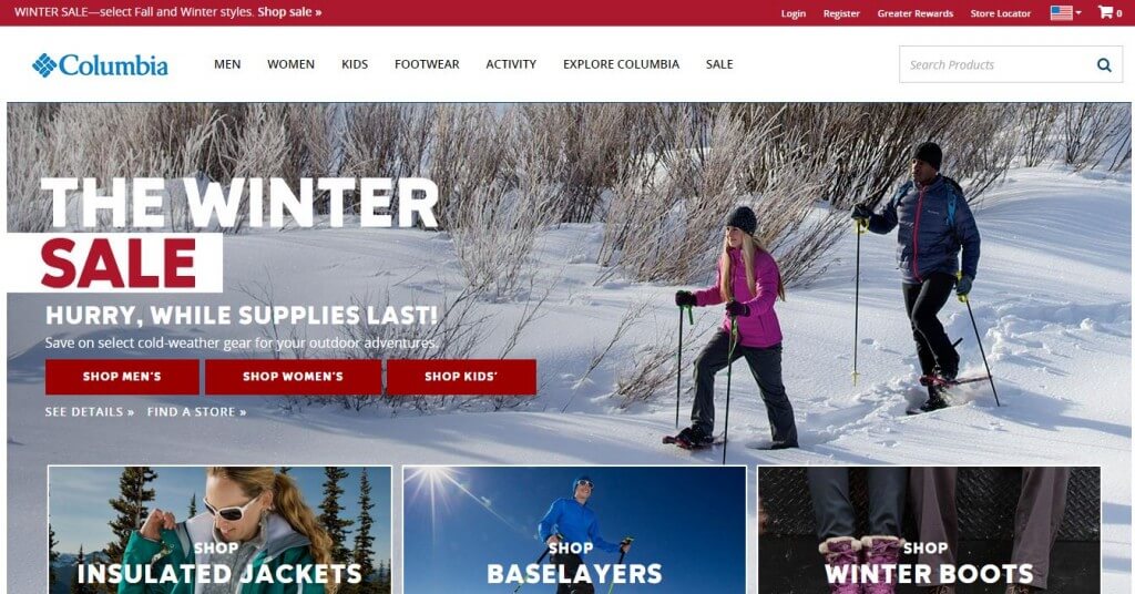
Very good use of imagery across all pages, particularly on product pages. Very nice, clean website.
—
Converse
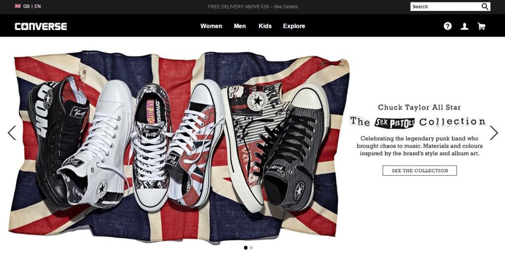
I really like the product pages on the Converse website, as they don’t stick to the normal convention. I like how they position the product on these pages and also manage to showcase the material of the shoes.
—
Crocs
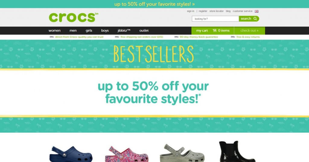
Very simple design and good use of video across the site, particularly on product pages. The colour bar on category pages is also very cool.
—
Godiva Chocolates
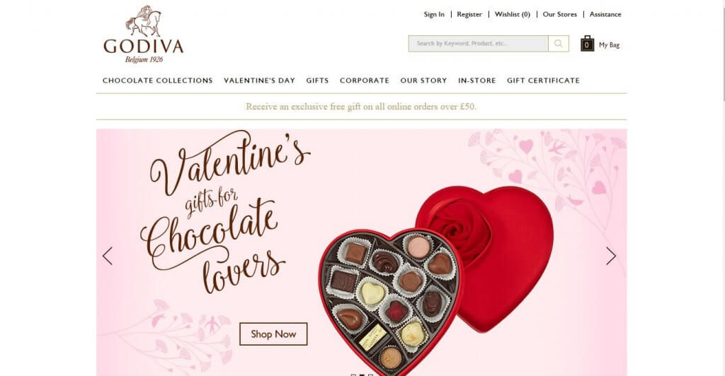
Very simple and clean ecommerce website. Good use of content in places (including social proof).
—
House Of Fraser
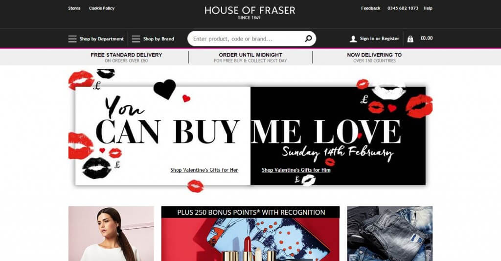
Very strong ecommerce site, as you’d expect. Navigation and user experience is very strong and I really like how they use the different images on their product pages.
—
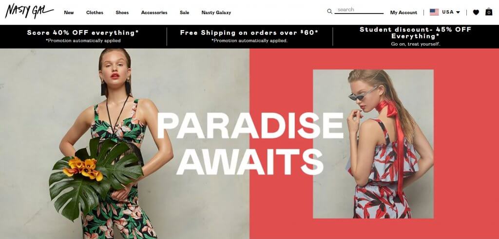
Nasty Gal
—
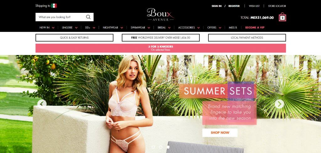
Boux Avenue
—
Hugo Boss
—
Jack Wills
—
Kate Spade
—
Kiehl’s
—
Musto
—
Lacoste
—
Lancome
—
Mothercare
—
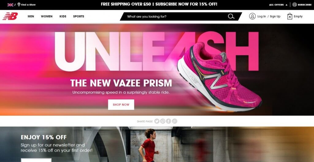
New Balance
—
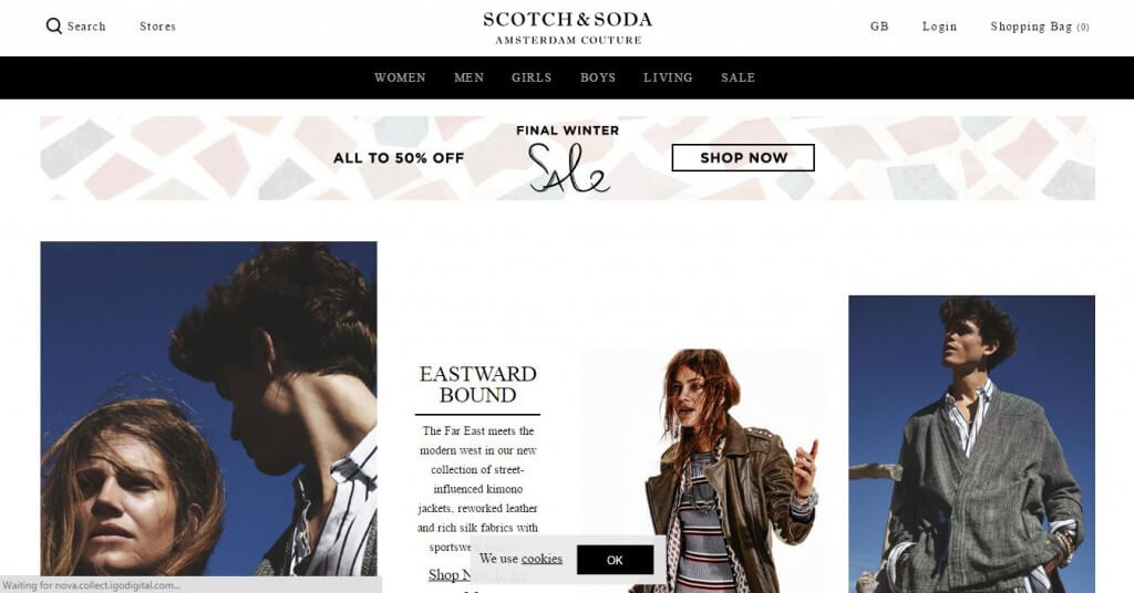
Scotch & Soda
—
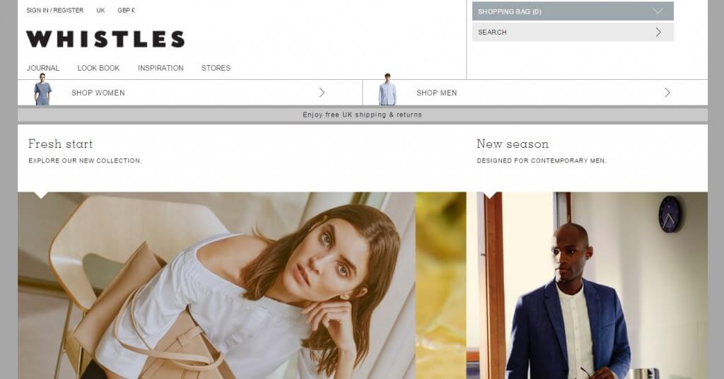
Whistles
—
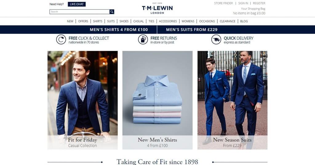
T.M.Lewin
—
Hush Puppies
—
Merrell
—
Under Armour
—
Nautica
—
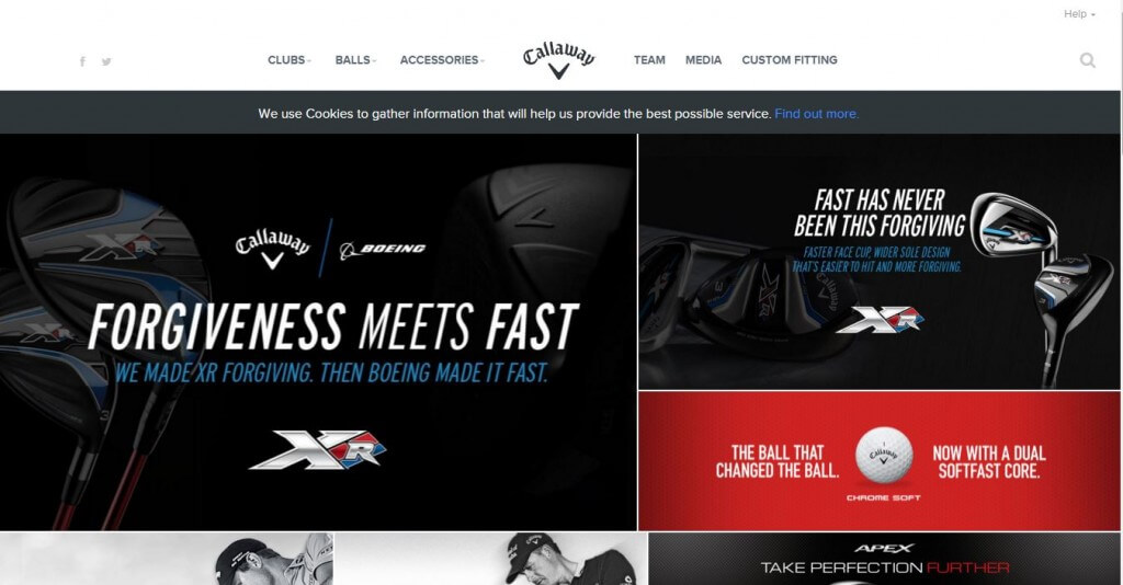
Callaway Golf
—
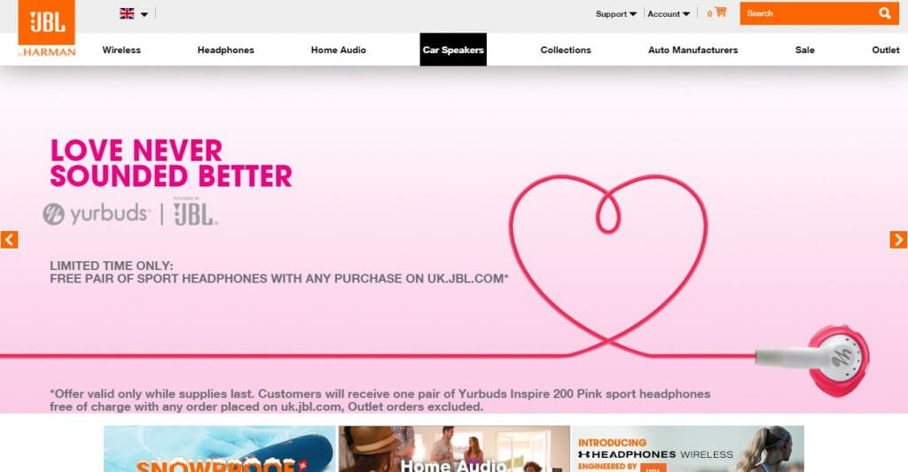
JBL
—
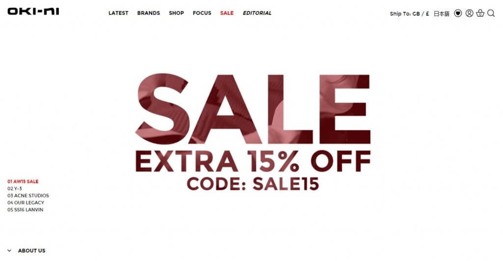
Oki-Ni
—
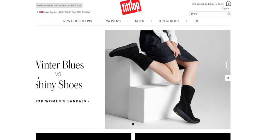
Fitflop
—
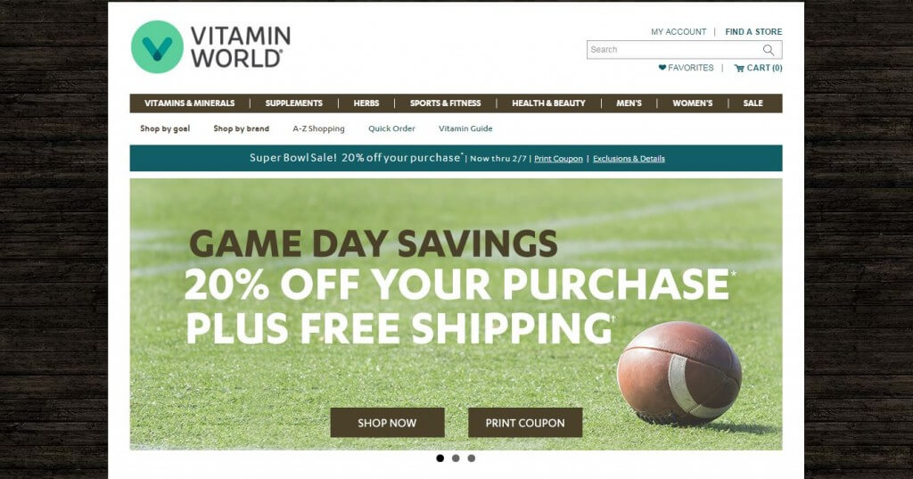
Vitamin World
—
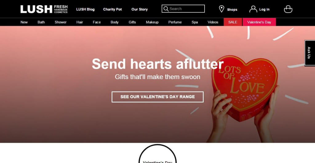
Lush USA
—
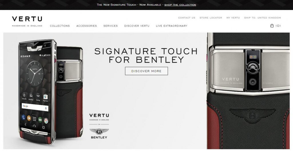
Vertu
—
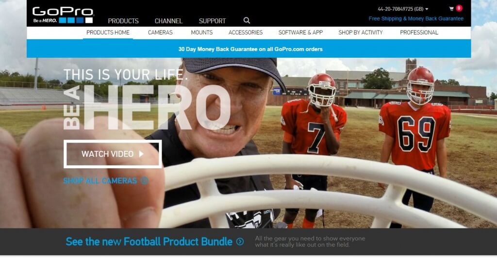
GoPro
—
Sleepy’s
—
Tourneau
2 Responses
Was watching Andy Murray on the tennis French open. Looked at his outfit, checked out the Under Armour e-commerce site. Tried to find out if it was Magento and found your blog, Paul! Wow look at that checkout experience ! Looks like Demandware has an awesome default checkout! Very impressed.
This one from my town: https://www.tigerofsweden.com/se/