Over the last few years, it’s become common practice for consumers to visit multiple retailers before transacting, in most cases for price comparison. Couple that with increasingly saturated online landscapes and you’ve got a much more challenging situation for online retailers than a few years ago.
This is why it’s more important than ever to invest in solutions and strategies that’ll enable you to provide more convenient and streamlined customer experiences. This article is focused on providing a better customer experience for Magento merchants – providing guidance around different modules, extensions and third-party services that can help to improve the overall experience you provide for your customers.
1. Make your website as FAST as humanly possible!
The speed of a website is one of the basic fundamentals of customer experience and it can have a huge impact on a store’s conversion rate. I’ve become fixated on site speed over the last few months and performance is a really important part of running an ecommerce site and Magento is notorious for being slow. Over the last few years, the expectations of users have changed too, due to merchants investing in this area and the norm being sub one second in most industries. This article from KISSmetrics states that 47% of consumers expect a page to load in under 2 seconds and 40% of visitors will leave a website if it takes more than 3 seconds to load (I would also argue that it’s a lot lower). I also worked with a luxury retailer a few years ago who managed to increase their conversion rate by 50% through significant performance improvements.
Magento is known for its poor speed out of the box, which is something that should improve with Magento 2.0 (out for public release later this year), but there are a number of routes for optimising performance for Magento 1.x sites. Here are some of the fundamentals (you can also read my more in-depth piece about Magento performance):
Enable full page cache (FPC) – Full page caching will save the full output of a page in cache so it loads much faster in the future. You can check out modules such as Cache ― Full Page Cache for Magento Community or you can use the built in FPC for Magento Enterprise. Caching with the Magento platform is a very complex area and I’d suggest working with an experienced Magento developer to get the most out of it.
Optimise front-end assets – Make sure that your front-end assets (images, fonts, JavaScript or CSS files etc) are optimised for performance. Minimise HTTP and image requests, keep your CSS uncluttered and optimise JavaScript.
Compress your images – Large images can contribute to load time, so reduce your image file sizes (without compromising quality) using tools such as TinyPNG or TinyJPEG.
Remove unnecessary extensions – Go through any extensions in your site and remove the ones that aren’t in use.
If you need more ideas on how you can optimise your site performance, I’d recommend using GTMetrix, which is a great free resource for understanding performance issues.
2. Improve your navigation, merchandising and search
Another key area of customer experience is the principle of making it easy for people to find what they’re looking for and there are a number of options for improving the OOTB Magento features in this area.
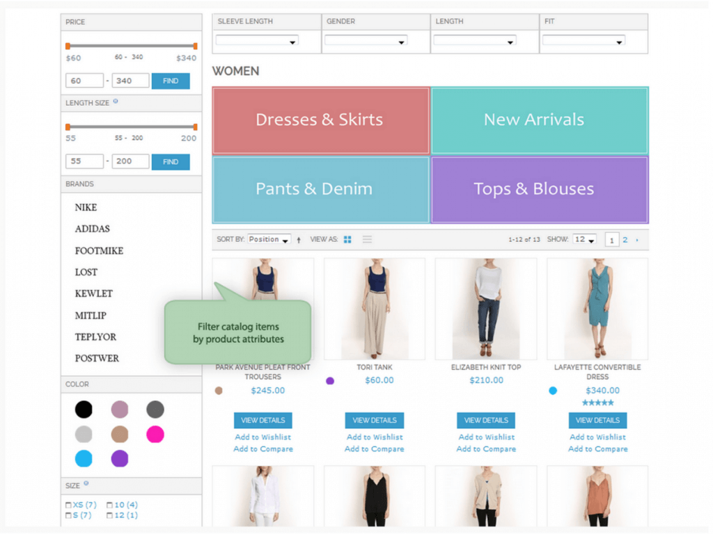
Using layered navigation allows shoppers to filter products on product list pages, so they can quickly find the items they are looking for. Most Magento sites use layered navigation, which is OOTB in both Magento Community and Enterprise, however it can be improved considerably with the addition of third party solutions such as Amasty, ManaDev, Layered Navigation Pro or SLI Solutions for more enterprise-level stores. Using one of these modules allows for a more complex implementation and features such as AJAX filtering, multi-select filtering, images for filters, price sliders, attribute search and more in-depth config options around SEO. Amasty is used by lots of merchants and is a good option – however it needs to be configured correctly from an SEO perspective as it can cause lots of issues with the filter pages being indexed.
If you’re trying to optimise your layered navigation to improve the overall categorisation experience, I’d suggest reviewing your product attributes and filters regularly and monitoring how they’re performing using your analytics platform. This can be managed easily in the Magento back-end using product attributes and anchors with categories.
Product merchandising and categorisation is another area that can have a big impact on customer experience, which is why it’s important to invest in a solution that makes it easy for you to merchandise your product list pages. I recommend Visual Merchandiser (now built into Magento Enterprise), which is used by lots of merchants, or the Attraqt visual merchandising solution, both of which allow for drag-and-drop merchandising, making it easy to quickly and easily merchandise individual product list pages.
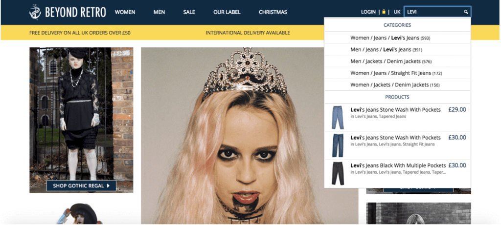
For search, I’d suggest using a third-party solution, as Magento’s out-of-the-box search technology is well known for being poor (although Magento Enterprise does use Solr). The two search solutions that I usually recommend are Algolia and Klevu – which are both high performance add-ons that can have a big impact on the overall search experience. I’d say that Algolia is more focused on providing a very rich searching experience for the user (as can be seen on the Jado Pado site – type “Headphones) and Klevu is more advanced in terms of technology. My client Beyond Retro implemented Algolia for search and also for serving products and they were very impressed and I know a number of merchants that have used Klevu who have benefitted from their semantic search capabilities.
The above screenshot shows how Algolia is used to serve both products and categories – Klevu also allows for deeper / richer search too.
3. Invest in rich media
People are visual by nature and when they are deciding whether a product meets their requirements and their quality expectations, a lot of this is inherently based on the appearance of the product and how well the quality comes across via the product images and video.
It’s been proven many times that higher quality product images can have a significant impact on conversion rates (this article provides some good insight into this area), as well as more images and the use of things like 360 images (especially for luxury items). I worked with a retailer a few years ago who ended up employing a jewellery photographer because they found that higher quality images (far better than the brands were providing) were dramatically improving on-page engagement rates and the conversion rate. Another important aspect of this is showing off the different angles of items and trying to make the size / dimensions obvious via the images.
If your products are more complex and the key features need to be demonstrated, videos are almost an essential requirement these days. Zappos are a really good case study for how product video improved their conversion rate considerably and they ended up investing in creating videos for their entire product catalog, as can be seen here. In 2009 it was said that Zappos’ strategy of adding videos increased the conversion rates of products by up to 30%.
Adding things like size charts and dimension maps is another great way to remove a consideration barrier.
When it comes to hosting media, I recommend using an image and video management solution like Cloudinary for fast and optimised image delivery. Cloudinary is used by a number of large publishers and it’s very good for reducing the impact of high quality images on page load speed.
4. Personalise product recommendations, merchandising and email
Personalisation is a really hot topic in ecommerce at the moment, as it allows you to provide tailored product recommendations and experiences based on how the user navigates around your site. There are a number of tools that can help with personalisation with Magento, such as Nosto and Listrak – both of which provide personalised recommendations based on the products a user views and engages with.
I really like Nosto, which is probably the most popular personalisation tool and it has an existing, easy-to-use Magento integration. Nosto’s module analyses shopper behavior and learns their preferences to serve up personalised product recommendations, behavioral pop-ups and relevant offers in real-time. In addition, Nosto allows you to personalise your ads and emails. Nosto have been adding lots of new features over the last few years and their product is always improving.
You can also use MageMail for sending automated personalised emails to customers based on their shopping behaviors. You can send anything from abandoned cart emails and wish lists reminders to post-purchase messages and review requests.
5. Use live chat to answer customer queries
Shoppers can abandon their purchase quickly if they can’t find the information they’re looking for, which is why live chat can be so effective. Studies have shown that “live chat has the highest satisfaction levels for any customer service channel, with 73%, compared with 61% for email and 44% for phone.” Not only that, but a survey from BoldChat found that 31% of US and UK consumers said they would be more likely to make a purchase after a live chat conversation.
One of my previous clients (a high-end furniture retailer) added live chat to their store and saw a 40% uplift in conversion straight away – just because they were able to answer queries around shipping and product dimensions without the user having to leave the product page. They used Olark, which has an existing Magento module.
There are lots of other live chat options for Magento merchants too and most of which have the same features (key things to look for are around reporting, the actual communication client, how seamless the integration is, the appearance of the widget etc).
6. Optimise the Magento checkout
Most Magento agencies and developers have had a go at re-creating the Magento checkout at one point in their career – purely because it’s quite clunky OOTB and most people seem to want a single step process.
When I first worked for GPMD, we put lots and lots of time into optimising the Magento checkout and we created a really nice solution for one of our clients. After doing lots of research (and minor tests), we found that removing the header and footer and various other unnecessary elements of the checkout pages had a positive impact on abandonment rates – and the one step checkout did perform slightly better than our alternative (three steps – email, delivery, payment – executed via AJAX).
I think checkout optimisation does come down to testing and the results for different types of retail do seem to change – however, the fundamentals are generally the same. Making your checkout simple, clean and fast will have a positive impact on your conversion rate and completion rate. I’ve also used the PCApredict (for auto-complete on address fields) in the past, which has had a positive impact too.
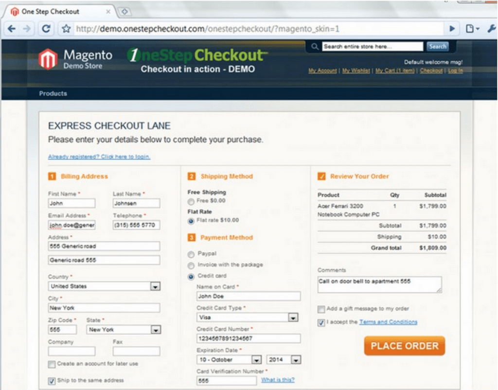
Lots of merchants I’ve worked with seem to use 1StepCheckout – which is a good option for people looking to use a one step checkout with a low overhead in terms of development.
7. Don’t stop testing!
The only sure-fire way to determine whether or not your optimisation efforts and design tweaks are effective is to test them. Whether you’re implementing a new product template design, revamping copy, or trying to decide on the best products to showcase on your homepage, you should really get into the habit of performing split or multivariate tests to quantify the most effective course of action. Although realistically you need to have a certain amount of traffic and trade to effectively use testing, it’s a good way of understanding how people actually respond to changes.
I generally use Optimizely for this because it’s very easy to use (has a visual page editor and allows for custom html / CSS etc), integrate (single javascript tag) and it’s very cost effective (freemium and paid packages are good value).
Testing is a really important part of running an ecommerce site and at a certain level, you should really be running continuous improvement tests, as well as just doing it for changes you’re making. These kind of tests would be applicable for things like page template layouts and call to actions – where you run different combinations etc to try and understand how you can change focal areas and make pages more appealing and easier to use.
—
Do you have any other tips and tools for improving the ecommerce experience? If so, please feel free to comment below.


One Response
Hello Paul,
found this page searching for a review of Cloudinary on mage. Led to many more links and a few more questions.
You mentioned issues with Amasty duplicate content issues out of box. Have you made a direct comparison btwn Amasty and Manadev? More concerned with performance. Not a fan of most commercial extensions but budget constraints…
Just figuring out Optimizely for a client. Is testing big changes like one step vs regular checkout something that is both possible and safe to do? Always afraid that would introduce bias by turning away alot of possible customers due to a js error or browser crash.
And back to original reason for visit, Cloudinary. Good option and solid magento extension? Are optimized images also stored locally for when switching to SSL or connection to cloudinary breaks?
Client already has MaxCDN paid up through the year w/custom url so any move would have to bring alot of value. Seems there are other magento extensions for optimizing existing images like Kraken and TinyPNG/JPG…
Thanks in advance!