
Businesses of all sizes are trying to fully understand customer shopping behaviour and really push the boundaries on UX and deliver great customer experiences. Not only is on-site search a key component for getting insights into understanding what customers want from your catalogue, but it’s become common knowledge that people who use site search are more likely to purchase, so it makes sense for digital teams to allocate time and energy into getting this journey right.
The key aspects of achieving / creating great site search are:
- The search function is easy to find
- Creates a user-friendly experience
- The function itself is intuitive throughout
- The search results are driven by data (and therefore remain relevant)
- The whole experience is rapid
Many eCommerce platforms do provide a native search feature, however, they are not necessarily built as a specialised solution, which is why the technology market has built solutions like Klevu (disclaimer: Klevu are one of our clients) or Algolia for example. With broader technologies emerging to deliver data-driven products recommendations across all core functions (e.g. the product grid, search and product up-sells / cross-sells etc) through a combination of machine learning and the ability to input business logic, merchants are now spoilt for choice to pick a solution which really works for them. The integration overhead behind these solutions is also getting lower – with solutions like aforementioned Klevu and Algolia having plug and play integrations with mainstream eCommerce platforms.
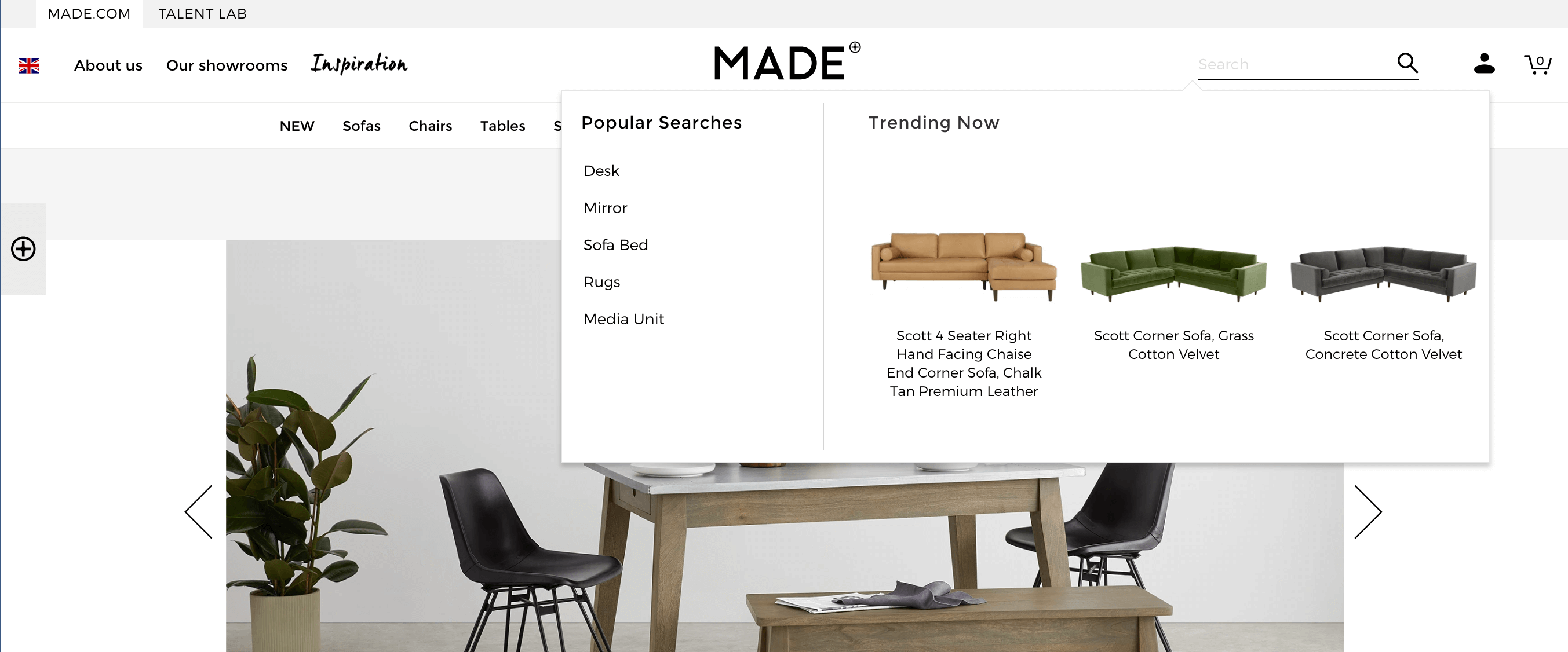
UX lead design is so important when delivering a great on-site search experience – an example of an area we will discuss is the search overlay itself. Using overlays is a great opportunity to showcase products, popular search terms, popular categories or even content results / CMS pages, possibly even before a user even starts their journey (with lots of providers now adding recommendations as soon as a search function is activated – as per the example below from Made.com).
This represents a good way to guide a user into areas which are more likely to yield a conversion or to push trade driven products and categories for example. Below are some other examples of great UX-orientated on-site search overlays, along with why I see them as great examples.
Personally, I think the MADE.com (a Klevu customer) search overlay / auto-suggest interface is a brilliant example of UX and design, however, although only covering a proportion of the screen allows a customer to explore the key areas of the main site navigation, I do see this as a distraction. If a customer has already searched for a term, they are committed to the search journey so I would suggest a full-screen overlay or darkening out the background or increase the focus on the overlay template.
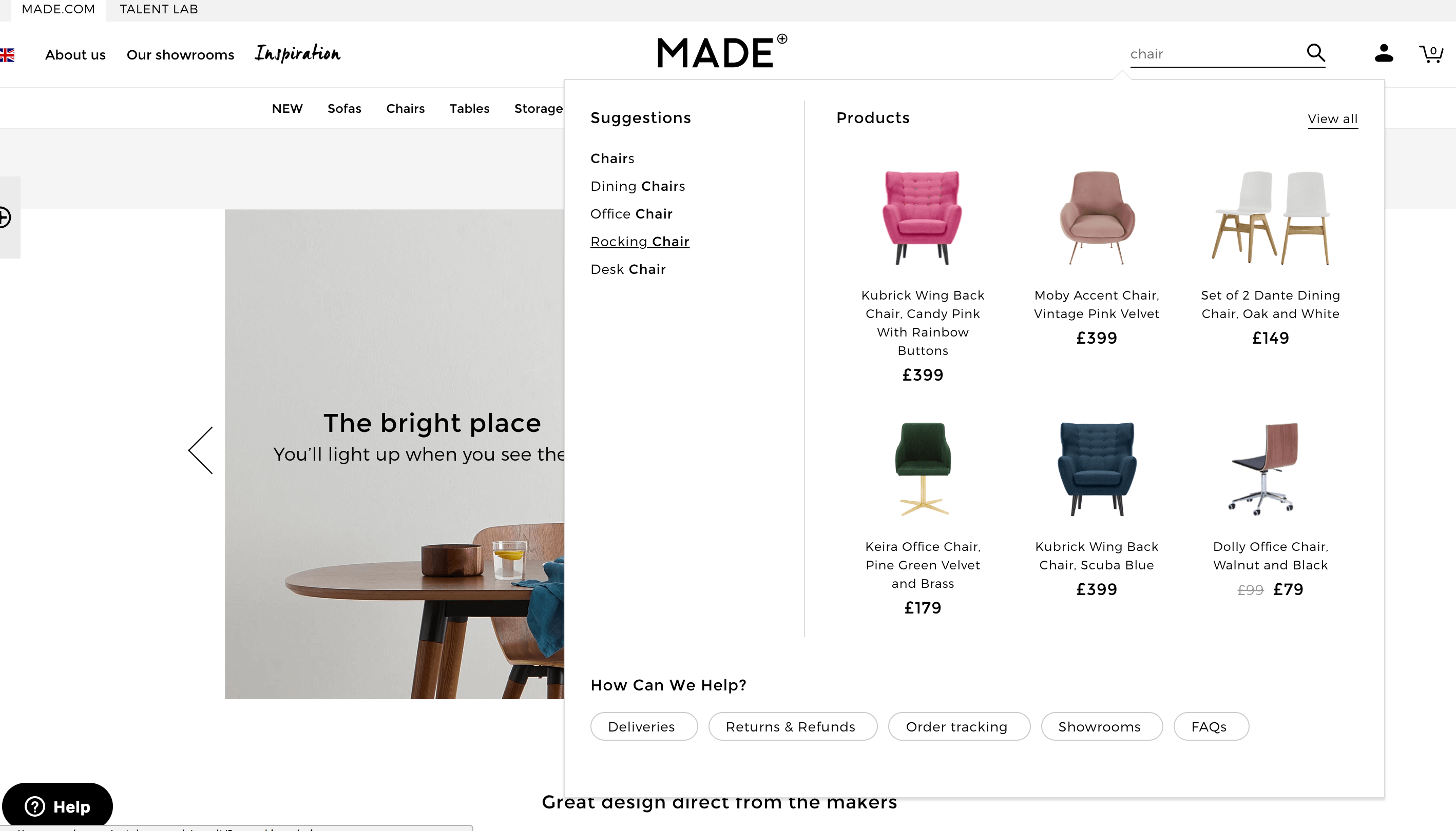
From a customer experience (CX) point of view, the user is presented with ‘suggestions’ based on the keyword entered – these keyword suggestions are in this case relevant to product type, which works well. Made.com provide a list view of their top 5 suggestions which are generally very relevant and are based on machine learning around the performance of queries.
Having five keyword suggestions and making the best use of space, allows Made.com to deliver a full product card above the fold on mobile – this is great for CX. Please view comparative images below.
 .
. 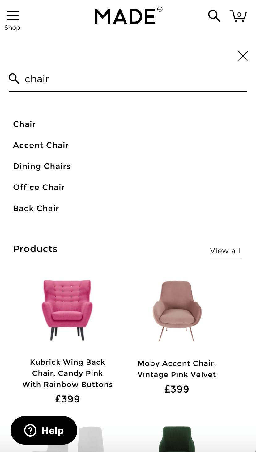
The only additional UX element I could suggest to add is a price filter (or the most commonly used attribute(s) on the SRLP) or a ‘sort by’ element to allow for refinements and make things easier for users who have a broader set of products available. However, I would be mindful of space as product results above the fold would take priority – as this allows for a very clean, faster user journey through to the product detail page (PDP).
Going back up to the main overlay display view, we can see that Made.com have opted to display 6 product recommendations. This looks great on the template, however, I would suggest that they could potentially increase this to 10.
The key difference with this overlay compared to most is that they’ve provided the customer with ‘Help’ options in the form of content links along the bottom of the overlay. This is an excellent component to display any helpful content pages which are used / searched for or even landing pages for campaigns that Made.com may wish to push.

The following are examples of other sites doing great things with their search. I will run you through my favorite features of each.
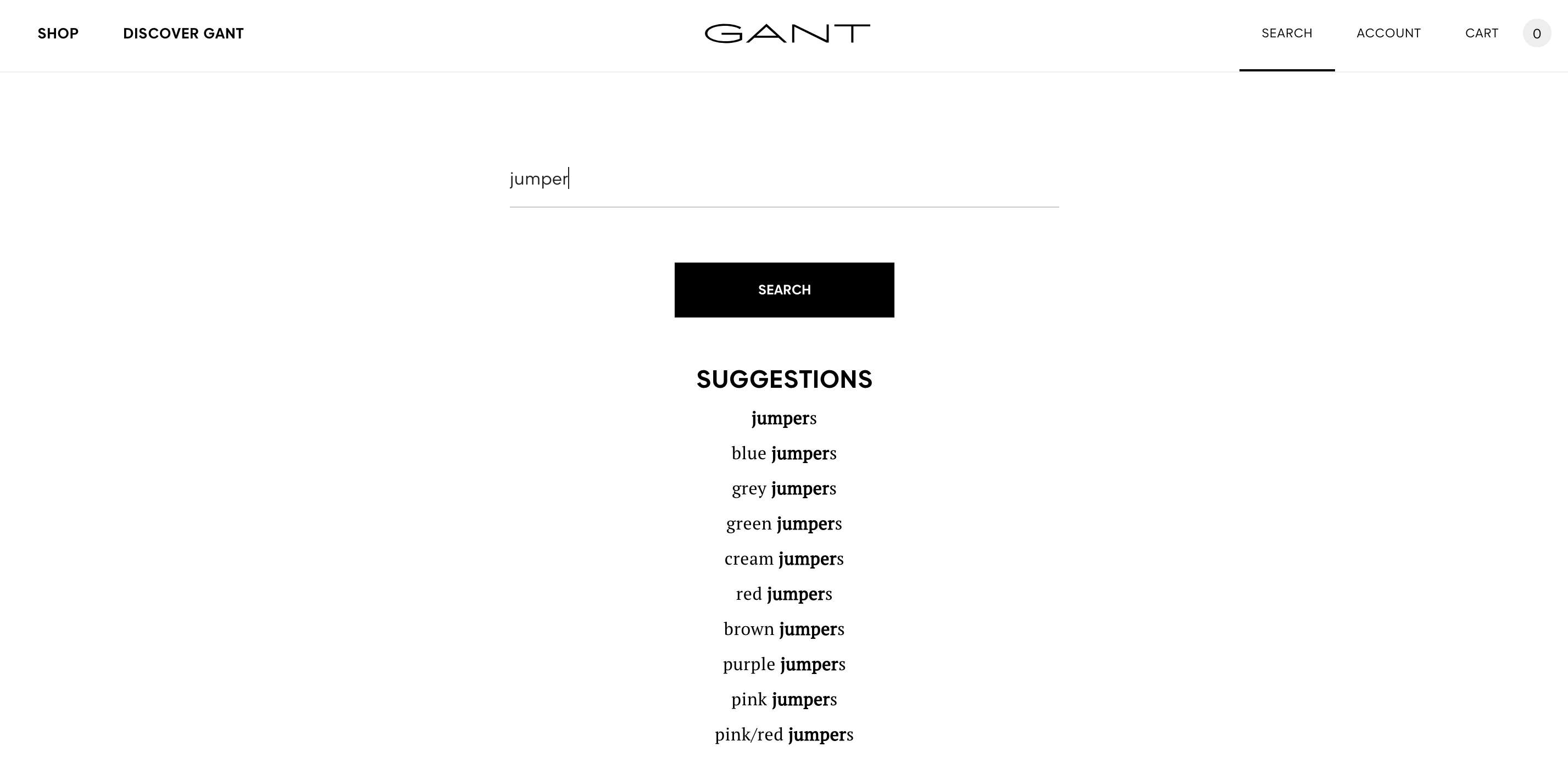
1.Gant.com
Following in the footsteps of Google for design – Gant’s simplicity is strong and bold. Note that they have removed any symbols on the main header (magnifying glass, basket image etc) and instead use wording – I think this makes GANT look really premium and is in keeping with the rest of the store.
Removing the icons is a bold move for CX though, as customers are used to visual aids. The full width view is something I really love about this design; it’s just a shame that the search UX does not match – returning only keyword suggestions upon pressing enter or search. Adding product recommendations (as would be expected) would be a big improvement here.
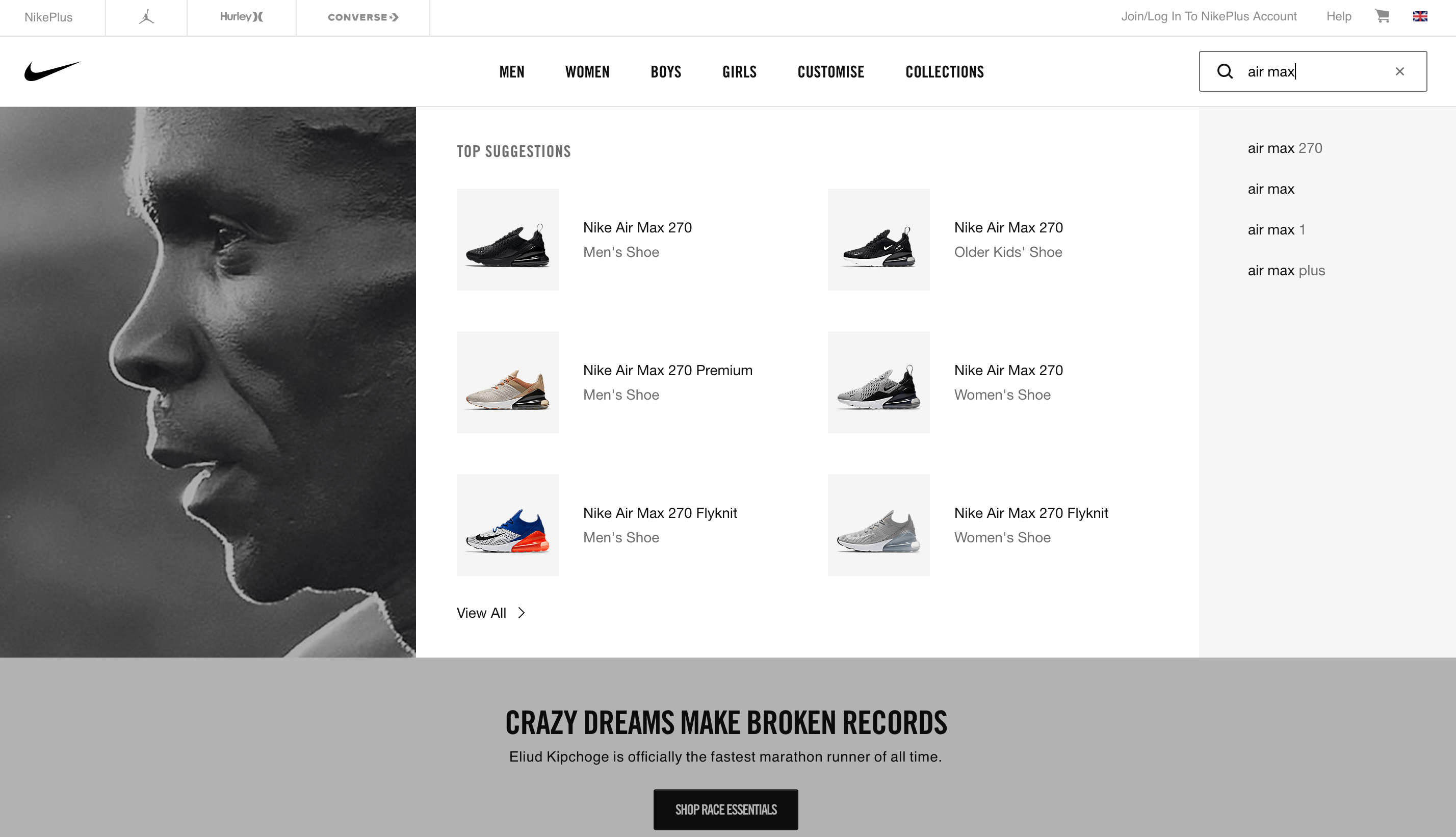
2. Nike.com
I really like the way that Nike grey out the background behind the overlay to allow it to stand out. The difference here is with their category suggestions being to the right of the overlay when most sites seem to position these on the left. I can only assume this is a Nike-specific, data lead design feature or possibly even part of a test. Clicking on their category suggestions changes their top product suggestions – this is a feature I really like!
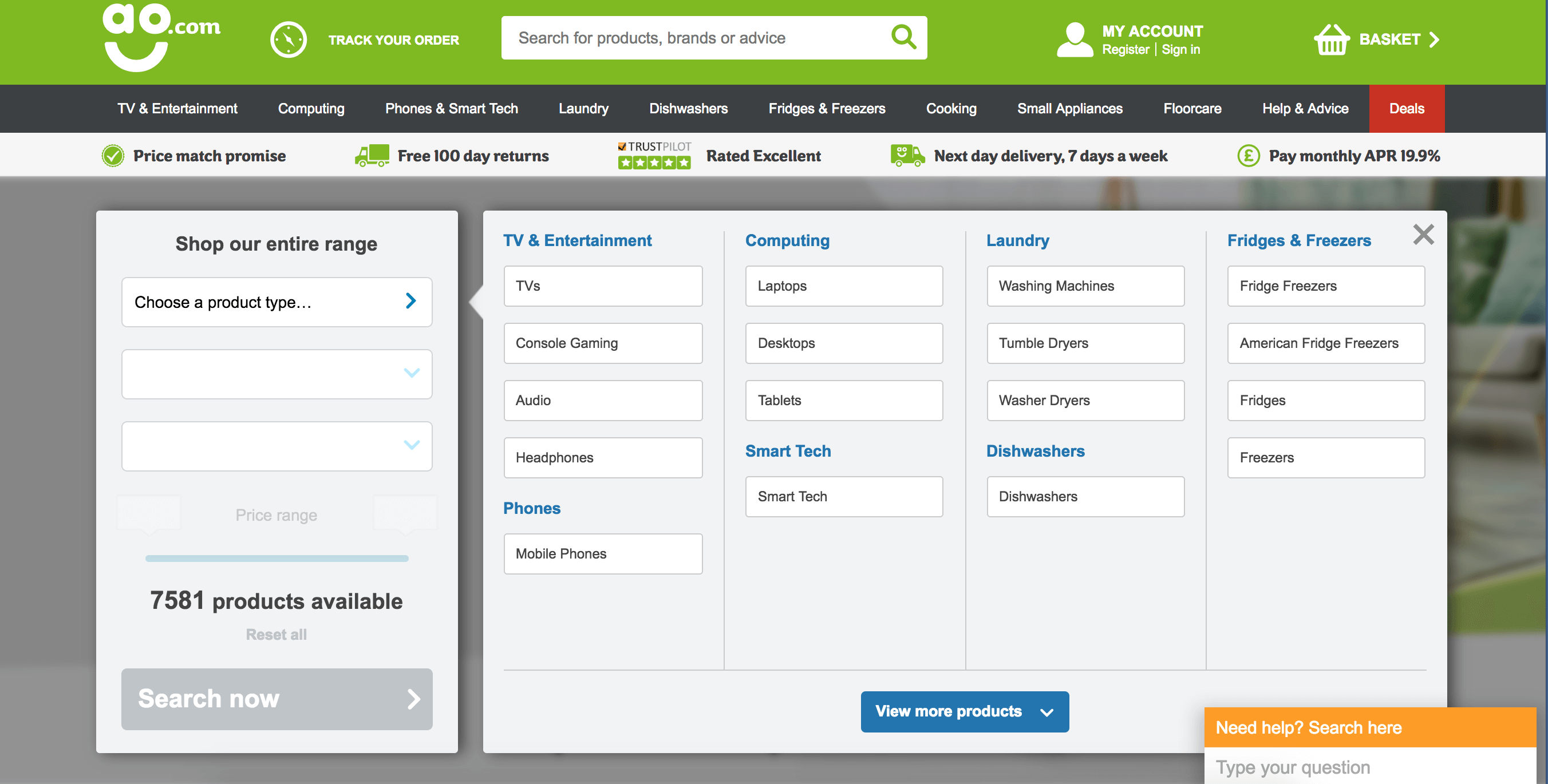
3. AO.com
AO.com has a fairly large catalog with 7550 different products and let’s face it, shopping for a washing machine may take slightly longer than buying a pair of trainers. What I love about AO.com is that they offer category and product suggestions (in a clean single list view) but for those customers who don’t engage with their main search, they also offer a product finder / wizard on the homepage for refining down based on specific attributes.
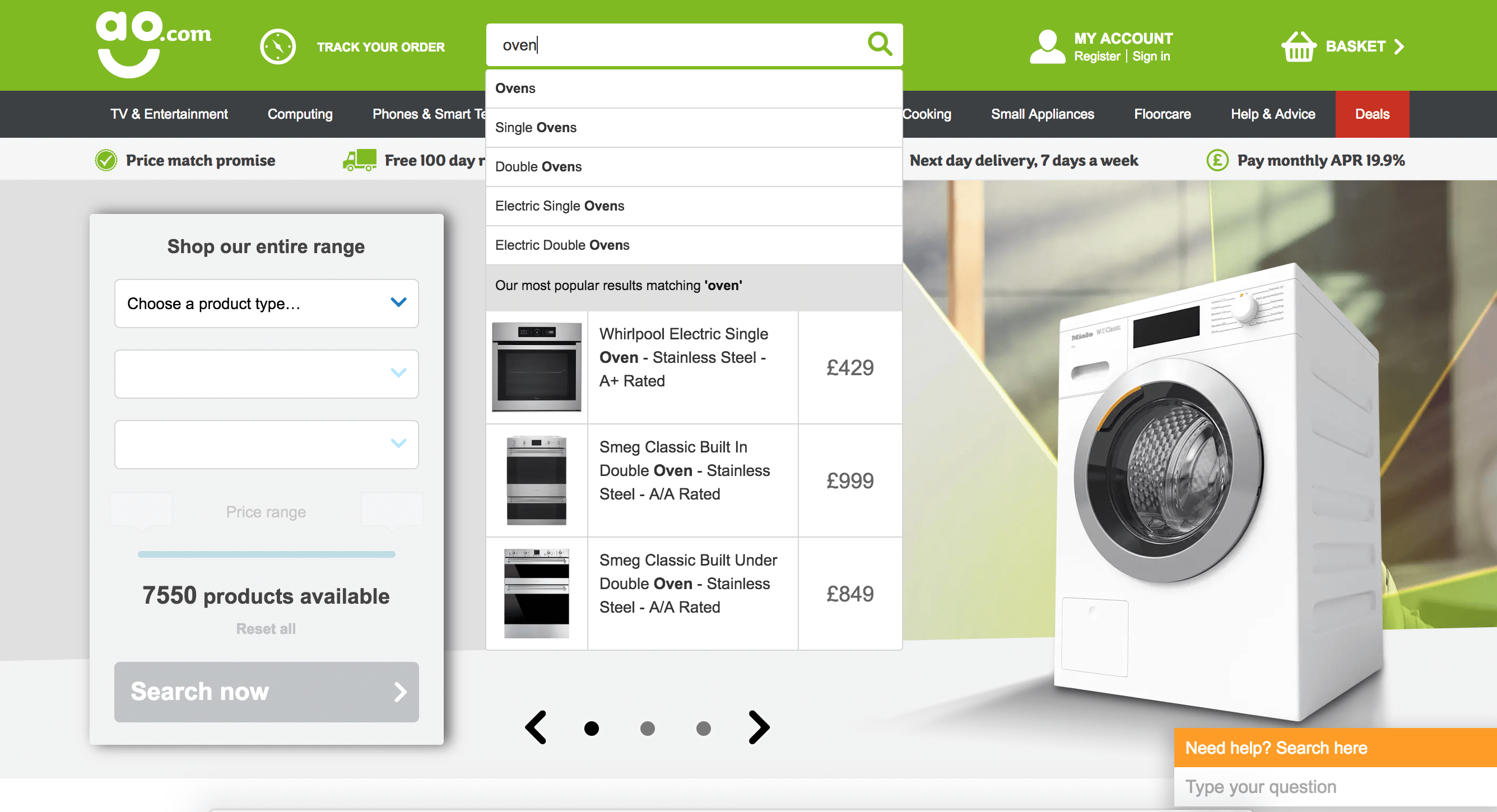
People who use a search function are up to 50% more likely to convert (according to Econsultancy) and don’t AO know it!
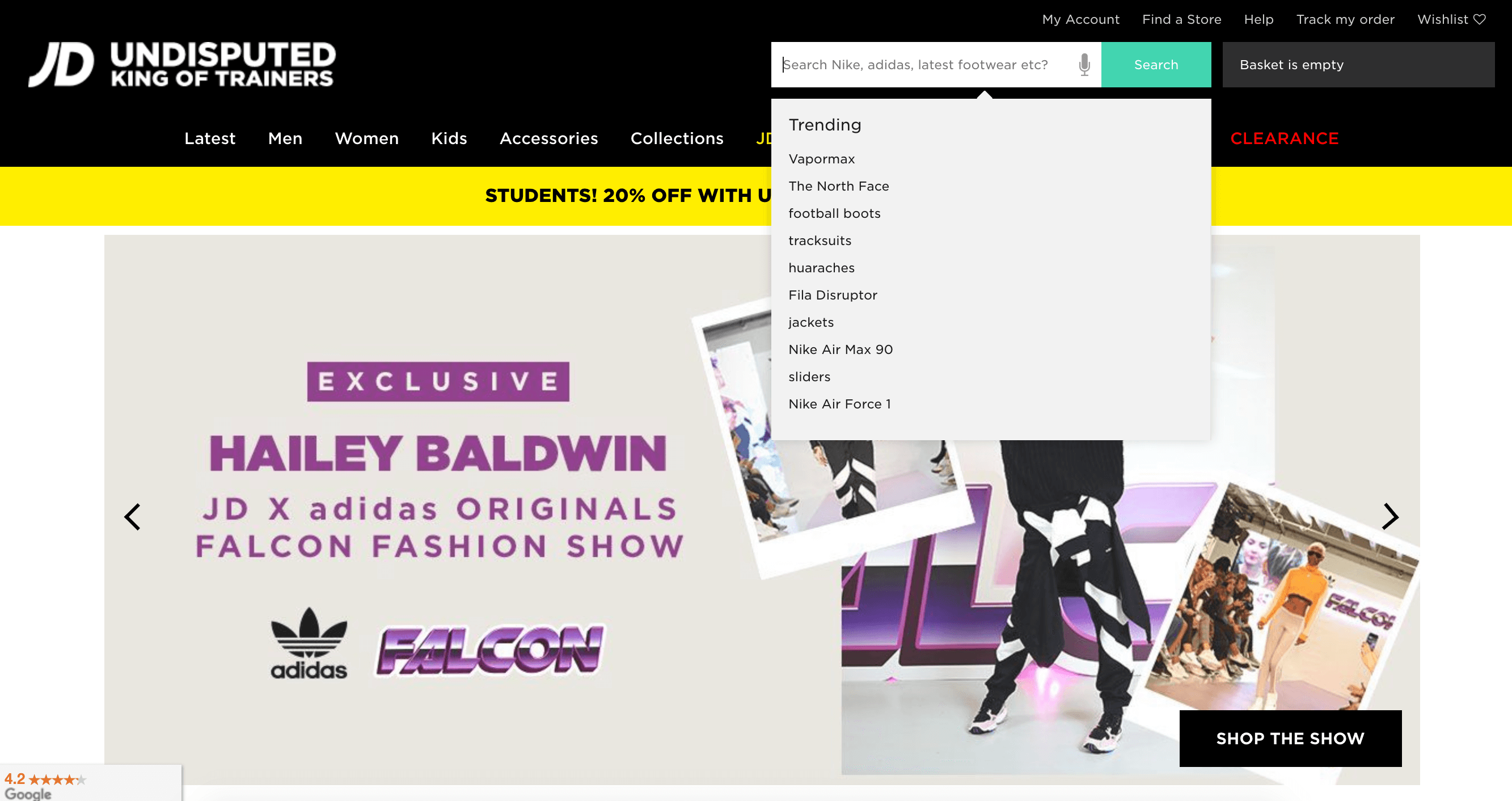
4.JD Sports
JD Sports isn’t a great example of an overlay when you’re using if for the first time, however it does become broader and more engaging as you interact with it over time (by adding in recently viewed items and keywords), as can be seen below.
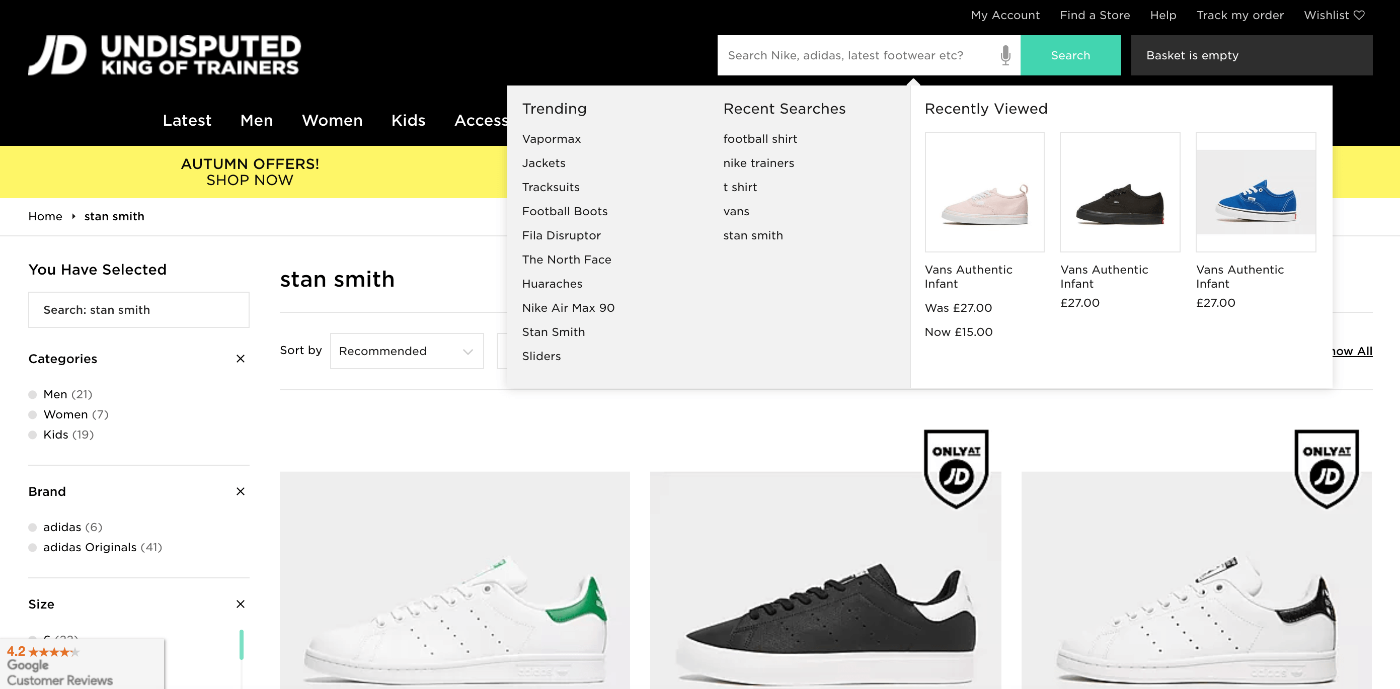
The design of the overlay itself could be stronger and larger (potentially with more components) and given size of their catalog, I think they would actually benefit from providing a broader set of result types. My favourite feature here is the voice search capability – they were one of the first retailers to introduce this around a year ago and it’s an innovative feature that actually works really well in the browser!
5. Adidas
Adidas have a very clean and sleek design for their overlay – the two column view looks strong and I really like the product list view with all product details (including review ratings within the search view), as well as the number of products available in each category – I think this is great for CX.
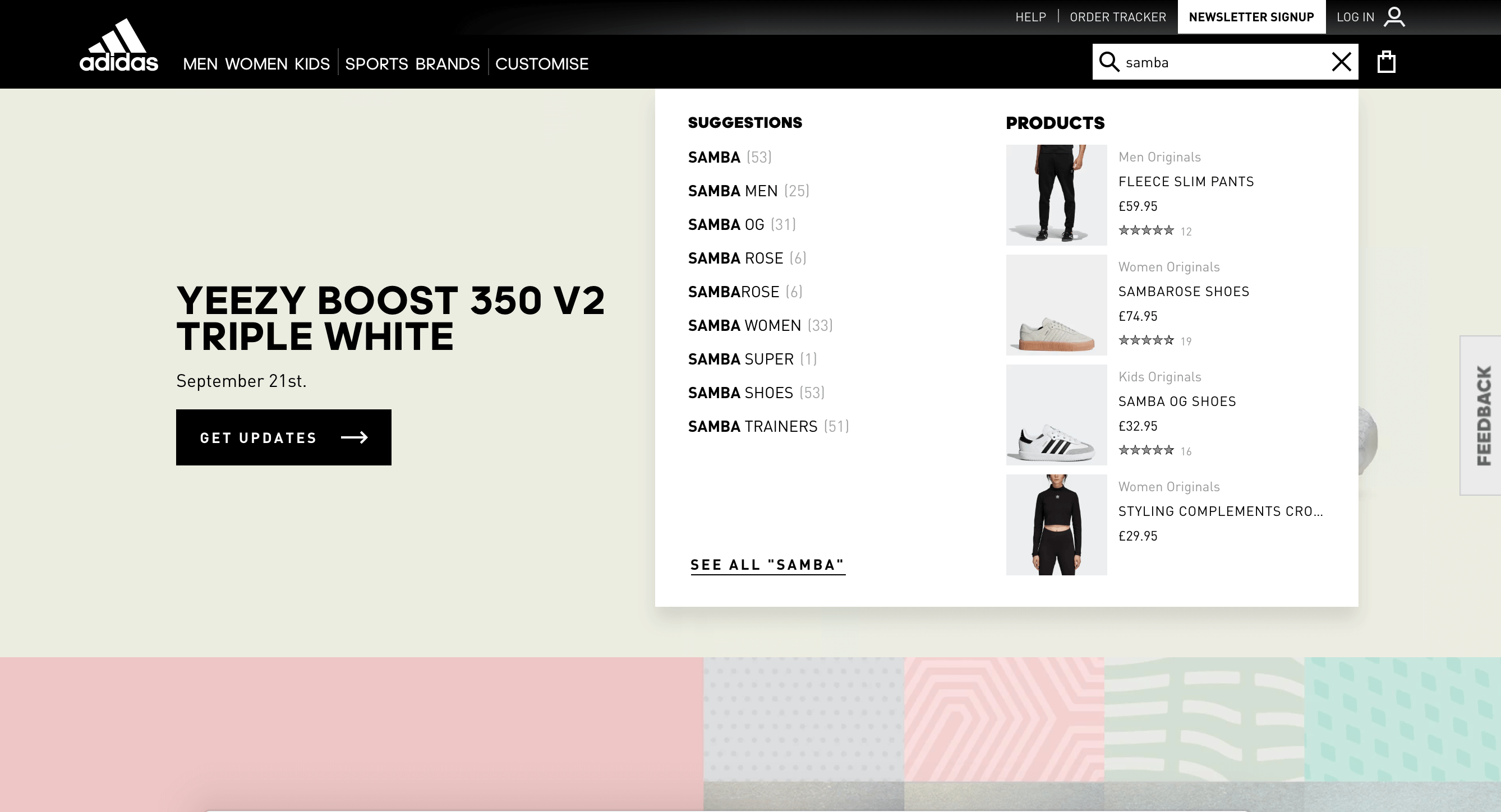
Like JD Sports, Adidas also promote recent searches, which I really like as this is a great way of allowing users to access their previous set of results quickly without having to think about what they searched for.
These examples are just a few of the ones I really like – we see a Javascript overlay as a really important part of a search function as it really helps to speed up the purchasing process and it’s a much cleaner way for users to evaluate products.
If you have any other really good examples of search overlays / auto-suggest interfaces, please feel free to add them below.

One Response
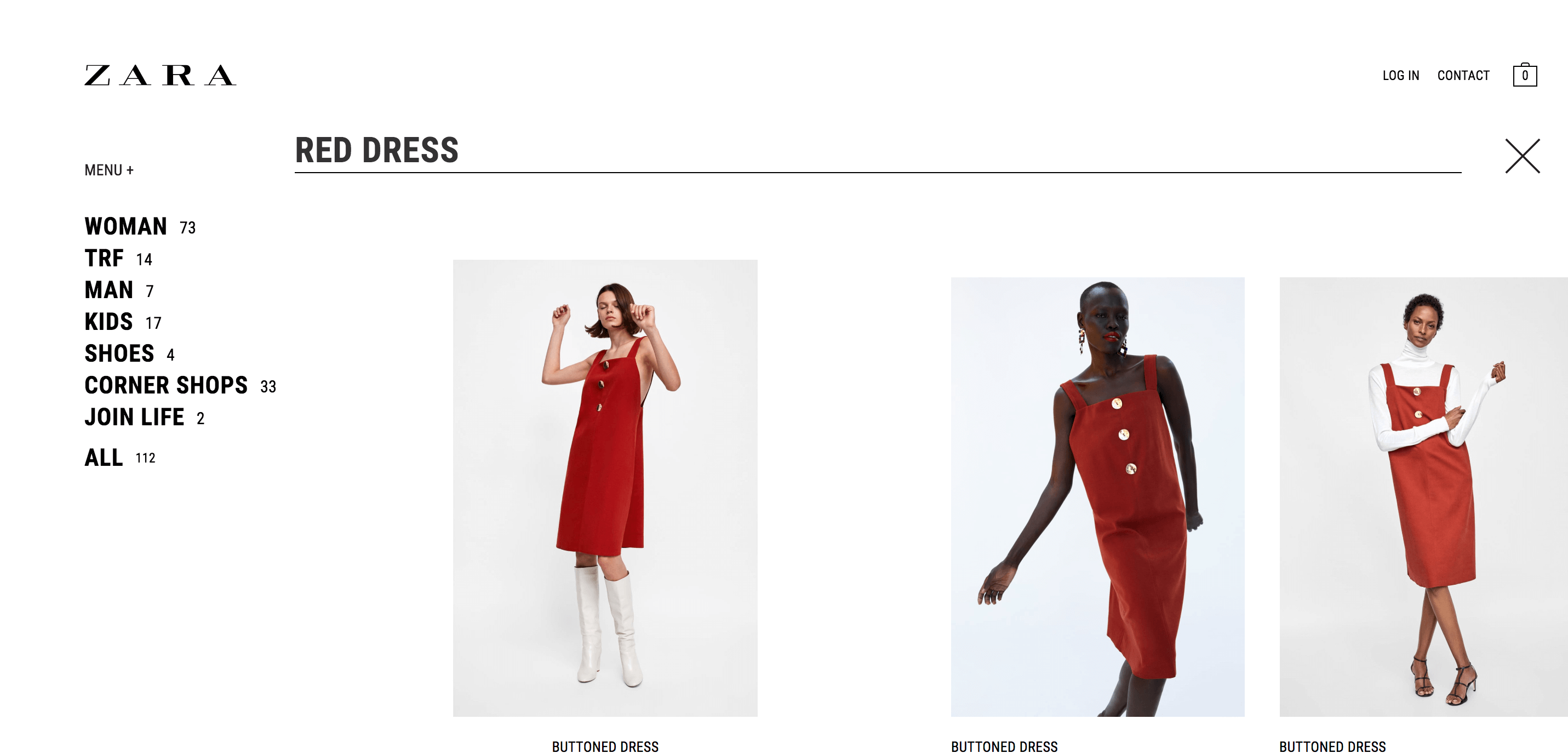
Nice piece. Good sample Zara.com of an overlay full page.
Aso recomend pullandbear.com or Oysho.com as nice full screens.
Good to have found you guys through this post.
Best