Over the last few years, I’ve worked with a wide range of luxury and premium brands and, from experience, creating a front-end experience that truly represents the brand, is accepted by brand stakeholders and still follows eCommerce UX best practice is a big challenge. Whilst working with these clients and as part of UX / optimisation projects, we’re also looking for and referencing examples that achieve this in different ways and places, with the following representing what I consider to be good examples.
Some of the luxury brands I’ve worked with previously (some of which are referenced below) include The Conran Shop, Byredo, Toteme, Bella Freud, Sunspel, David Austin Roses, T3 Micro, Waterford, Heal’s and lots more.
The following examples are just the ones I typically reference and use as examples. If you have others that you think should be included, please feel free to suggest them in the comments or email me.
Sandqvist
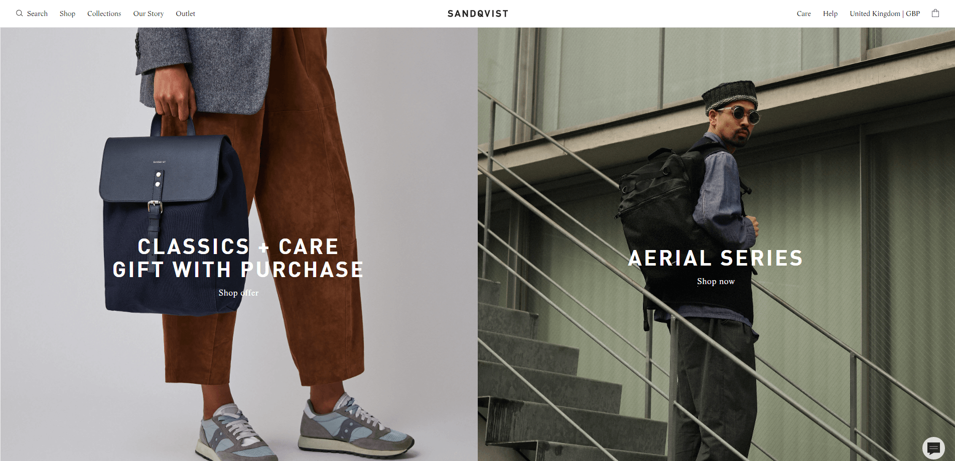
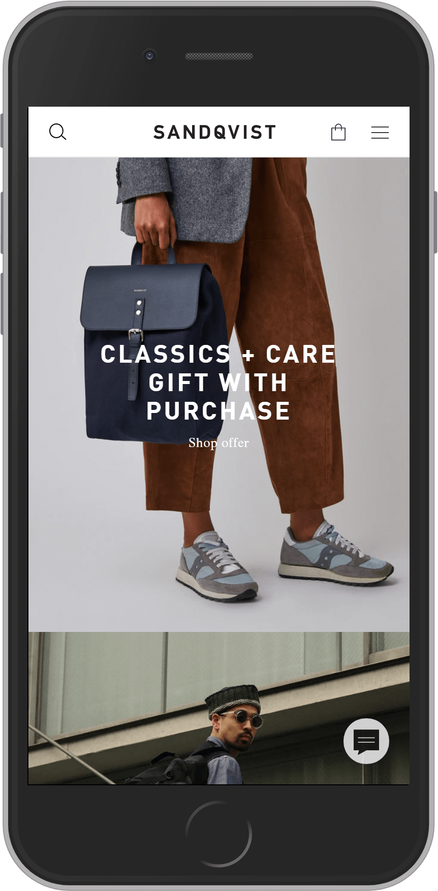
Industry: Fashion
Technology: Centra + React front-end
Rapha
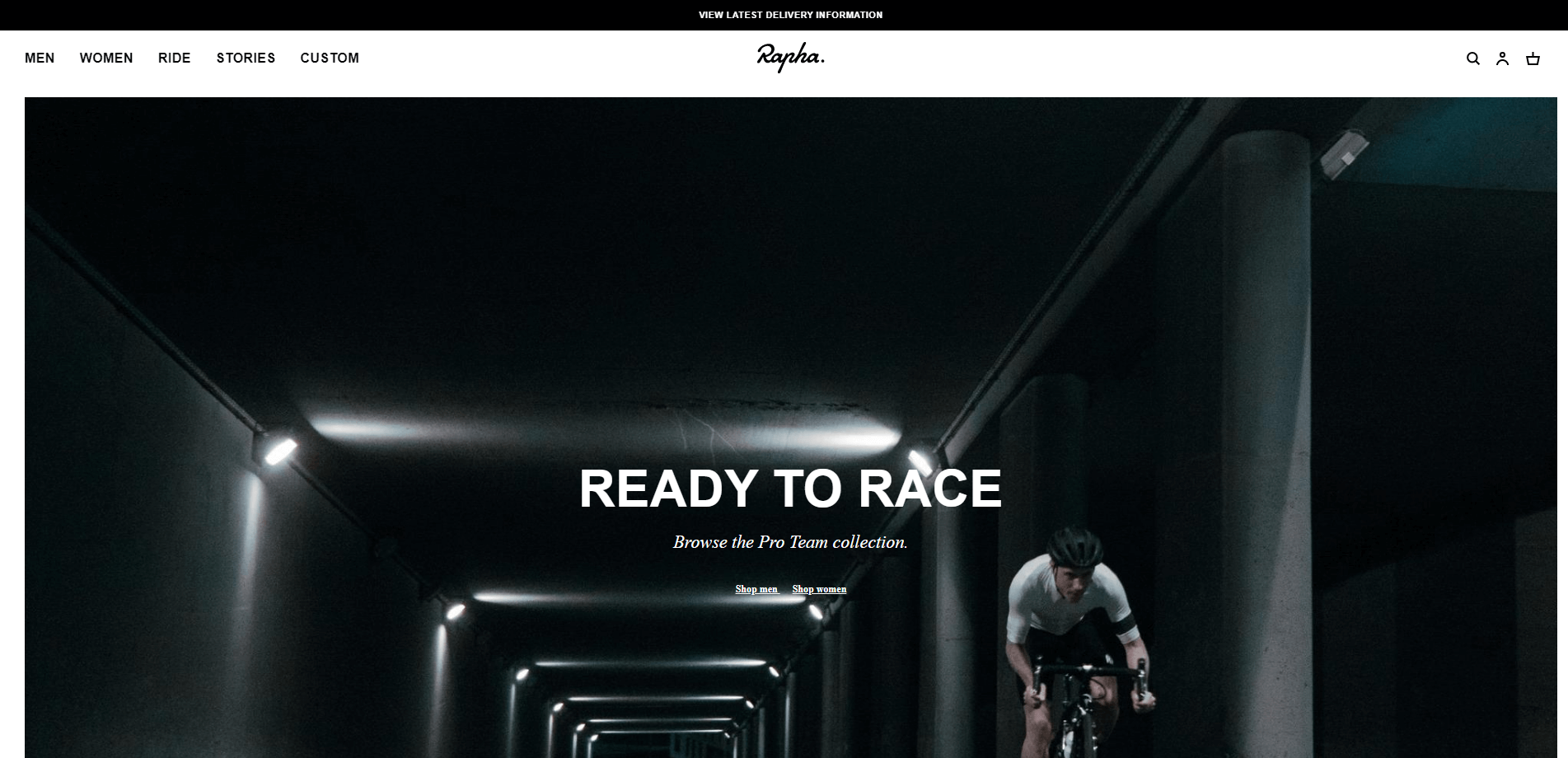
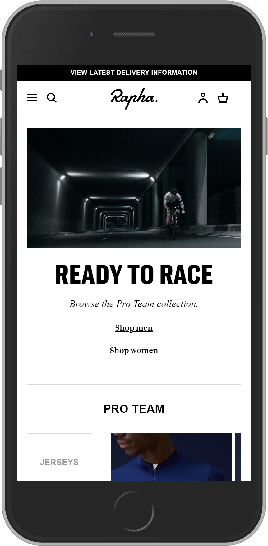
Industry: Leisure/Fashion
Technology: SAP Hybris
Filippa K
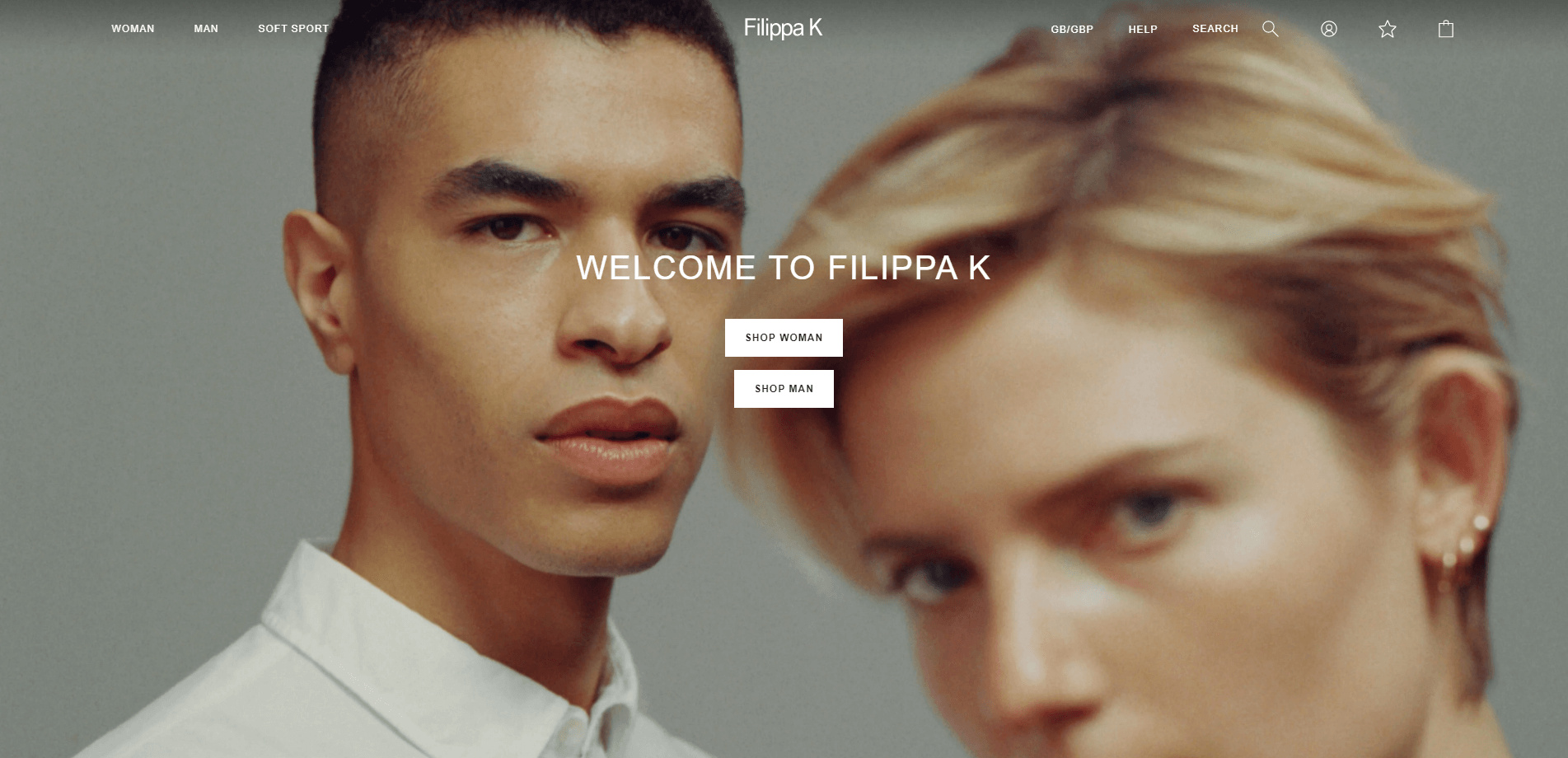
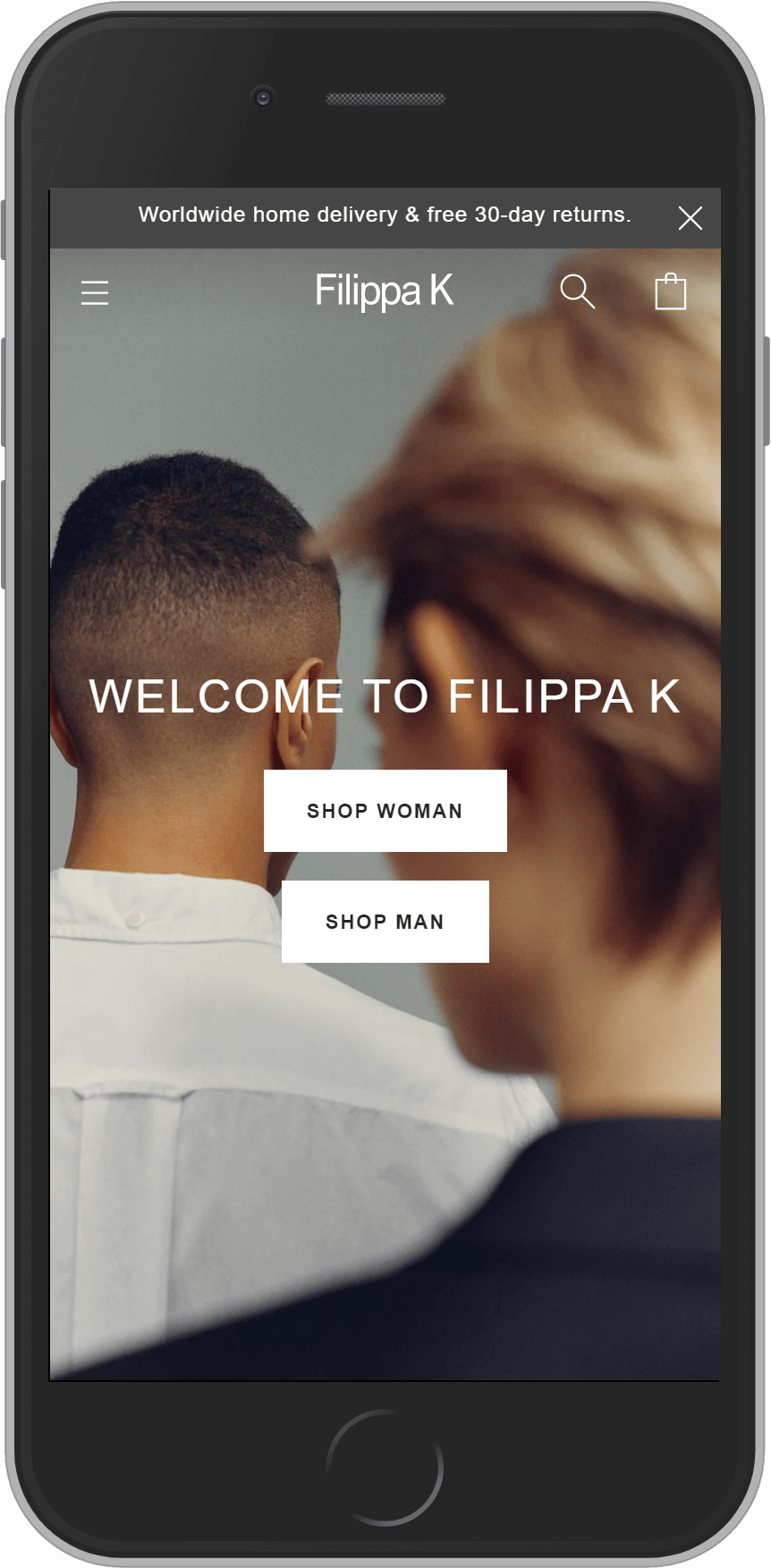
Industry: Fashion
Technology: Episerver
Balenciaga
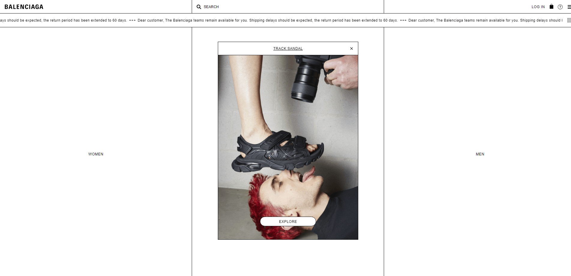
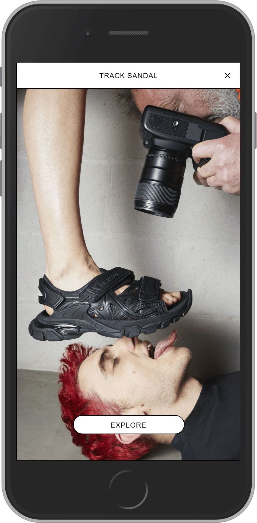
Industry: Fashion
Self Portrait
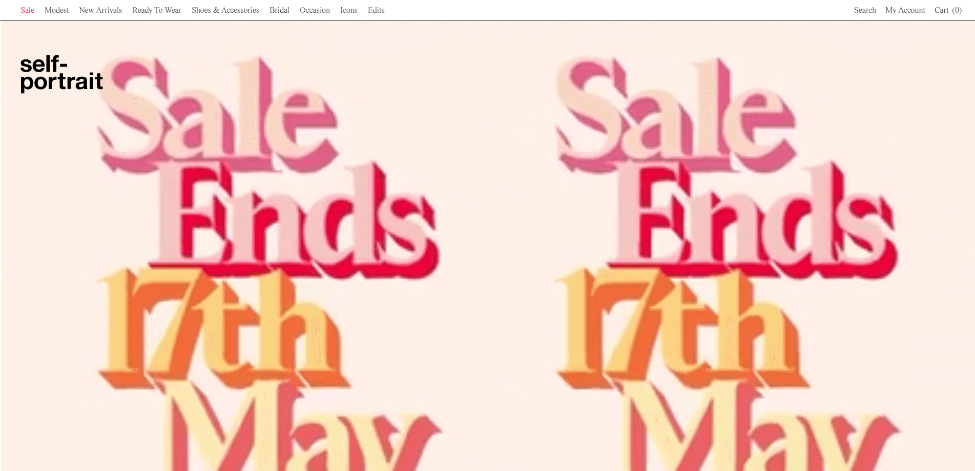
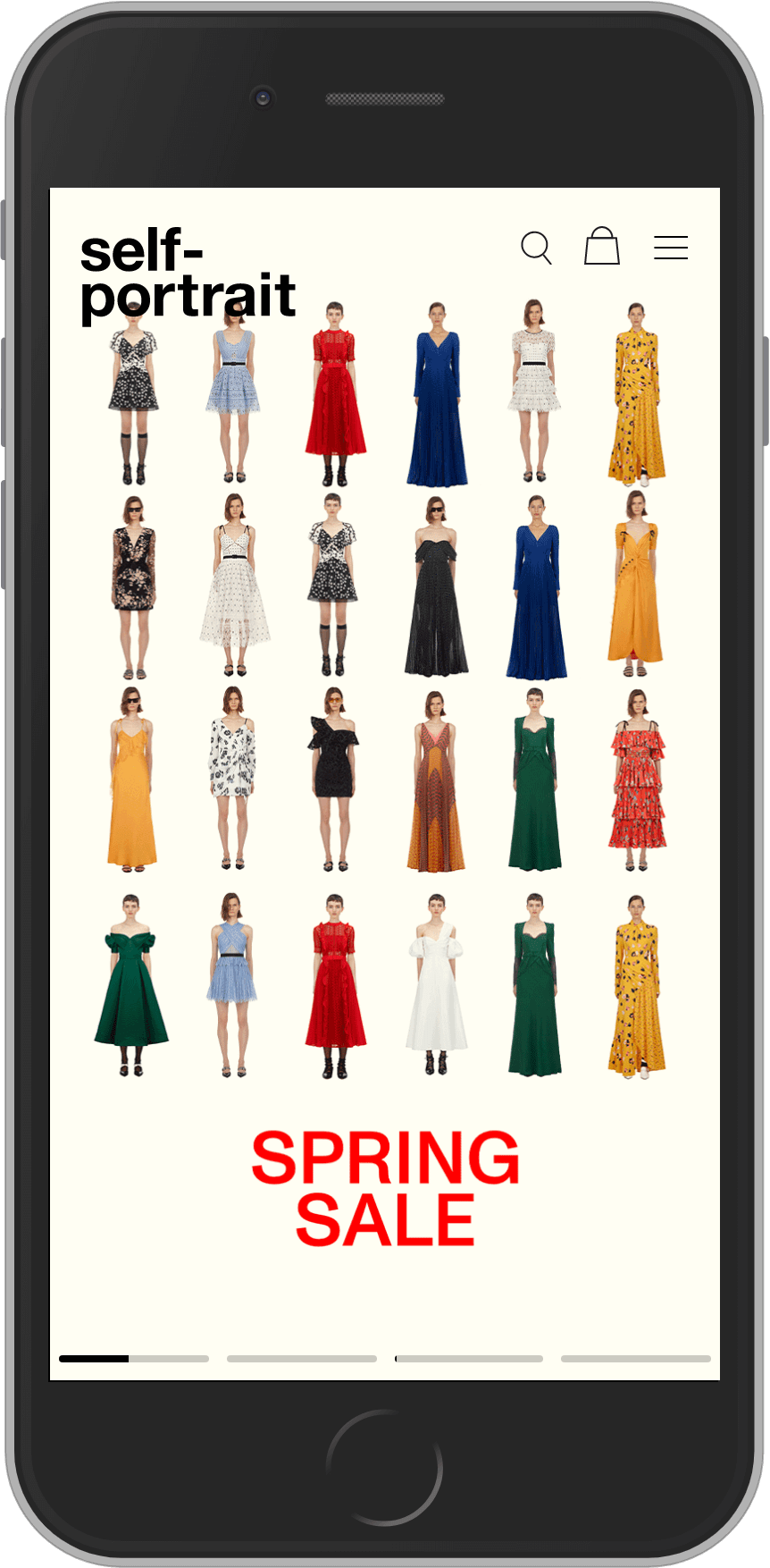
Industry: Fashion
Technology: Magento Commerce, NOSTO, Klevu
Nudie Jeans
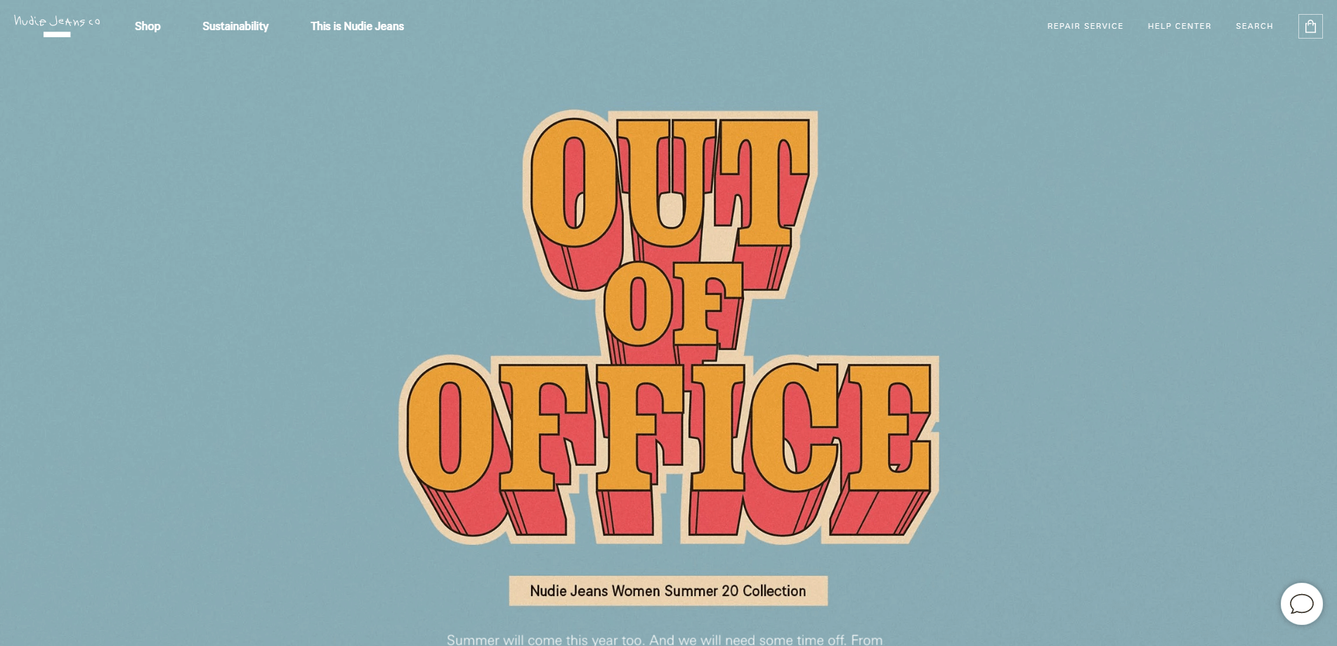
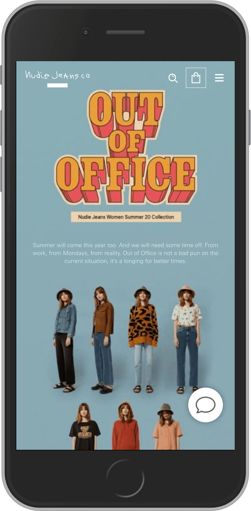
Industry: Fashion
Technology: Centra + React front-end
Burberry
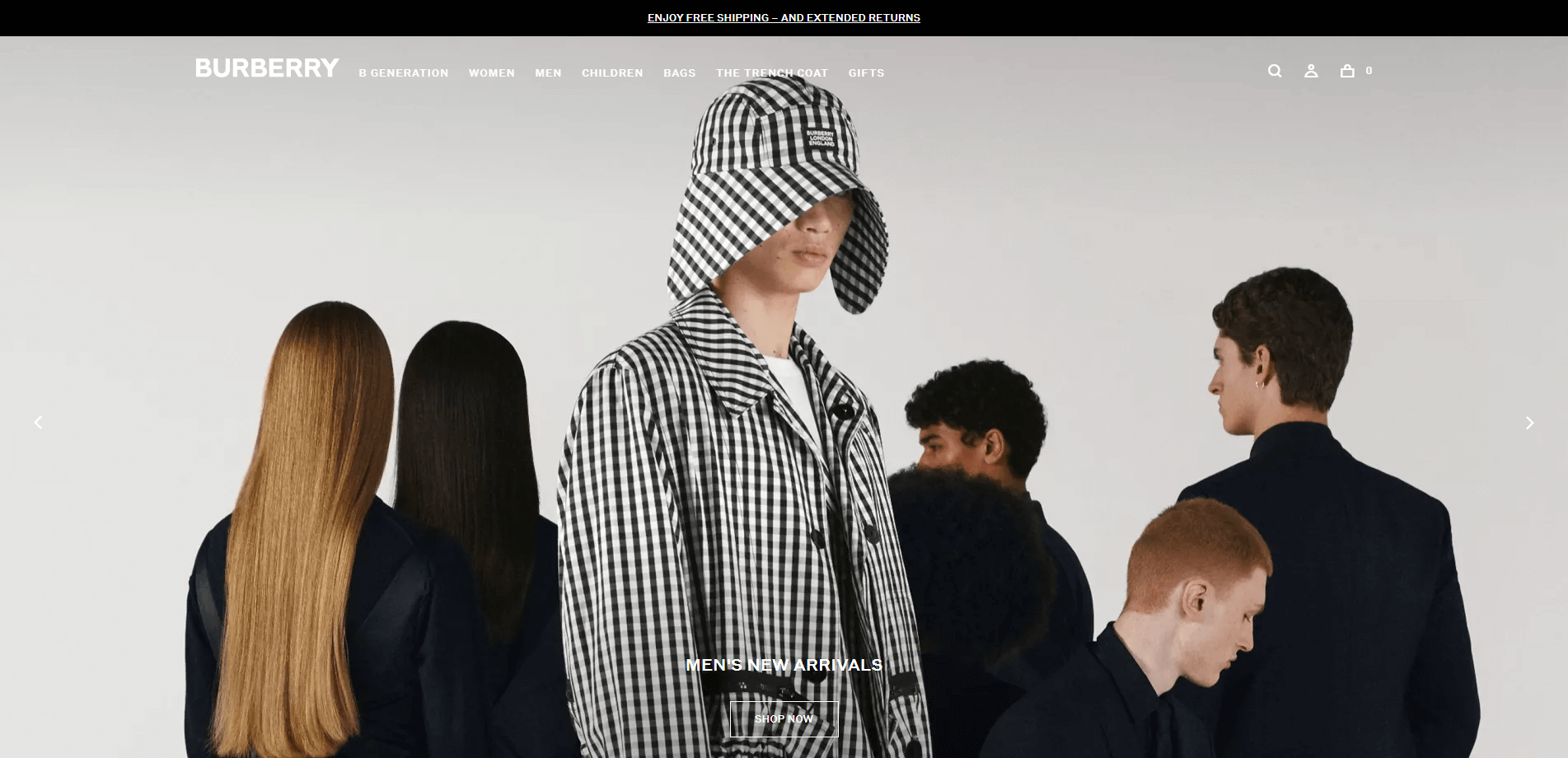
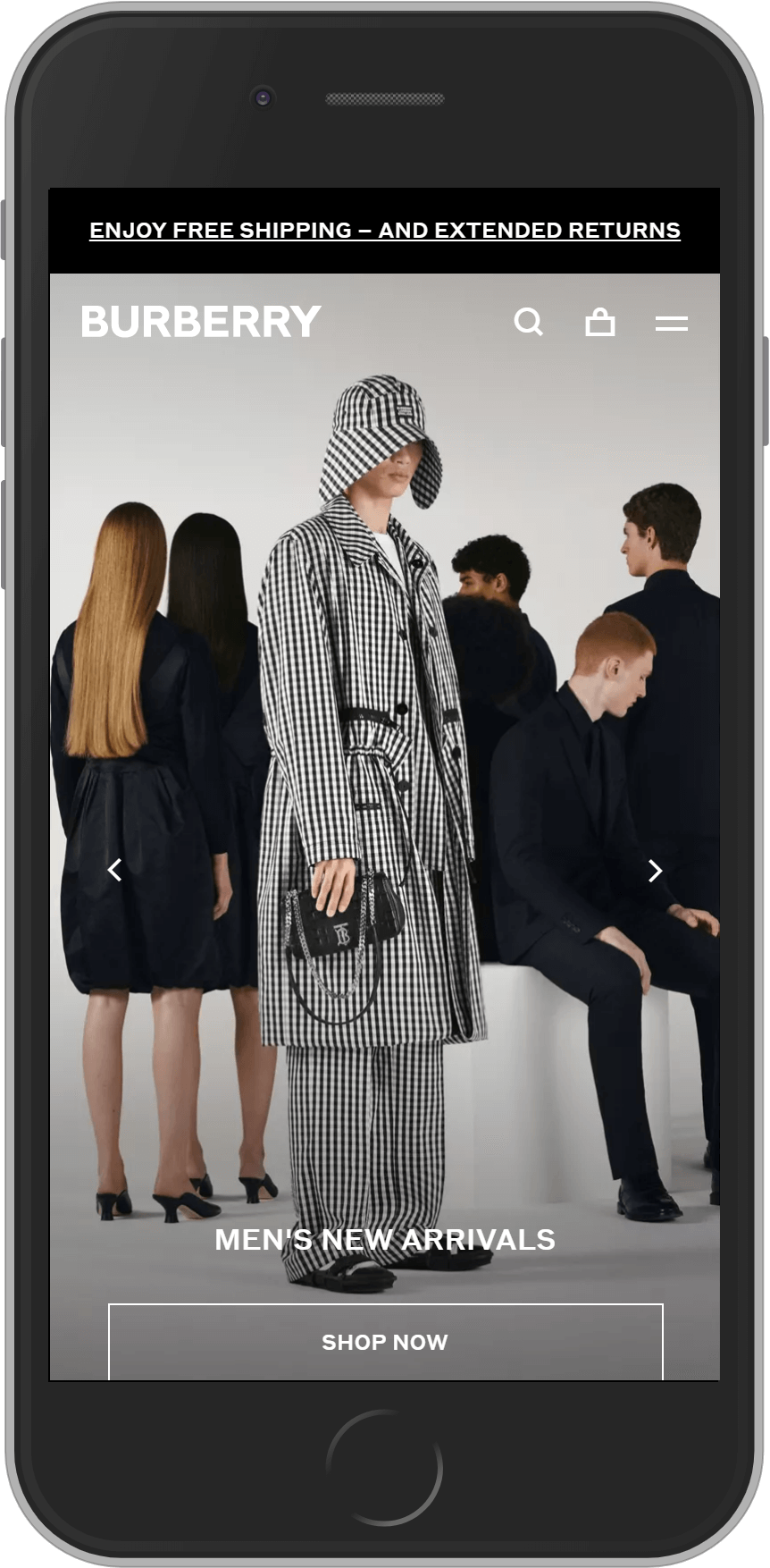
Industry: Fashion
Technology: Oracle
Le Labo
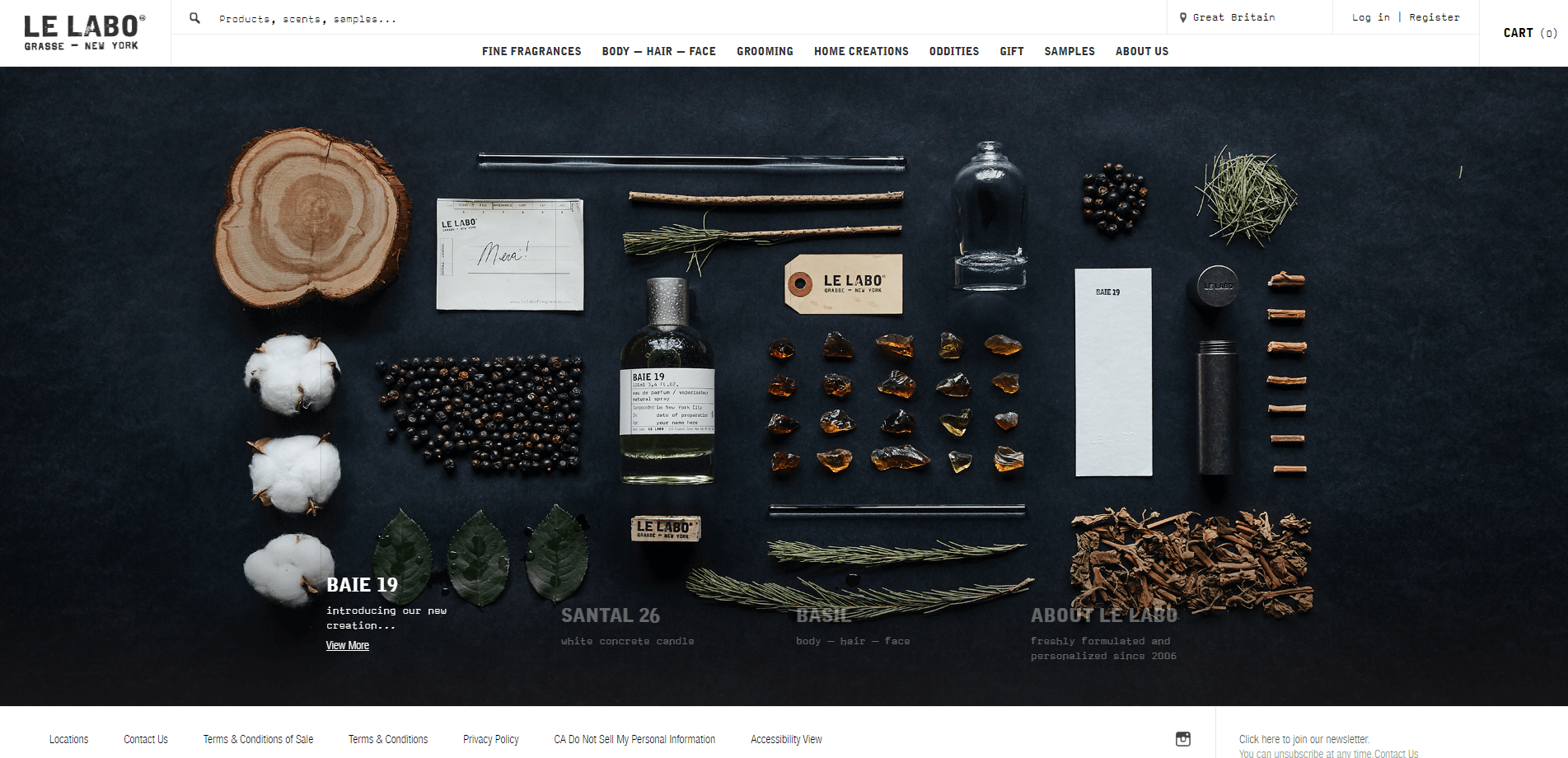
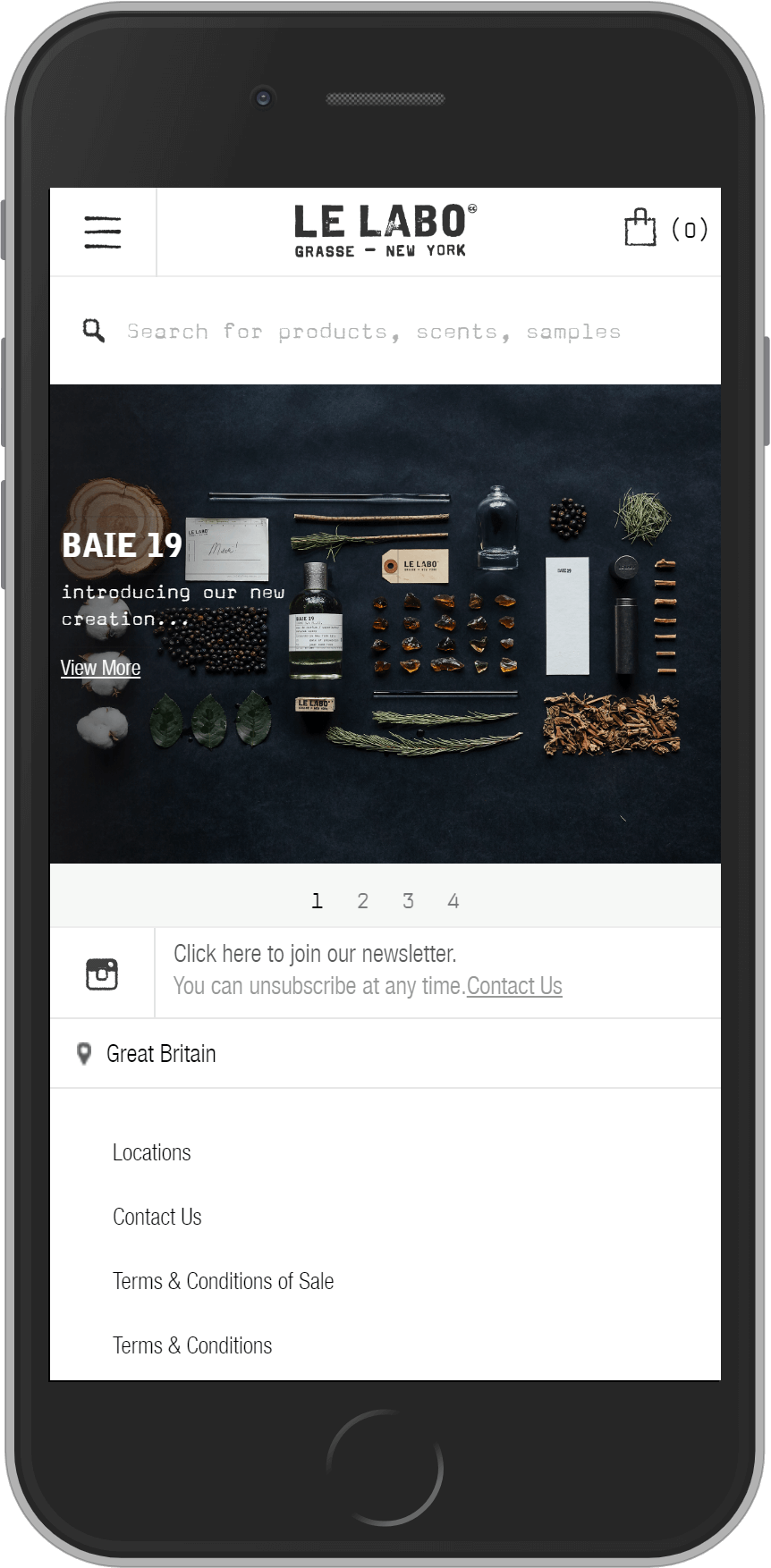
Industry: Beauty
Technology: Bespoke
Orlebar Brown
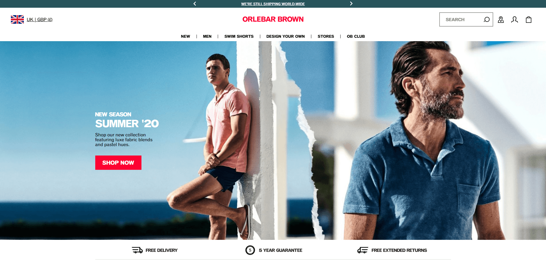
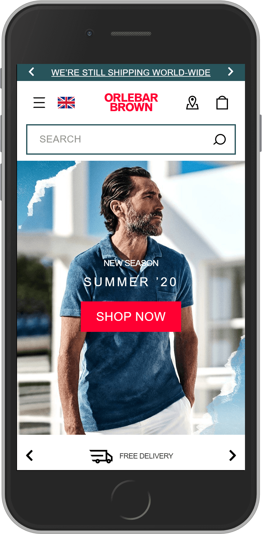
Industry: Fashion
Technology: Salesforce Commerce Cloud
Sunspel
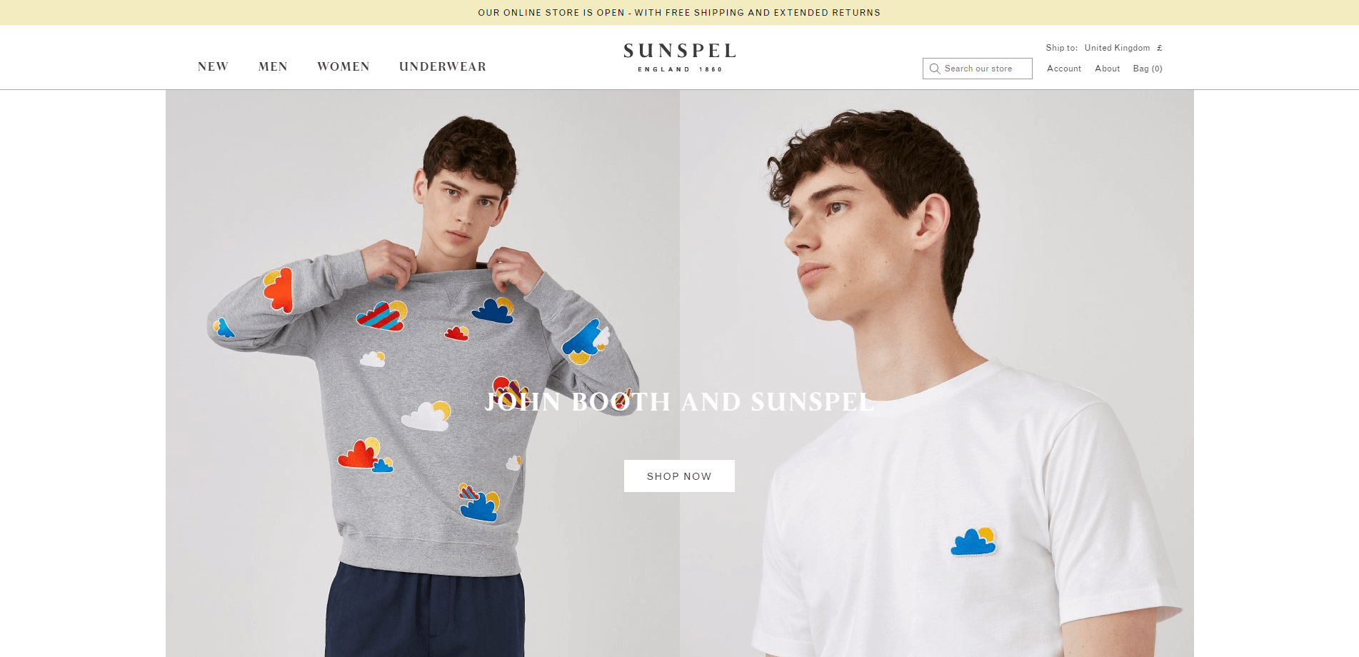
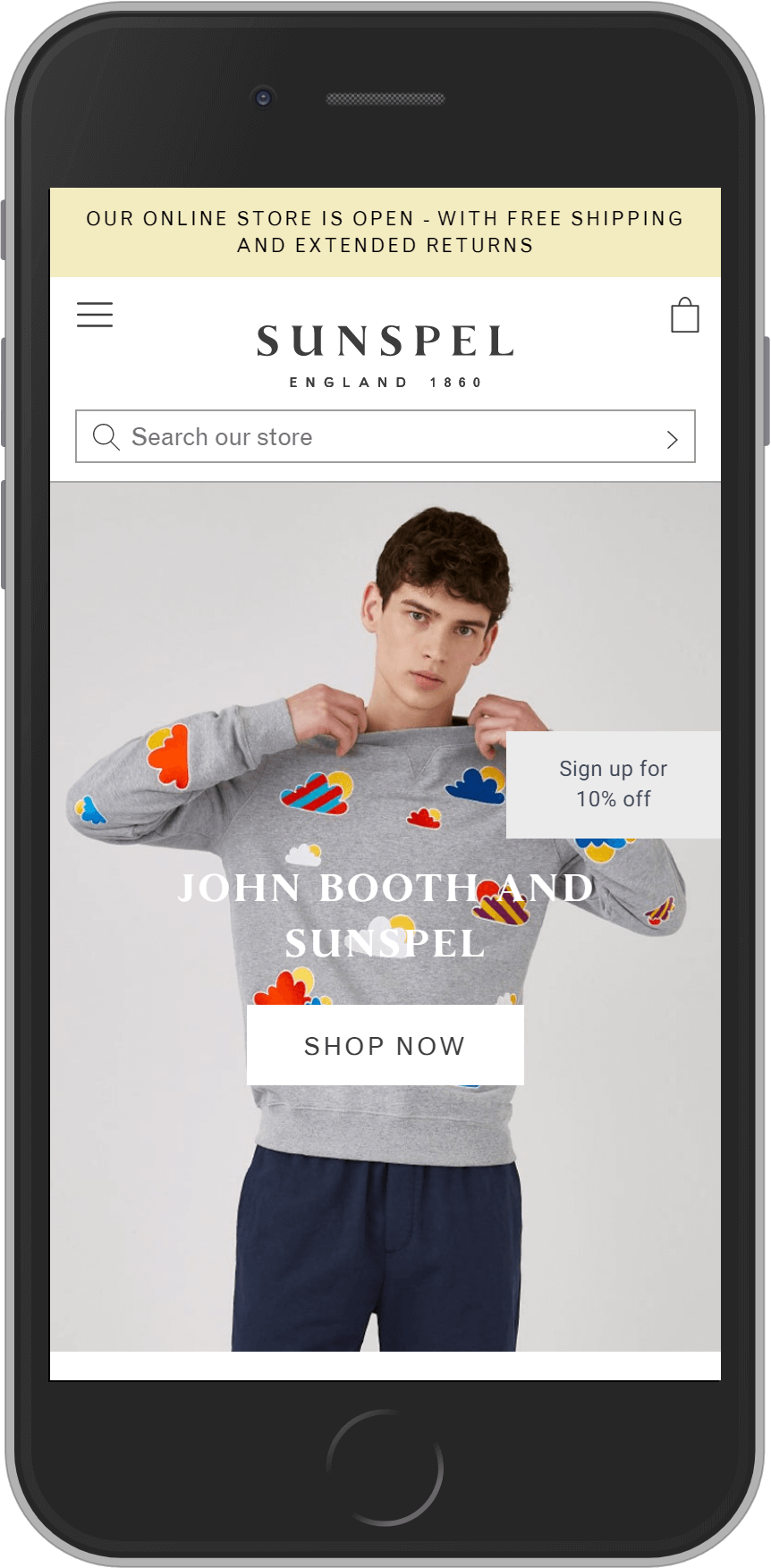
Industry: Fashion
Technology: Magento Commerce
Toteme
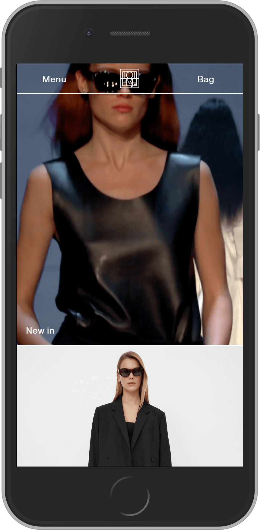
A very strong example of a WooCommerce store that has been developed to showcase the Toteme brand and product very well, across the site. The site features a host of unique nuances and the templates match the style of the brand rather than conventional eCommerce formats. Overall, a really nice example of a brand being portrayed whilst still creating a good transactional experience.
Industry: Fashion
Technology: WooCommerce, Klarna Checkout
Aesop
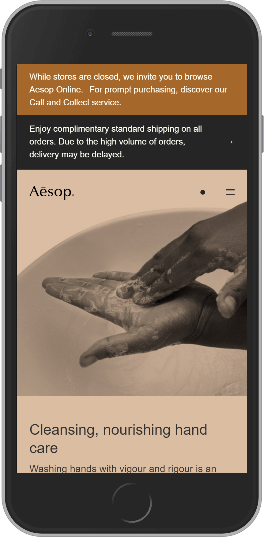
Aesop is well-known for creating an aspirational, premium brand experience in their physical stores and their eCommerce store has gradually got closer to delivering the same premium experience online.
The Aesop eCommerce store is very clean and content-led and there are lots of very subtle effects and interactions that make the experience more premium and luxury. All of the templates have been very carefully designed and the way that the pages render again feels very premium. The other areas that are particularly strong in this example are the imagery (across the store) and quality and consistency of the written content.
Industry: Beauty
Technology: SAP Hybris / CX
On Running
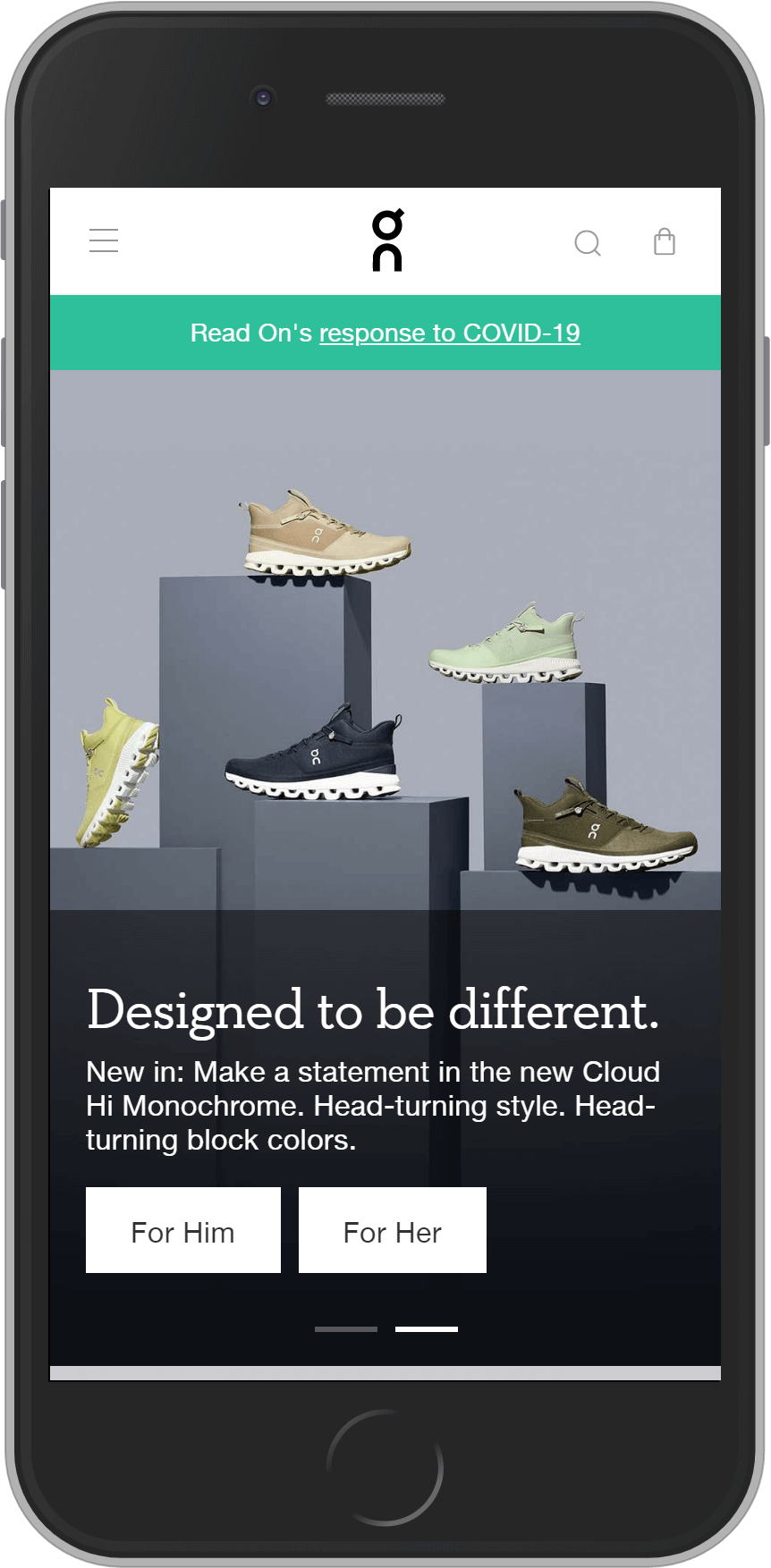
This website has become one of my favourite eCommerce stores in recent months, featuring a huge amount of great content, general best practice, CX-led features and a generally really strong experience. Examples of CX-led features include a shoe finder (really nice implementation of this type of feature), PDP-level comparisons (again, implemented really nicely) and really strong PLPs.
On Running are everywhere at the moment and this is a really strong example of a site with an exceptional, brand-focused UX, for one of the higher-end sports and fitness brands. I would say this is one of the best examples for content and UX in eCommerce.
Industry: Fitness
Technology: Spree, Contentful, Dynamic Yield
Everlane
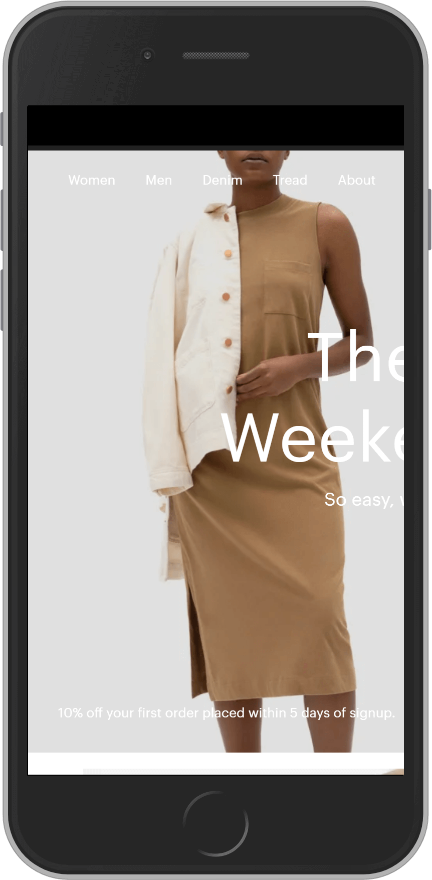
Whenever I speak to luxury brands about UX and design, the one example that always seems to come up is Everlane. I think Everlane is arguably the strongest site on this list when you combine imagery, general comms, content, UX and how the brand is represented and is generally a very strong site and shopping experience.
All of the features across this eCommerce site have clearly been considered in great detail – with lots of examples of things like animated interactions, loading screens and hover affects. It also has a very premium rendering path. Again, the content across the site is really strong and things like the size guides, curated PLPs (grouped collections of product), promoting of different colourways etc are really nice.
Industry: Fashion
Technology: Unknown platform, Algolia, React, Cloudinary
Me + Em
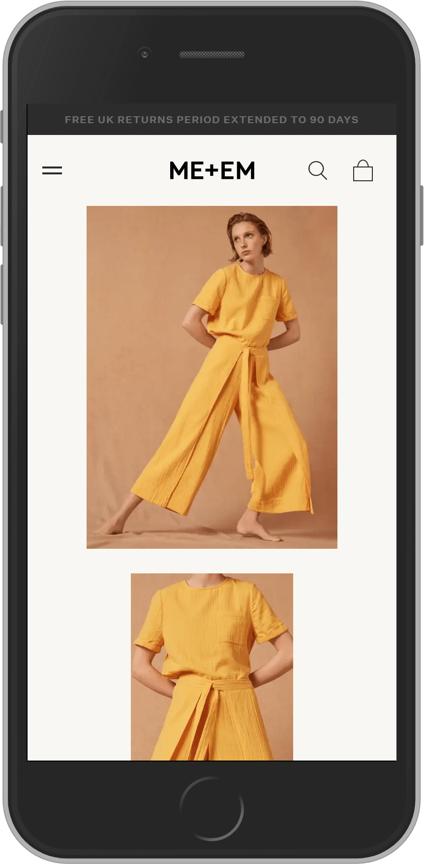
The Me + Em brand has grown rapidly over the last few years, with both their offline stores and eCommerce store constantly referenced as examples of great brand experiences. The new online store (which is a significant improvement) is a headless build, with Magento Commerce for the eCommerce platform and a custom vue.js framework powering the front-end.
The website features lots of premium elements, with the loading pages, rendering of most content types and various hover interactions adding to the luxury design of the site. For me, the search UI (powered by Klevu), the navigation and the product detail page templates are all very strong.
Industry: Fashion
Technology: Magento Commerce, custom vue.js front-end, NOSTO, Klevu
Bang & Olufsen
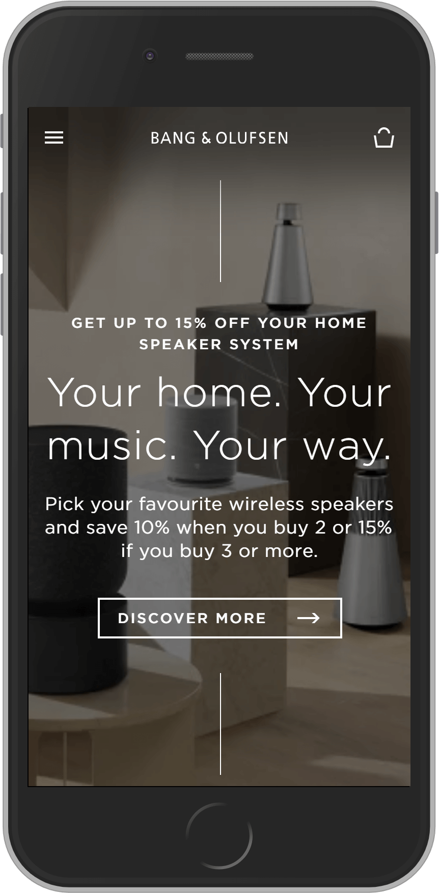
The Bang & Olufsen eCommerce store is another very clean, brand-led site, with lots of great editorial content and lifestyle imagery. This store was one of the first premium brands to use Commerce Tools, a leading API-first commerce platform that has since really taken off.
It’s clear that the site has been built out via components and modules instead of templates, as there are lots of different types of pages with different content and layouts etc – there are also lots of really nice interactions and effects as you browse through the site. The editorial section of the site is also really nice and combines product content and editorial content really well.
Bang & Olufsen use Commerce Tools alongside Contentful (a headless CMS), which allows for the modular approach to content management and page building.
Industry: Technology
Technology: Commerce Tools, Contentful, react.js
Byredo
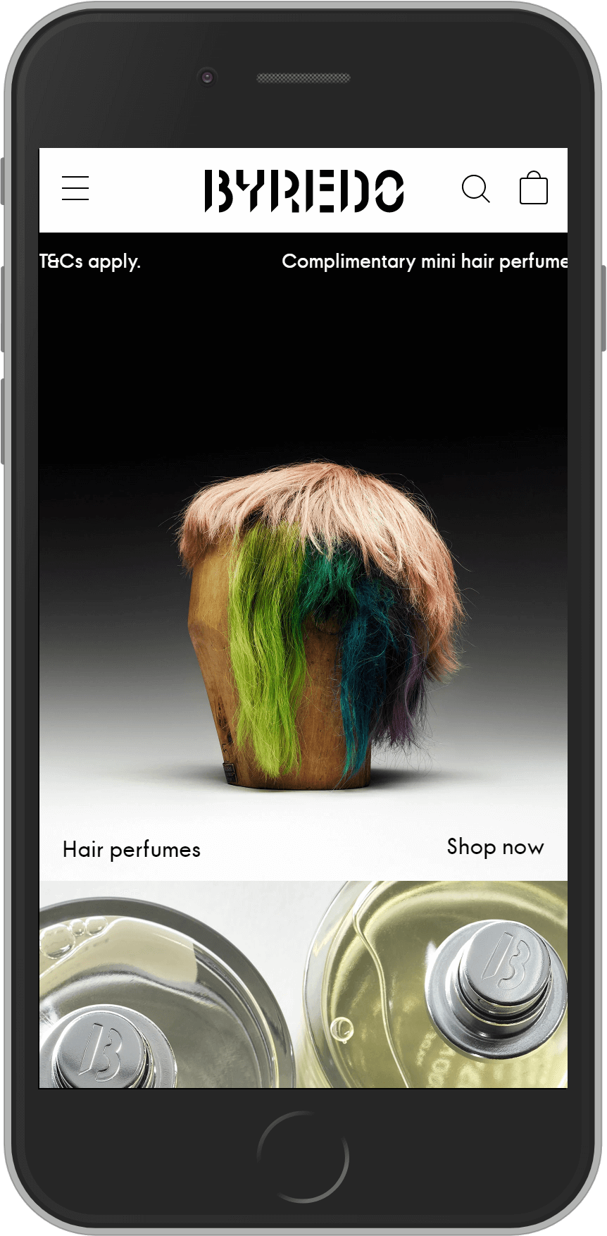
Byredo has to be one of the world’s coolest brands at the moment and their website is very on-brand and clean also. Although arguably not as strong as some of the others on this list, Byredo have great content and the website has a very premium feel to it.
Byredo’s Magento 2 store was the first ever Magento 2 commerce store launched and the have the same approach and technology now.
Industry: Beauty & Fashion
Technology: Magento Commerce, Cloudflare
Uruoi skincare
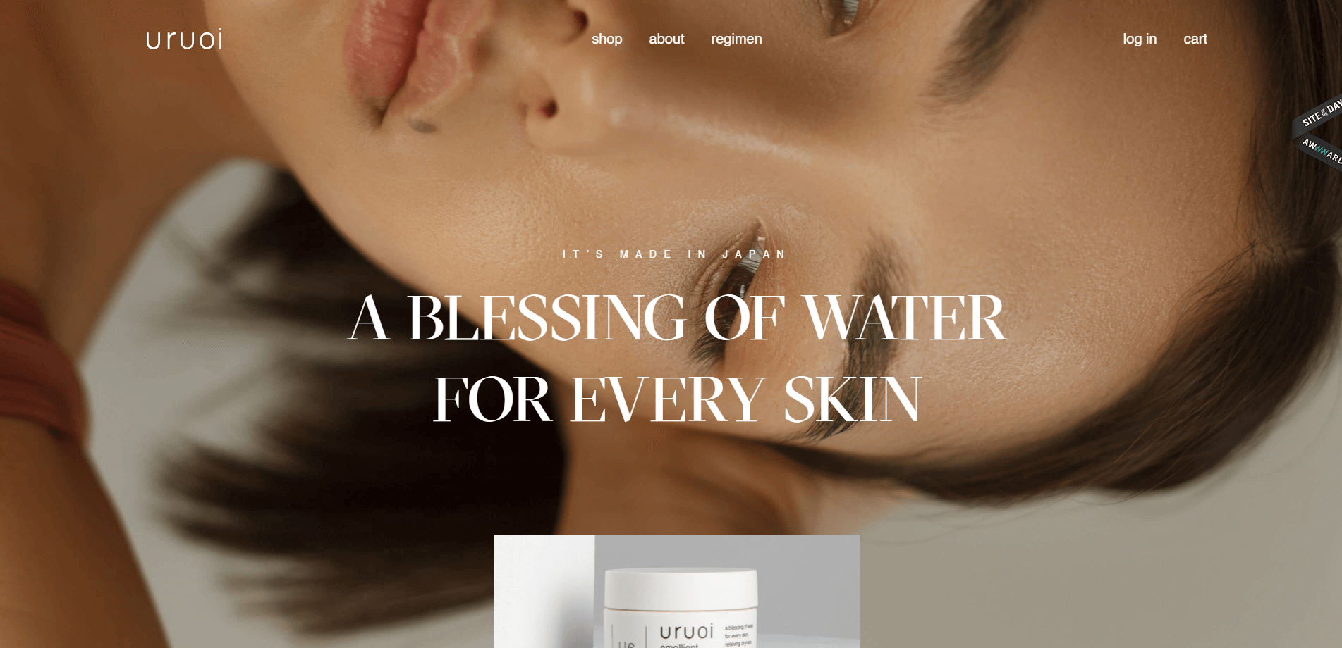
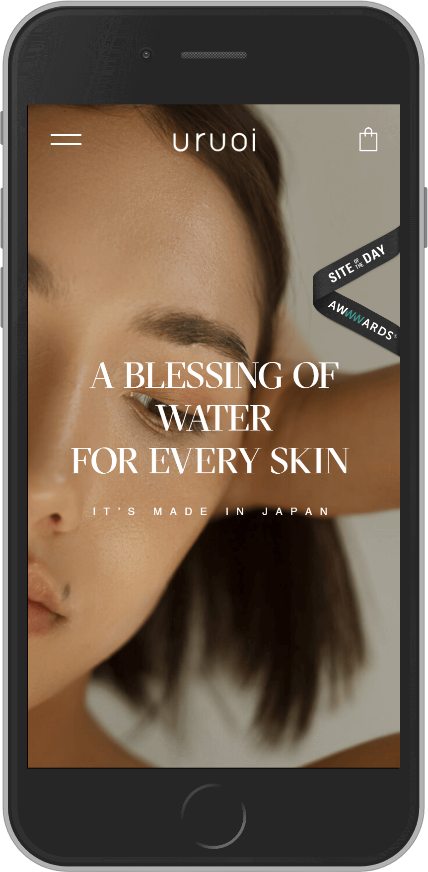
Another very considered design and browsing experience, with a number of effects and interactions designed to create a more premium experience – the Uruoi skincare site creates a very unique experience.
Built as a headless Shopify site, this site has an interesting feel to it – with very original scroll effects, a unique approach to content rendering, lots of really nice hover interactions and branded loading screens. Although not one of the best known brands, this site is a really good example of a very unique and premium approach to front-end development.
Industry: Beauty
Technology: Shopify Plus, Contentful, Vue.js
—
I’ll continue to update this article with more examples – I have 15 more that I’ll be adding shortly. If there are any you’d like me to add, please email me or add them in the comments below.