Having done a tonne of research for a recent M2 project and a couple of front end design projects in the last year or so, I came across many strong designs, some really cool functionality plus some sites that just seem to ‘get it right’ on both sides. While homepage and product listing pages were mostly following a very similar formula, product detail pages really stood out to me – some from a pure eCommerce point of view following best practice rules religiously – Astley Clarke, Missguided & Whitsles for example – and some by being adventurous like MAC, Reformation or Mykita. Here’s a list of my top 20.
—
Astley Clarke
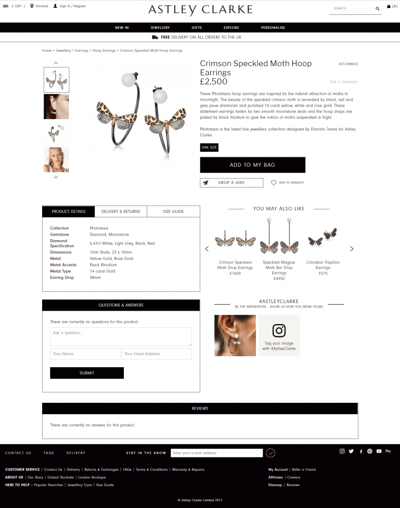
This product detail page ticks many ‘best practice’ boxes – compact in size with not too much scrolling required it packs in standard product description & details content plus recommended products, customer reviews, product Q&A and user generated content.
Built with Magento
—
Sonos
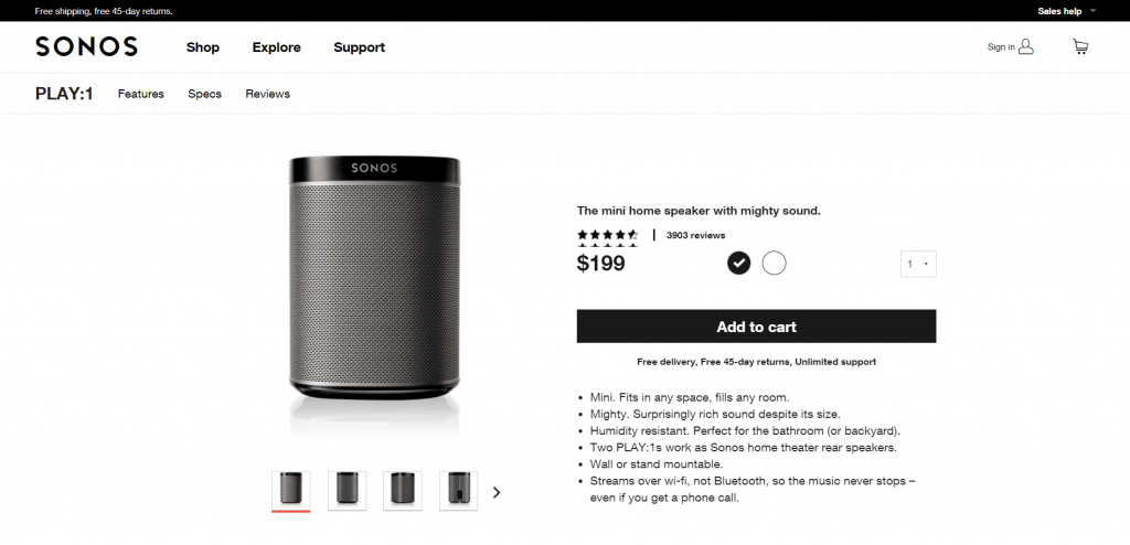
A long but content rich product detail page, Sonos have gone to a lot of detail combining technical info with beautiful photography, video and blog content creating a really high end experience.
Built with Demandware
—
Missguided
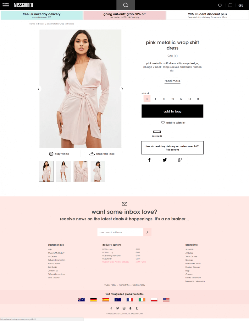
Simple, functional and to-the-point page perfect for their young, fast fashion audience. Nice use of product video and shop the look quick links plus looks great on mobile.
Built with Magento
—
Tangle Teezer
Great use of full width product photography and custom content blocks on each product page demonstrate they know their audience. Plus a customiser tool means you won’t get bored on this site.

Built with Magento 2
—
Birkenstock
Functional and clean, the birkenstock.com product pages follow the longer page template we have been seeing in the last few years which means they are able to include additional elements such as the product construction guide and user generated content.

Built with Demandware
—
Réard
Really considered, delicate design. The illustrated, interactive size guide is a highlight.
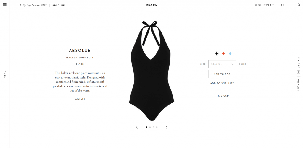
Built with Spree
—
MAC
This page ticks all the boxes in terms of product page features and content and also has a ‘designed’ feel which really enhances the experience. The swatch selector and user reviews are really strong.
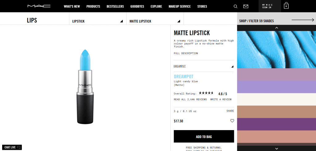
Platform uknown
—
Burberry
A sleek, luxury experience, favourites include the product image gallery layout, the interactive size finder and the packaging content block.
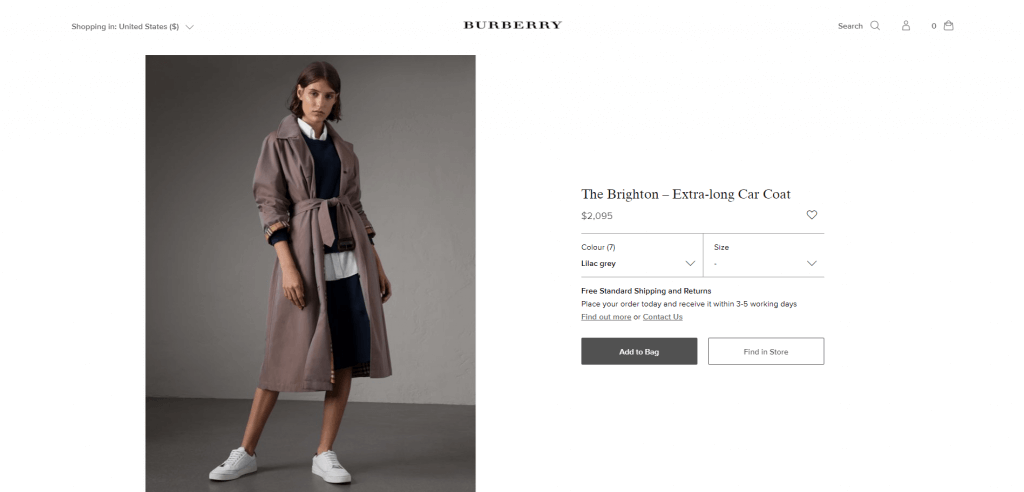
Built with Oracle
—
Deciem
An unusual product detail page, all content sits above the fold with some accordion elements storing product descriptions and user reviews.
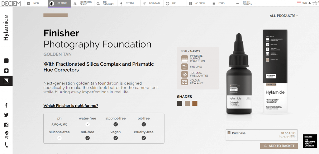
Built on a bespoke platform
—
Mykita
A cool ‘layered’ design with interesting scrolling functionality and product videos.

Built with Shopware
—
Nasty Gal
Another fast fashion, young retailer, Nastygal’s product pages feature big, impactful images and plenty of matching ‘complete the look’ options.

Built with Demandware
—
See’s Candy
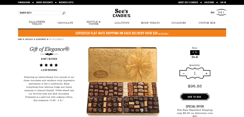
Another ‘above the fold’ product page, the main feature is the customer reviews which seem to be the driving element for conversion and are extremely positive.
Built with Demandware
—
GStar Raw
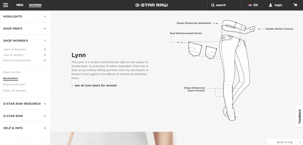
Another long layout page, this G Star Raw product detail page integrates additional content pieces including a very slick product construction animation, a graph detailing where the product was made and a fabric wash & care guide.
Platform unknown
—
Boosted Boards
A less ‘designed’ product detail page focusing more on technical spec of the product. Highlights include the comparison feature allowing you to decide on spec without leaving the page; and the ‘what’s in the box’ section.

Built with Shopify
—
Forzieri
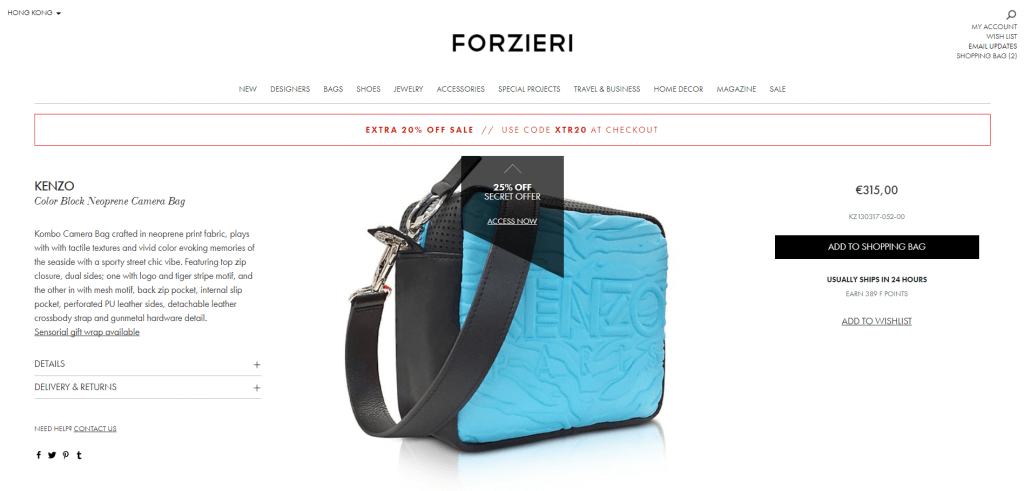
Really slick UX throughout this site, the product detail page stands out thanks to an interesting take on product image gallery, custom promotional flags and a dispatch time estimate.
Platform unknown
—
Reformation
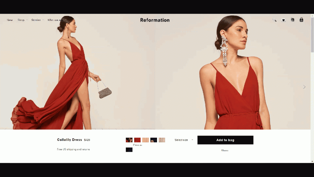
Another full width layout, the strongest features of the Reformation product detail page have to be the ‘RefScale’ environmental impact index and the waitlist email sign up.
Platform unknown
—
Whistles
The high street retailer’s product page include a wealth of information including ‘Style Tips’ encouraging you to ‘shop the look’ and the option to check stock in store using a post code look up.

Built with Demandware
—
Lush
A really creative product page, favourite features include the product demo videos running in the background, the ingredients feature and the reviews which take up most of the page.

Built with Demandware
—
Tinker
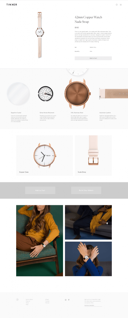
An elegant & minimalist design, the page feels more like a product moodboard but still manages to highlight the key features and benefits of the product. Highlights include the related product selection using lookbook as opposed to standard still life photography and moving product detail images.
Built with Shopify
—
Glossier
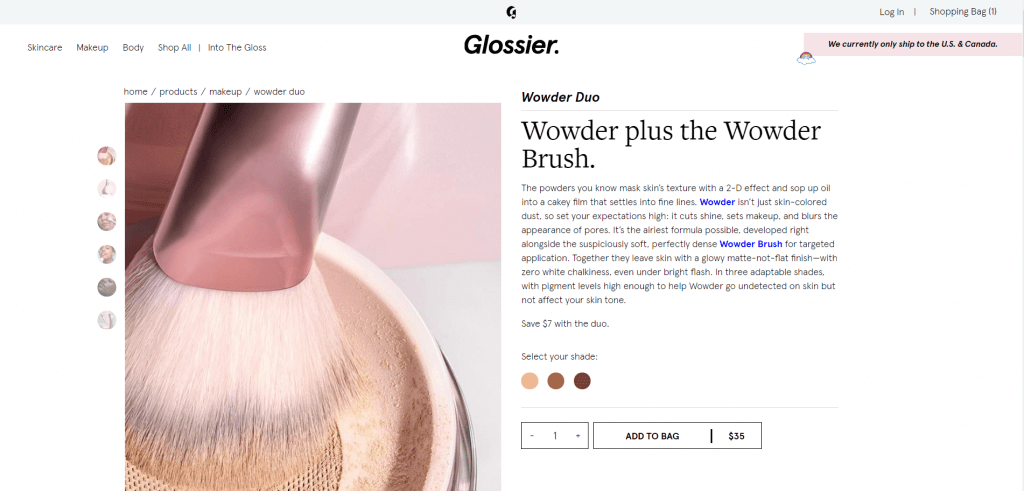
A great mix of product, model & lifestyle photography paired with detailed product descriptions, the elements that really stand out are the product subscription option (as opposed to a one-off purchase), the best and worst customer review plus stats on age and skin type of customers who have bought the product.
Platform unknown
