The luxury market has been known to be a bit slower on the digital transformation side of things than its mid-market & high street counterparts but over the last 5 years eCommerce has become a priority in the luxury fashion space with strong visuals, carefully curated content & a seamless omnichannel experience often featuring at the top of the list for website design & architecture. In addition, partnerships with established online players like Farfetch and Yoox Net a Porter are becoming more common too – with brands like JW Anderson and Roksanda Ilincic choosing to exclusively sell via Farfetch, and Bally & Marni amongst others choosing Yoox as their eCommerce engine.
Here is a list of our favourite high impact luxury eCommerce sites and what makes them stand out:
—
Dior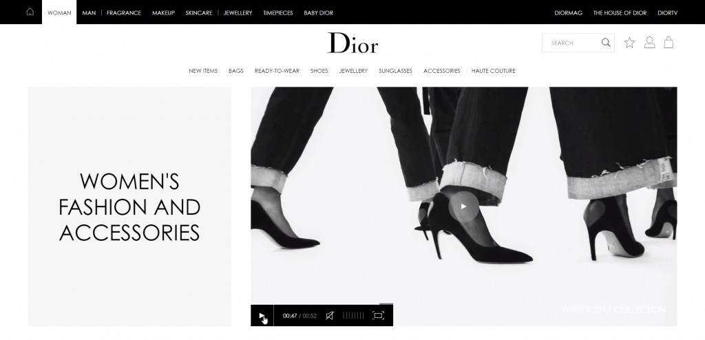 In addition to lots of beautiful photography & three separate content areas (DiorTV, DiorMag & World of Dior), the website also features plenty of stunning video content neatly incorporated into product listing and product detail pages. Other highlights include shoppable homepage images and a global product locator so you can shop items in store or schedule an in-store appointment.
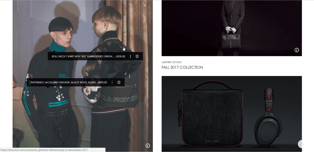
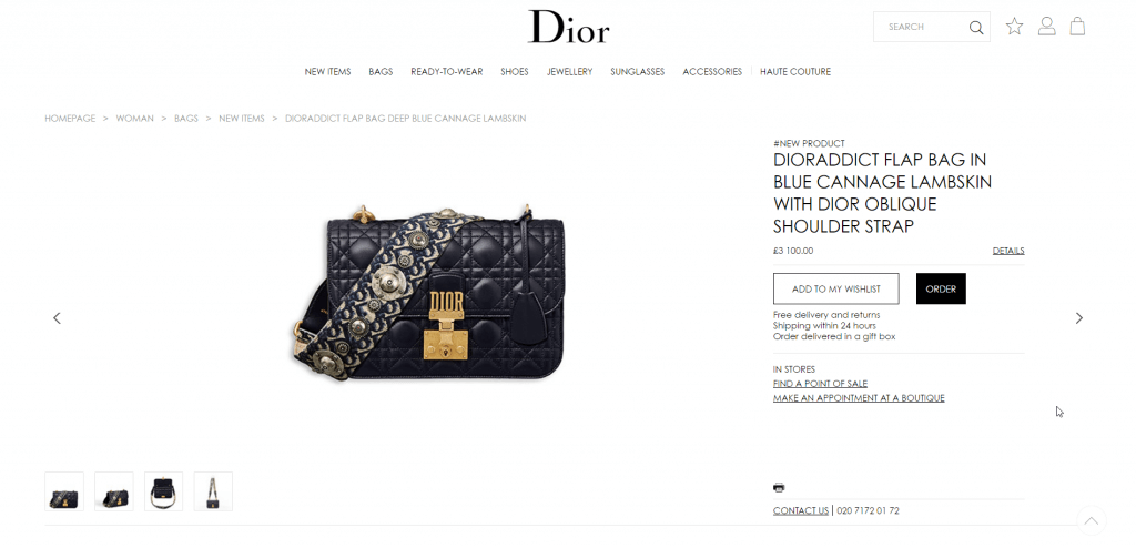 The website was built on a bespoke platform.
—
Jimmy Choo 
The Jimmy Choo website is seasonally re-vamped to match the brand’s campaign theme & colour palette. It also features a ‘Made to Order’ tool allowing users to create their very own design choosing everything from heel height, material & colour to a personalised sole. The site is always neatly merchandised with the ‘Collections’ tab offering product edits based on colour, occasion, trend & season.

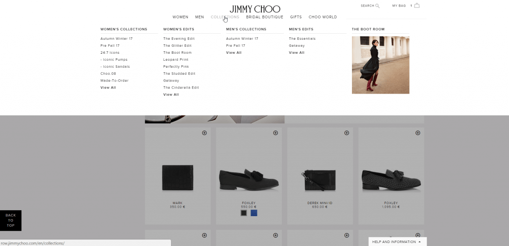
The website was built with Demandware.
—
Fendi
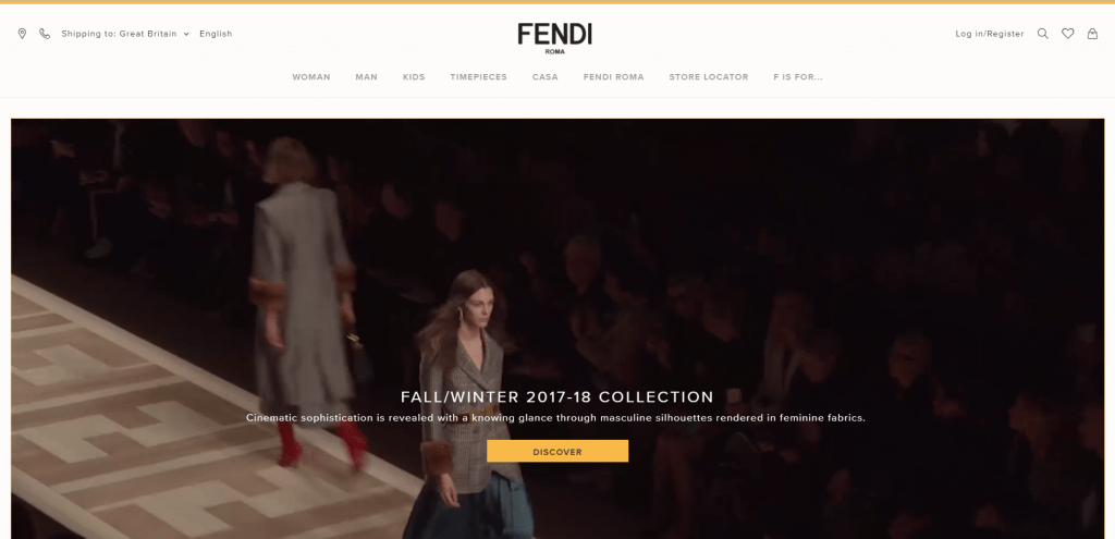
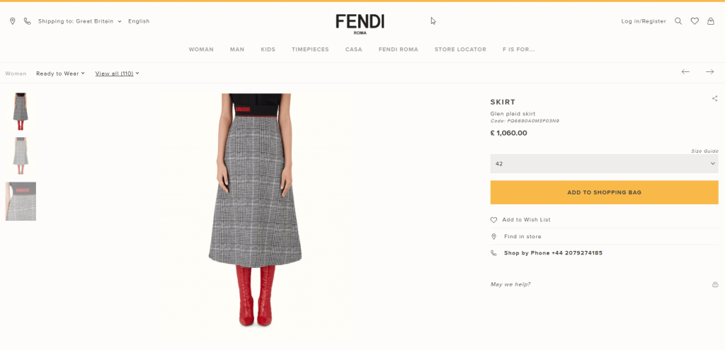
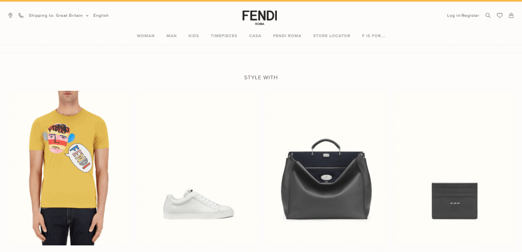
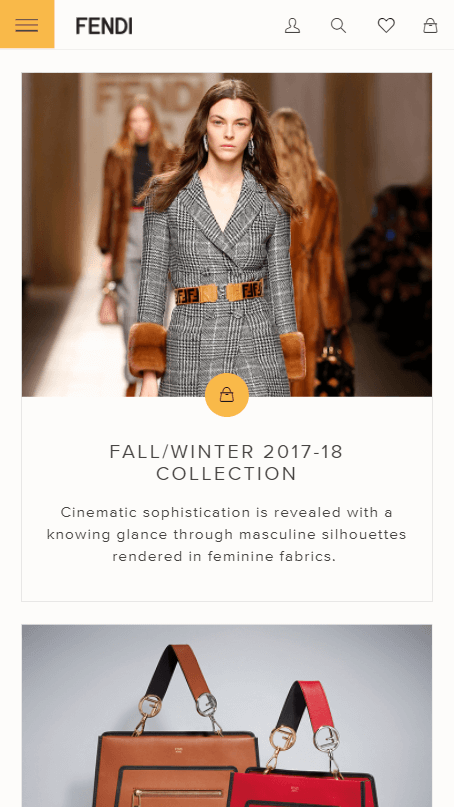
A neat, minimalist site, the Fendi online store smoothly transforms on tablet and mobile devices. The product pages offer a ‘Shop by Phone’ services as well as a ‘Style With’ section encouraging you to buy a whole outfit rather than a single item.

The website was built on a bespoke platform.
—
IWC
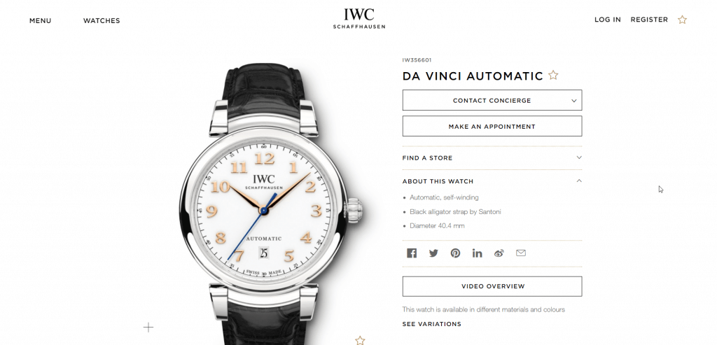
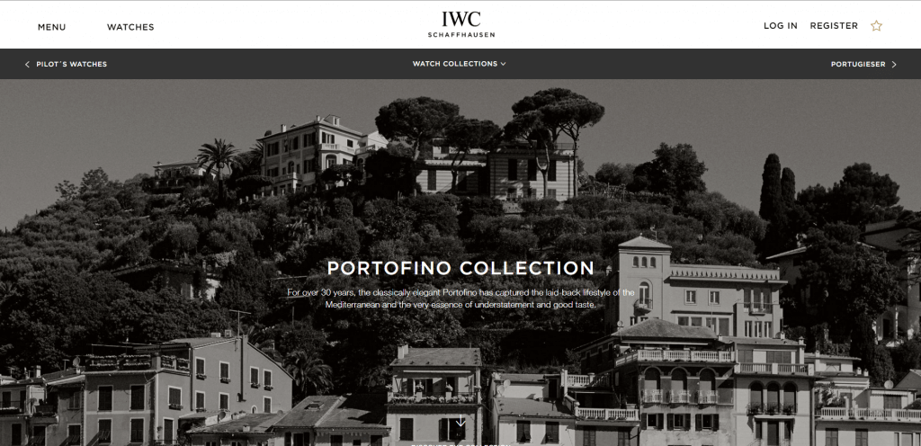
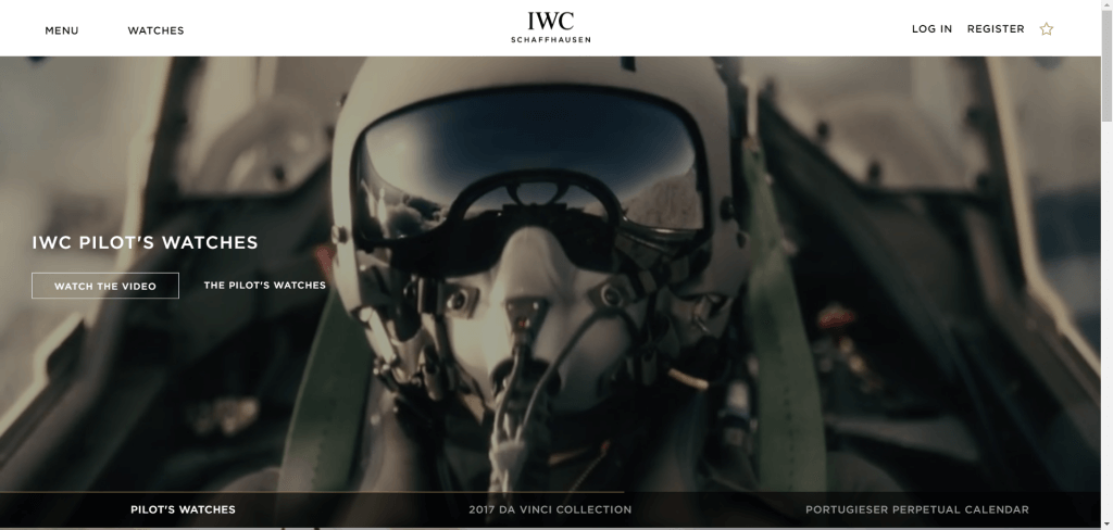 Six watch collections are accompanied by a wealth of video content, including a campaign and a ‘product overview’ video for every single item. Users are encouraged to visit the physical stores or get in touch by contacting a concierge or making an in-store appointment. Each collection is presented through a bespoke landing page.
The website was built on a bespoke platform.
—
Moda Operandi

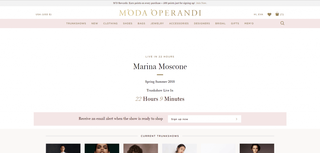
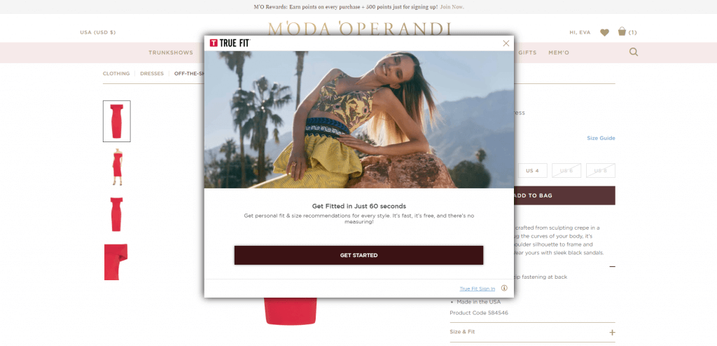
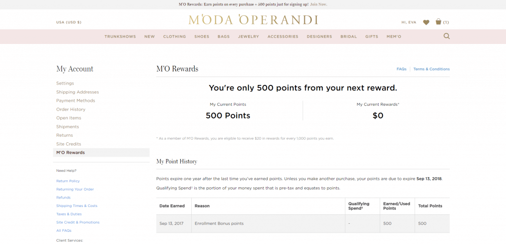
This site specialises in pre-order and trunkshow sales (although immediate inventory is available too) allowing customers to shop product a whole fashion season ahead of the rest of the market. Highlights include: trunkshow countdown landing pages with an option to receive email alerts when the show is ready to shop; a ‘True Fit’ size fitting tool to ensure you’re buying the correct size; and ‘MO Rewards’ – a points based system rewarding you every time you shop.
The website was built on a bespoke platform.
—
Reformation
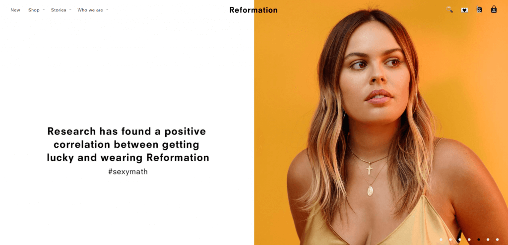
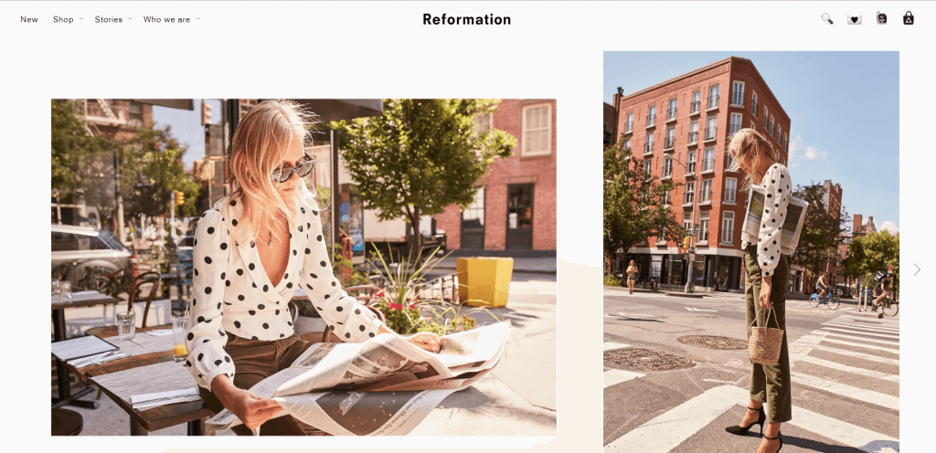
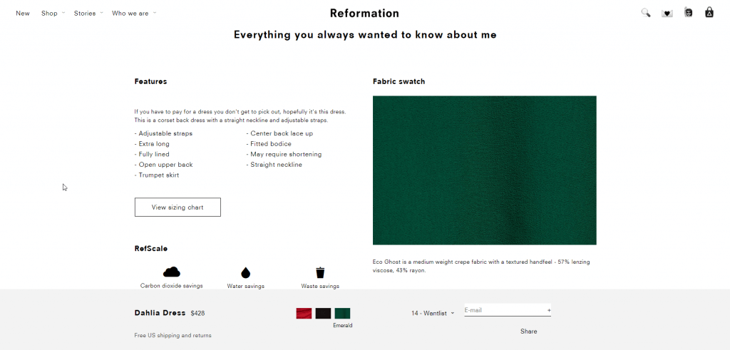
Minimal design with bold photography on all levels – campaign and lookbook down to simple yet impactful eCommerce product shots is what makes the Reformation website stand out. Other interesting features include a ‘Stories’ tab in the navigation acting as a lookbook / landing page for seasonal trend edits and super detailed product pages going as far as stating the carbon footprint of each product.
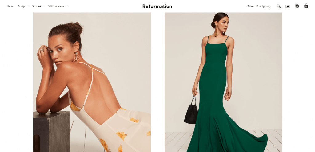
The website was built on a bespoke platform.
—
Mansur Gavriel
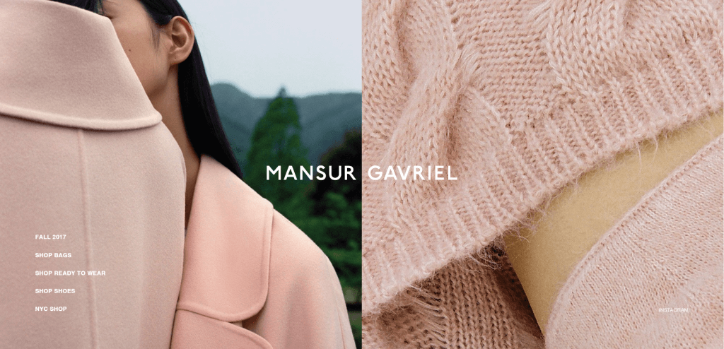
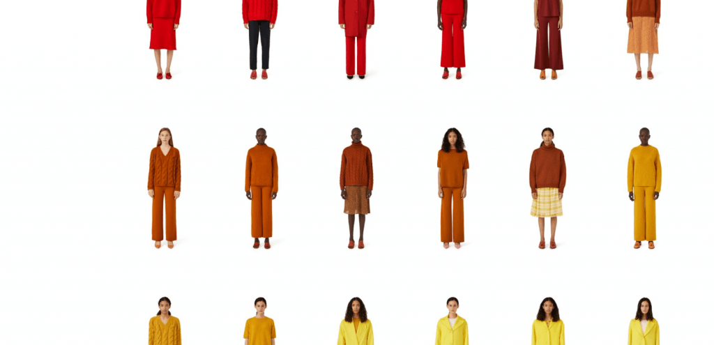
Simple but beautiful site relies on clean product merchandising & styling to create impact. Highlights include a well designed product care landing page, product listing pages visually merchandised by colour and 7+ images per product on product detail pages.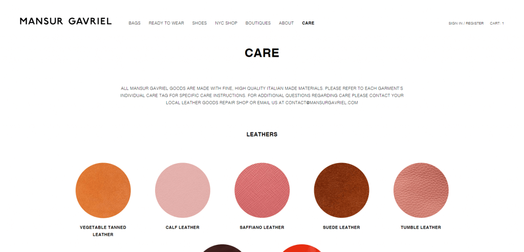

The website was built with Shopify Plus.
—
Makr

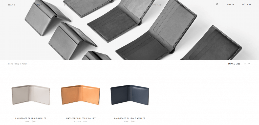
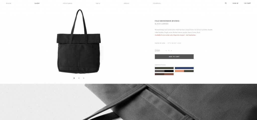
A furniture & accessories brand, Makr’s site stands out thanks to its well designed & smooth UX. Favourite features include a detailed homepage highlighting all product categories in a really slick way; simple but effective inspiration sections sitting under the ‘Journal’ and ‘Features’ tabs; product listing pages include the option of choosing the product image size as you are browsing; and finally the product pages use an unusual but very pleasant image layout.


The website was built with Magento.
—
N°21
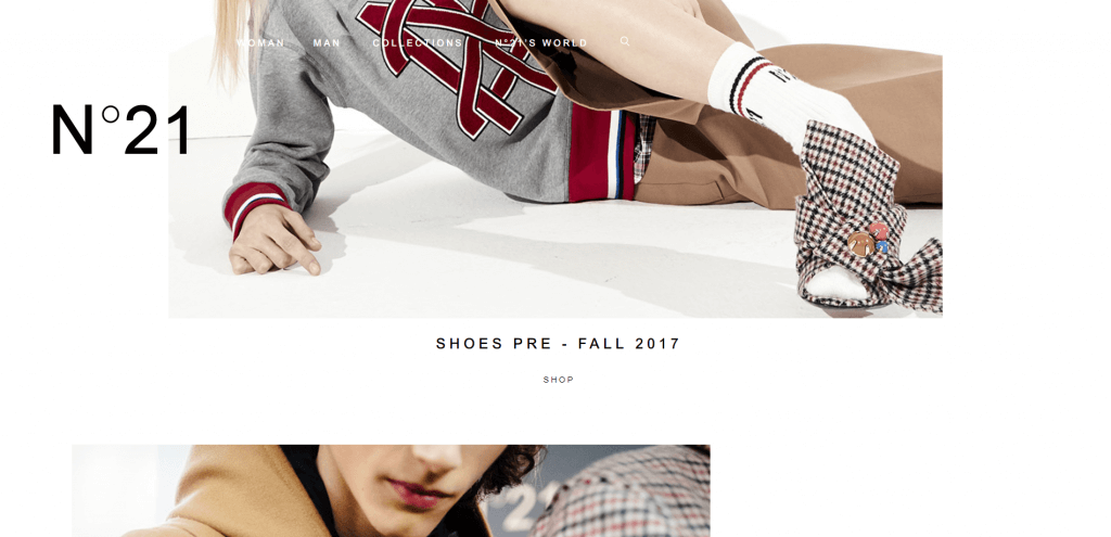
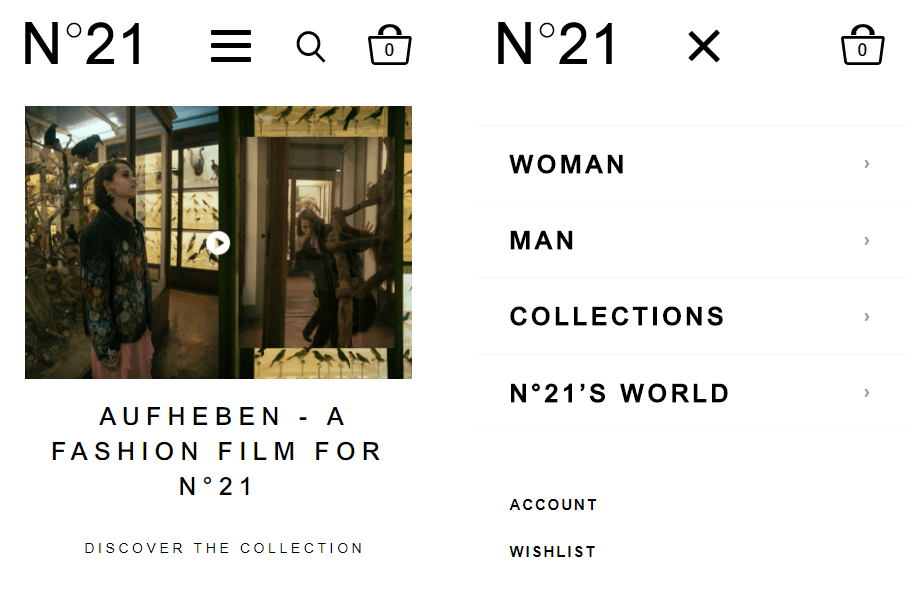
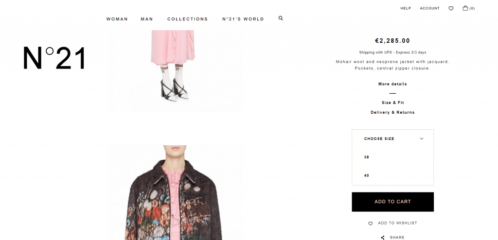
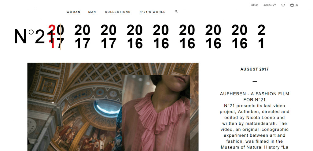
A tidy site with a bold homepage and a sleek branded navigation throughout, the N°21 website smartly resizes on mobile & tablet devices. Product listing and product detail pages are very clean letting the styling of the product imagery take over. ‘N°21’s World’ content area has an interesting timeline navigation design.

The website was built with Magento.
—
Sergio Rossi
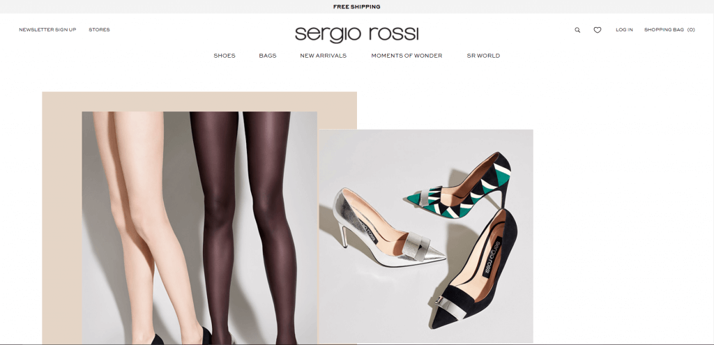
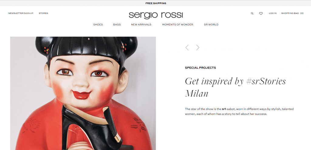
The Sergio Rossi online store uses imagery to inject life into what is a very minimal & polished site. Main features are the option to choose heel height on product pages; a well laid out ‘Social Wall’ landing page with links to shop products pictured; and a super clean blog / news are under ‘SR World’.


The website was built with Magento.
—
24 Sèvres

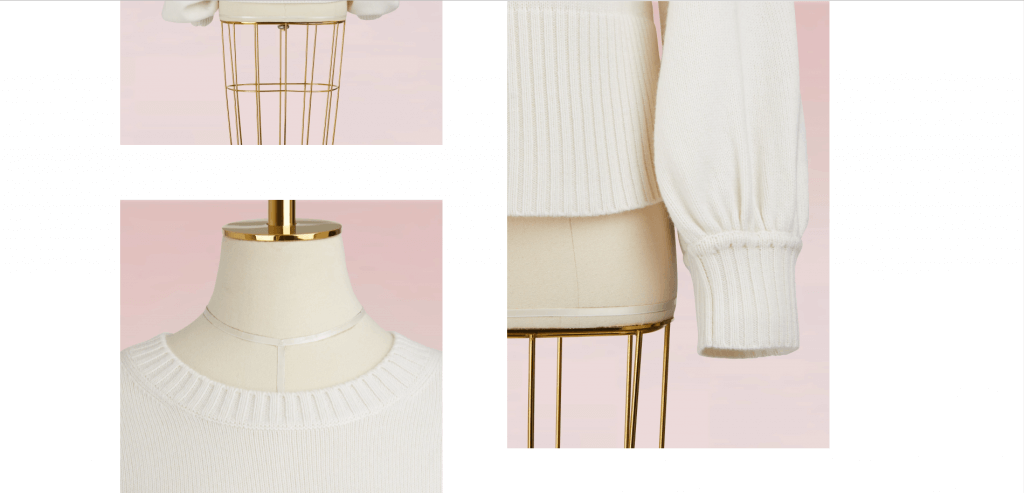
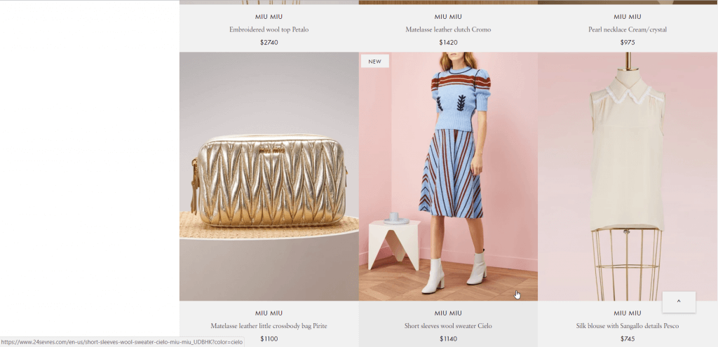
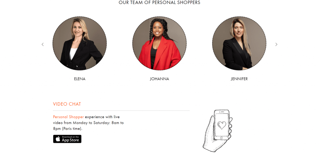
LVMH’s newly launched multibrand site with a luxurious feel and magazine-like layout, beautifully shot product photography and plenty of customer service options including the very impressive Personal Shopping video chat and Facebook stylist chat bot.
The website was built on a bespoke platform.
—
Gentle Monster
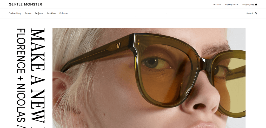
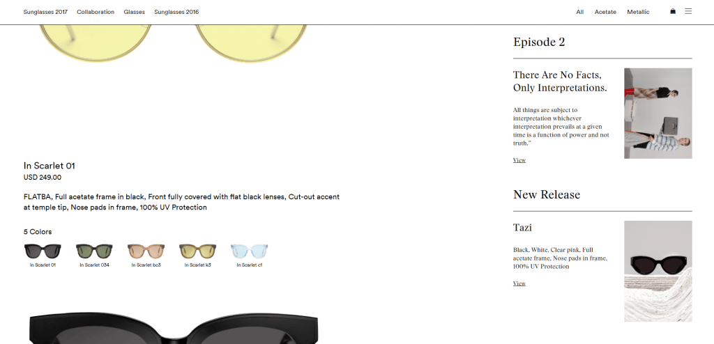
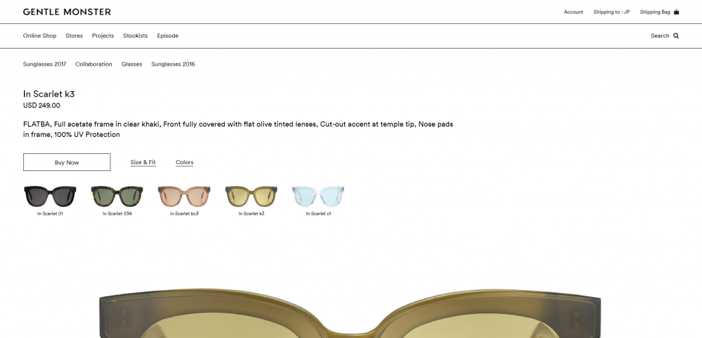
A very editorial site with a focus on full width images and branded content incorporated into every corner of the site. Particularly interesting are blog snippets featured on product listing pages and a super zoomed in product detail page layout
The website was built on a bespoke platform.
—
Goodhood

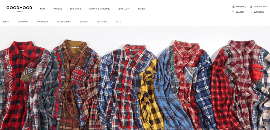
This lifestyle store covers Womenswear, Menswear & Home – all three categories are easy to navigate to thanks to a double navigation design & rich landing pages. Other interesting features are size availability indicated on product landing pages and product detail pages featuring 7+ product images.
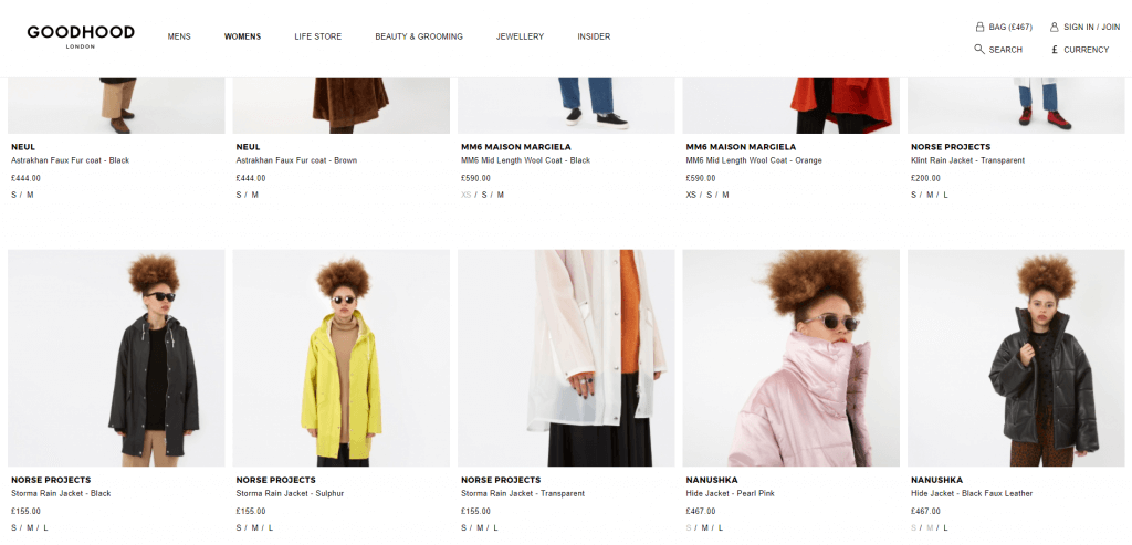
The website was built on a bespoke platform.
—
Alexa Chung
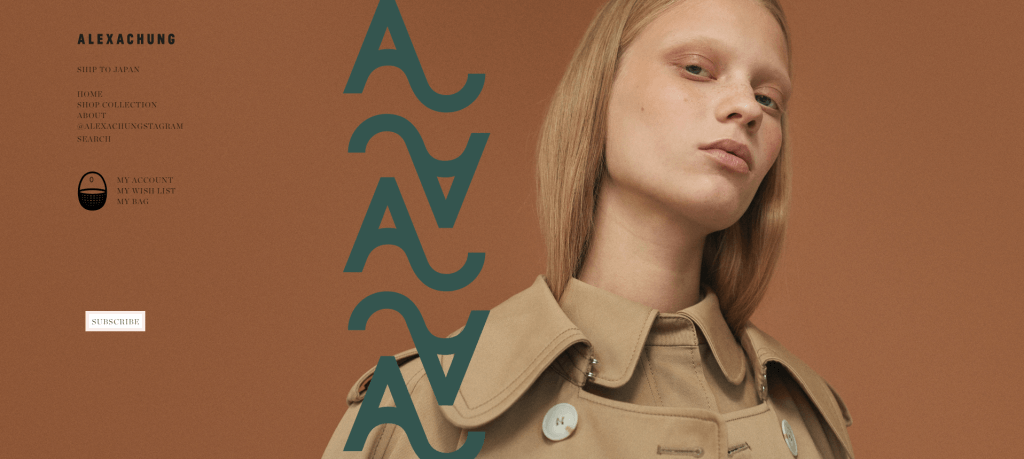
Quirky and cool site with lots of small design features like the wishlist icon and subscribe button animation. The site also features a nice combination of cursive and print lettering, illustration and photography capturing the brand’s retro modern vibe. The shopping journey is very straight forward and simple.

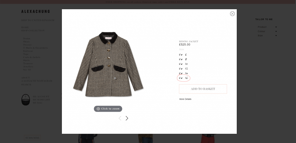
The website was built with Magento.
—