
Over the last 12-18 months, cart drawers (or pushcarts or slide-out carts) have surged in popularity, starting as a trend coming out of modern, high volume sites and progressing into a fairly mainstream inclusion in lots of eCommerce sites. Following some really nice implementations and positive results, cart drawers have become an obvious inclusion in most of our projects and they’re always a big discussion topic with the client in terms of creating the best possible UX and maximising up-sell opportunity.
I decided to write this piece to highlight some of the key considerations and also some really strong examples that we’ve used as inspiration.
What is a cart drawer?
A cart drawer is essentially an off-canvas pop-out that appears on the side of the page when a user adds an item to cart, usually, at least in part replacing the need for the cart page. A cart drawer would generally include more functionality than a mini bag, such as the ability to edit quantity and add a gift message. We’ll go into more detail around best practices for functionality below.

What should be included within a cart drawer?
Although cart drawers will vary in terms of the functionality they offer, we generally suggest adding the following:
- Full list of items in cart
- Ability to edit quantity and remove items
- Free delivery progress bar
- Logic-based, well-positioned product recommendations
- If relevant, subscription up-sells
- Details of an relevant promotions
You’d then have the optional inclusion of the following:
- Gift messaging or ability to remove invoice
- Delivery note
Although both of these could be within the checkout instead.
Ideally, the functionality within the cart drawer would be sufficient that you could bypass the cart and send the user straight into the checkout.
Cart drawer product recommendations
One of the main appeals of the cart drawer is having the space to add clean, nicely positioned product recommendations, be them manual, based on logic or using some level of personalisation or machine learning. Most well-optimised cart drawers will feature product recommendations and in our experience, obvious up-sells can achieve up to a 20% add to cart rate.
We’d suggest really focusing on delivering relevant up-sells via the cart drawer – there may be examples where other types work too, but in the most part up-sells are likely to yield the best responses. The product recommendations should ideally also be simple, so allowing for one-click adding to cart and very little configuration (e.g. sizing).
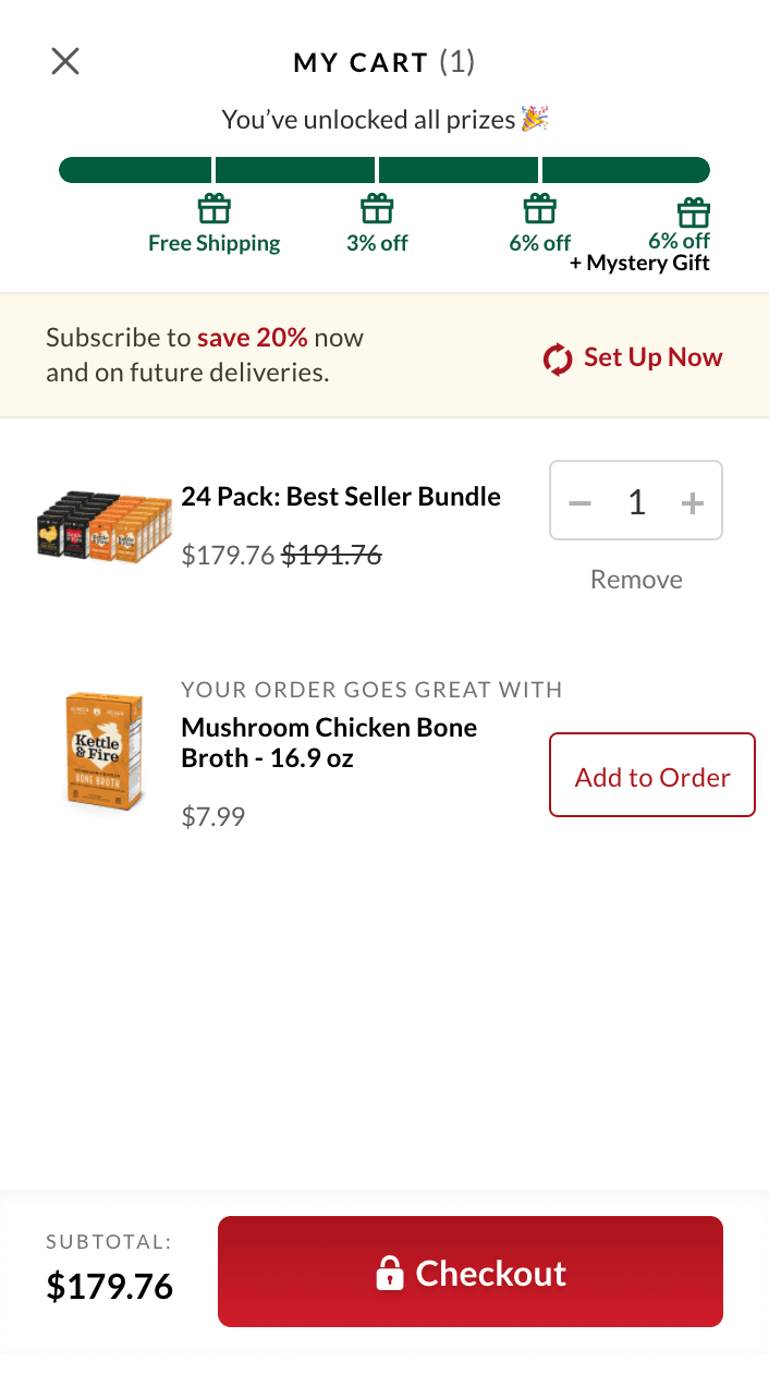
We’d suggest trying to really justify the up-sell within the accompanying wording, helping to make them feel more curated or personalised. This example from Kettle and Fire is a really good example.
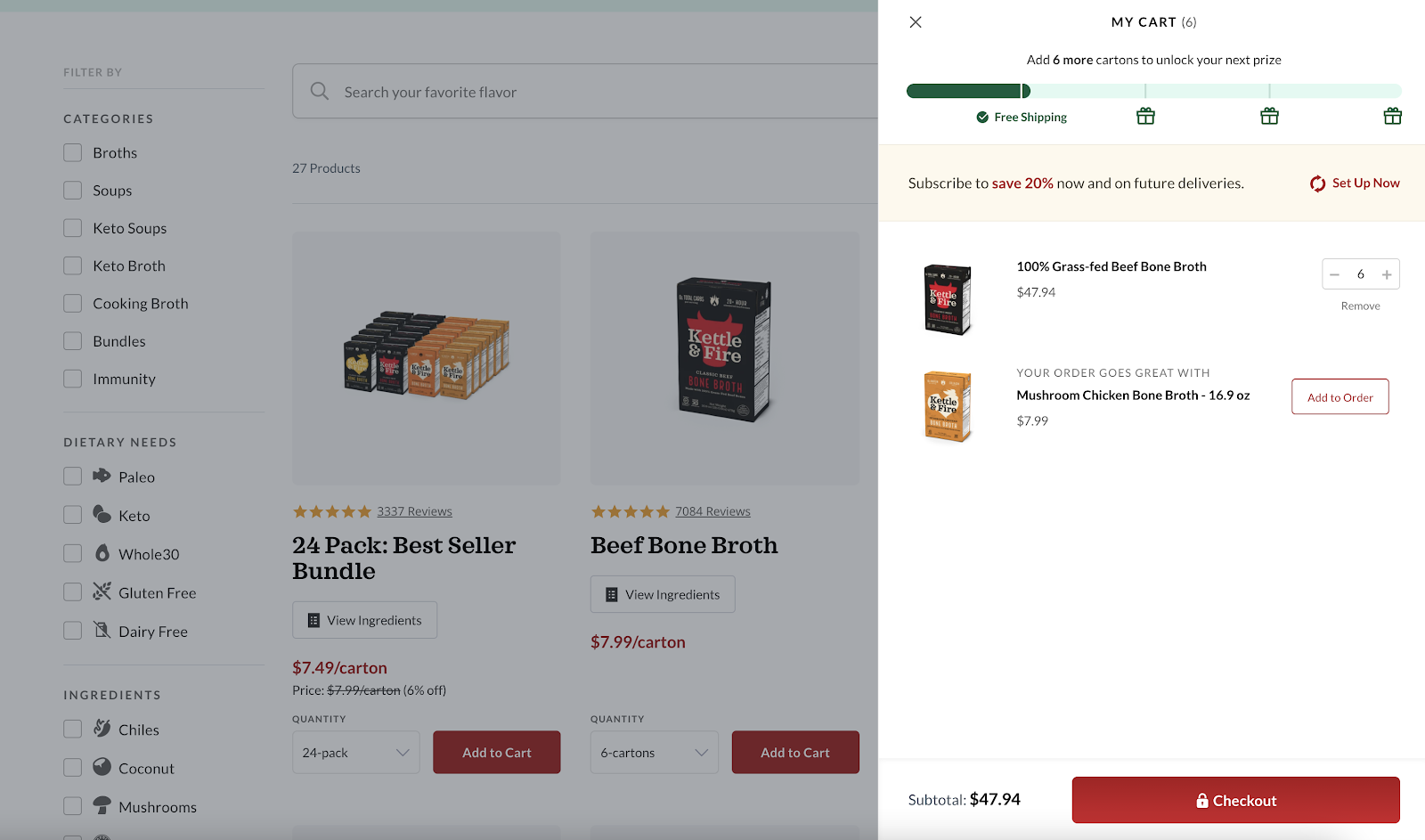
The use of the “your order goes great with” just adds a bit of context – in an ideal world the recommendations would be stronger and be really specific to the item(s) within the cart.
If you’re using Shopify, we really like the Rebuy app, as it allows for rule-based logic with different recommendations and positioning based on the cart contents. One key thing is making sure the product recommendations load fast, as this is one issue you see quite a lot with examples using third parties for recommendations (waiting for the JS to load).
How should a cart drawer be built – apps vs custom
Overall, I’m yet to see a really solid end-to-end solution for a cart drawer on any platform, so we’ve generally gone down the bespoke / theme route and then used a third party for specific parts where needed (e.g. product recommendations or gift messaging).
I would say that you don’t necessarily need anything beyond theme logic to power the product recommendations in a lot of cases, but it depends on your catalog and approach.
There are some examples of cart drawer apps in the Shopify space (such as this one or this one) but I think all of the best examples I’ve seen have been custom. The same applies to Magento, with Weltpixel offering a module, but most strong examples again behind custom. The other thing to be conscious of if you do go down the third party route is performance.
Cart drawer mobile UX
Most cart drawers operate very similar on mobile devices, but span the whole screen to make better use of space, which is my preference. Some do still remain pinned to the right-hand side of the screen, but I personally prefer the full-screen approach.
Functionally, again most of the cart drawers remain the same as desktop, just with the sizing being adapted to the smaller screens. The Kettle and Fire examples works really nicely and very similarly to desktop, on mobile devices.
Examples of well-optimised cart drawers
The below examples represent well-designed and implemented cart drawers that feature examples of what we’ve suggested below.
Kettle & Fire
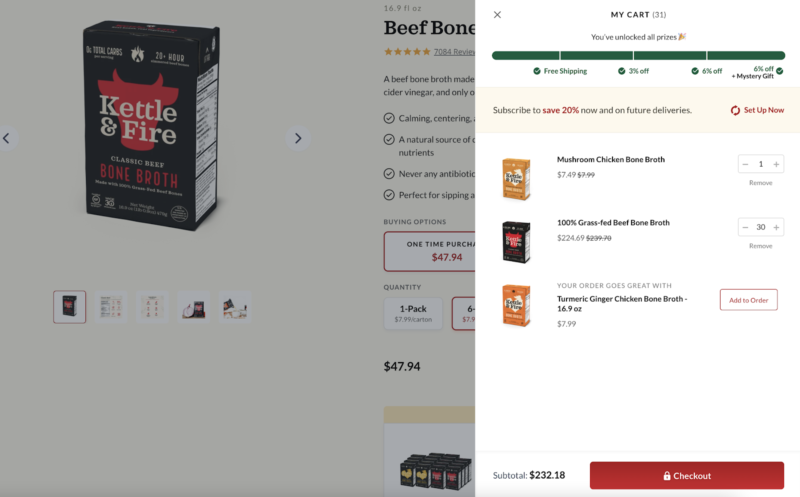
Kettle and Fire has been one of our best references for a strong cart drawer for a long time, featuring all of the core aspects we recommend (well-positioned up-sell(s), the free delivery progress bar, the ability to edit quantity and remove items and then the CTA to go directly into the checkout.
This example is built on Shopify Plus and the product recommendations are powered by Rebuy.
Natreve
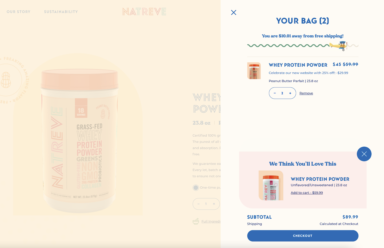
The natreve example is really nice too, again featuring all of the core functional recommendations we’ve highlighted above, but it’s also a really nicely designed example, that’s in-line with the styling across the rest of the site. This site is again built on Shopify Plus.
One thing I really like about this example is the positioning of the up-sell.
Recess
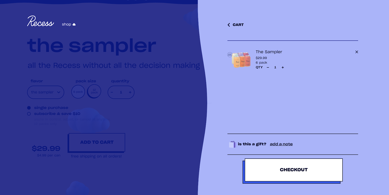
The Recess example features most of the core bits we’ve suggested, but with no product recommendations, which may not be as relevant for them. The addition of the gift note in the cart drawer is nicely done and keeps things simple for users (knowing early that it’s an option).
Primal Kitchen
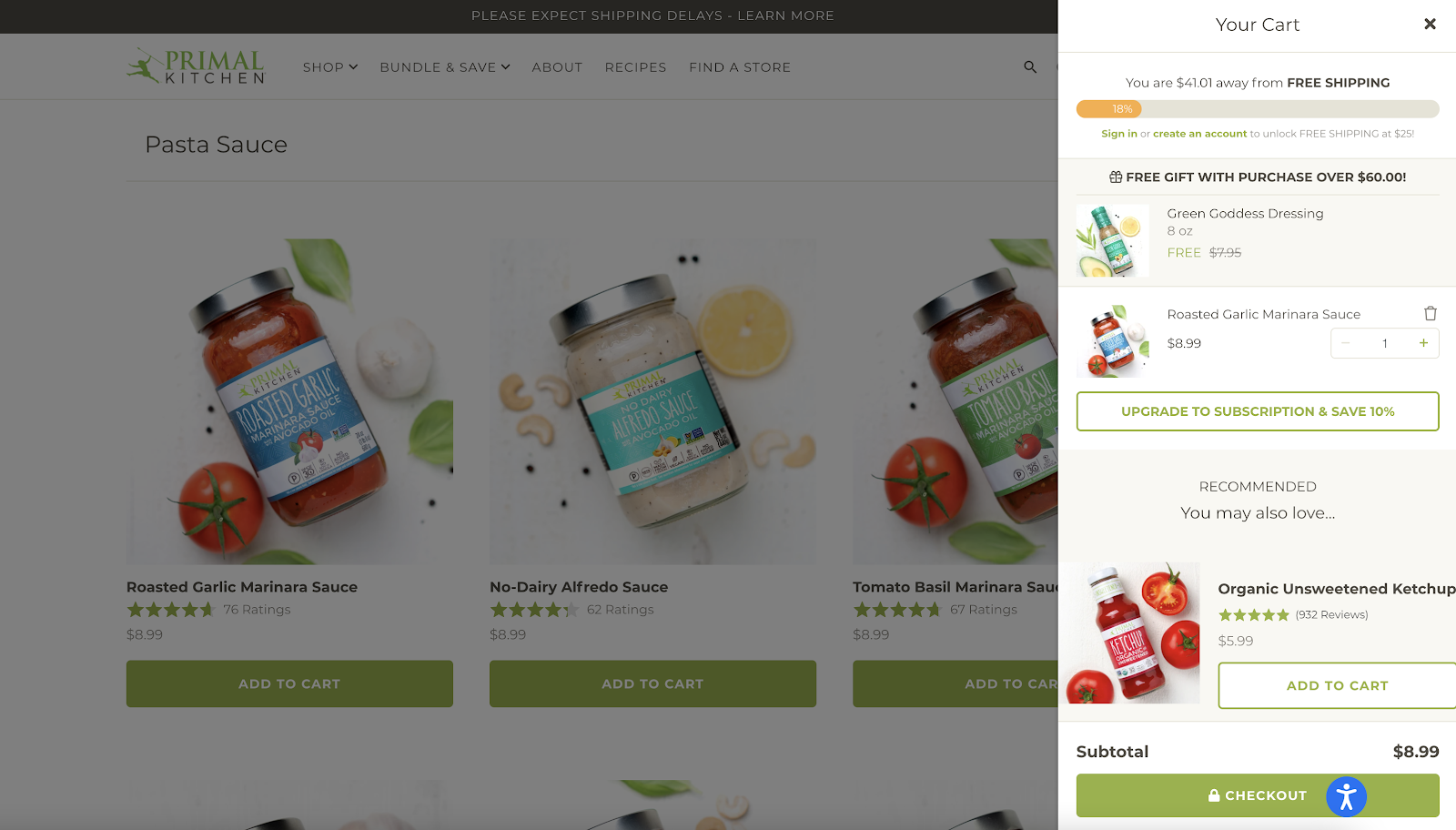
The Primal Kitchen example is again on Shopify and again features Rebuy for the product recommendations and the (Recharge integrated) subscription up-sell.
This example is one of my favourites as I think the one-click subscription up-sell works really well, but it also has all of the other core features we’ve recommended above.
Vivo Life
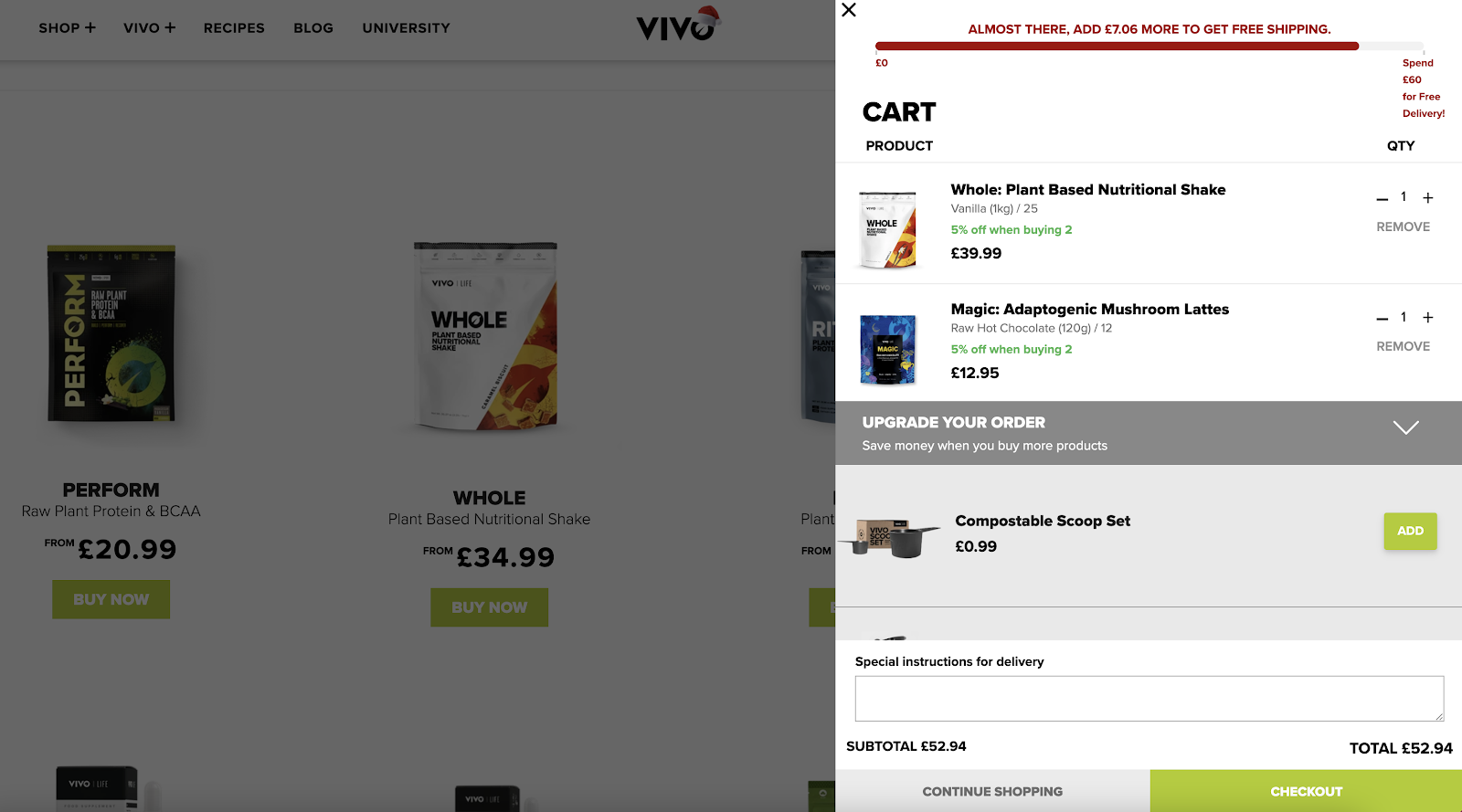
Not quite as strong from a design perspective, but Vivo Life is another really strong example, featuring fixed accessory up-sells (which I’d imagine would perform well), most of the other functional aspects we’ve touched on and then also delivery instructions as an optional field.
—
If you have any additional examples you think I should add or any other functionality you think can add value, please let me know in the comments below.
